What's new
Photoshop Gurus Forum

Welcome to Photoshop Gurus forum. Register a free account today to become a member! It's completely free. Once signed in, you'll enjoy an ad-free experience and be able to participate on this site by adding your own topics and posts, as well as connect with other members through your own private inbox!

New logo idea, not sure how to accomplish it


QuincyG

Member
Messages
9
Likes
0
I have a logo I'm trying to create. I used a pad an pencil and came up with some ideas, a couple of which i liked. But i sat down at Photoshop, and frankly it dawned on me, even after a lot of years with PS i'm still a newbie in so many ways.

What I want to do is use two initials, and form them into a circle. Not text on a path, but shape the letters so they form a circle. Does this make sense?

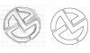
Maybe i should scan my sketch and show what i mean. If my description doesn't explain it I will.

I tried the puppet warp but honestly it made far too many triangles and I just ended up with a giant mess lol.

anyone got an idea for a 10 year user that apparently is still a newbie?
 
Are you using an existing font, by any chance? If so, you might find the Warp Text Tool to be of value. You can invoke this tool by right-clicking on your text layer and selecting "Warp Text" from the flyout menu. The best warp to use would likely be Bulge, although Inflate may work better with some fonts, depending greatly on the text itself.

The other option is to use the Pen Tool and create the shapes yourself, if you are comfortable with the Pen Tool.

Edit: Have you used the Transform>Warp tool?

A sketch might be helpful.
 
Last edited:
I think what you're asking is most easily accomplished using Illustrator. I think they have 1 month evaluations of that, this should give you plenty of time to try it out and see if it works for you. Using vectors are usually much easier that working with bitmaps when you're trying to create shapes from scratch.
 
hi guys. thanks for the replies

the font is kind of irrelevant really. I can use many different ones.

here's what i have come up with. i just sketched these out thinking of some ideas how to make a round logo out of initials.


it's sloppy, but again, it's just a sketch. i just need to figure out how to get that into a vector image. so correct, illustrator, but man oh man, i'm bad with illustrator.warped.jpg
 
I think what you're asking is most easily accomplished using Illustrator. I think they have 1 month evaluations of that, this should give you plenty of time to try it out and see if it works for you. Using vectors are usually much easier that working with bitmaps when you're trying to create shapes from scratch.
by the way, getting the software isn't the issue :) I own the full CC suite. well i should say i rent it lol since i have to pay yearly.

I do a ton of video work in after effects, and use photoshop, but illustrator and i don't get along. i'm not goo with vector work.
I do have a third party addon that will vectorize things in photoshop tho. i think i'll just open this in photoshop, use the pen tool, the vectorize it.

ugh i'm not goo at this.
 
Hi QG, Just curious, do you want your designs to be in a circular shape like your drawings?
 
yes. I plan to put a larger circle behind it. like an emblem. probably a ring around the text, then the border of the emblem. similar to an olympic medal. i can do that part, i just don't know the easiest way to make this vector, but now that it's scanned I guess I could do it in ps then export the paths to illustrator

i don't know an easier way
 
It seems to me the simplest approach is to just draw it using your sketch as a pattern. Just use shapes instead of doing it freehand. Be organized and think it out. Save the selections, outer circle, inner circle, rectangles, etc. Then use them as needed for each piece.
 

Attachments

  • ScreenShot001.jpg
    ScreenShot001.jpg
    27 KB · Views: 25
yeah you're right. my problem is, I struggle with the pen tool. I can use it, but i have a hard time making things consistent like line width. but i think if i just do like you did i'll be ok.

Amazing how some things are so hard for me, yet I can make awesome logo stings and intros with after effects. I wonder why that is.
 
by the way, since i'm here now. i circled the two in red that i thought looked the best, but you chose one I thought was sub par. Do you think that one is the best of the given choices? the two standalone letters weren't to be used, I did that so I could visualize how they might fit laying over each other. So i wasn't planning on using it.

if anyone else has a suggestion on which is better, or a suggestion on a better way to do this, hey I'm all ears!
 
I just chose one at random, but the procedure would be essentially the same for any of them. For something like you posted you don't need to use the pen. Look at it as shapes and it's really just circles and rectangles. Make the shapes and combine them and cut out parts you don't need.
 
See thisis why i come here.

It never occured to me to just use shapes to do this.

I created an elipse, and put it behind the drawing. then duplicated it, and reduced it till it matched the width of the drawing's outter, round lines.

then i created one rectangle to the width of one of the drawings straight lines. then duplicated it and rotated it till i had all lines covered. one thing I didn't think about, doing this allowed me to make the 'v' on the m use the same angle as the downward stroke of the z for consistency.

but here's where i had a problem. as vector shapes you can't cut, bend erase etc. so what i ended up doing was having to convert them all to raster shapes. then use the selection (control click on the layer) to erase the parts of the other lines I didn't need, then when everythihng was done, I joined all the shapes.

so that worked, and worked perfectly. However, i need this vector. Well i have a script that does a very similar action to using auto trace in after effects, and it results in a vector path. then i exported that to illustrator to fill the paths. but the problem is, just as the auto trace in after effects, it's not very accurate. and it warped sections. I can edit those paths, but i wish i could get it perfect.


sample.jpg
ok next, here's the bizarre thing. I used the vector to bring into After Effects. i use a plugin called Element 3D to extrude the path so i can animate it. but take a look at the jagged edges. that's using the vector. so it's not smooth and accurate.

sample-2.jpg


so while I think i'm on the right path, I don't think i'm quite there yet and I'm not sure what to do.

I do want to make it clear, I'm VERY grateful for the help given so far, I think i'm very close, so i'm really happy, just not quite all the way home.
 
OK. well I think i'm there. I gave up and just went in and manually did the mask instead of using auto trace. the problem is auto trace throws in tons of anchor points you don't need, and it causes inconsistencies.

i creeated it myself and it looks ok. I brought in my image and traced over the top of it then deleted the pic.

yay, i think i'm there. Thanks a ton for the help! It's looking much better now.


sample-4.jpgsample-3.jpg
 
"but here's where i had a problem. as vector shapes you can't cut, bend erase etc. so what i ended up doing was having to convert them all to raster shapes. then use the selection (control click on the layer) to erase the parts of the other lines I didn't need, then when everythihng was done, I joined all the shapes."

You can use a layer mask.
 

Back
Top