Inkz
Guru
- Messages
- 2,358
- Likes
- 1,554
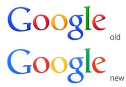
Flat Google Logo..
So with a big hiccup on the untimely release of the new Flatter version of the
Google logo.
Flat design is a minimalistic design that emphasizes usability. It's features
clean, open space with bright colours and 2d flat illustrations.
The logo itself isn't all that new as it's been used internally for several years
for banners and white paper.
http://static.googleusercontent.com...nomicimpact/pdf/google_economicimpact2010.pdf
What are your thoughts on the new logo?


