What's new
Photoshop Gurus Forum

Welcome to Photoshop Gurus forum. Register a free account today to become a member! It's completely free. Once signed in, you'll enjoy an ad-free experience and be able to participate on this site by adding your own topics and posts, as well as connect with other members through your own private inbox!

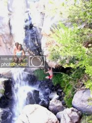
need help with this picture


noslenwerd

Well-Known Member
Messages
51
Likes
0
How can i make the people going down the waterfall look a little more like they were in the original picture? I was trying to mess with the contrast and brightness of their skin but it makes it start to look fake...

thanks

peoplecopy.jpg
 
At a glance, I kind of agree with Brightness/Contrast. Kind of...
More specifically, boost the black point for dark shadows but not completely blown out, then blast the highs into uberness.

I'll play some when I get a chance.

edit:
Used Levels to pump up contrast.
Then tweaked Sat just a tad.
Not the greatest, but getting close.
 
Boost the Black Point

In Levels there are two sets of sliders.
The top sliders are Input and there are 3 of them.
The bottom sliders are Output and there are two of them.

Both of the sliders on the left are black point sliders.
Messing with them will change the black point.
Depending on how you look at it, one will raise the black point and the other will lower the black point.

Not sure how to explain what exactly the black point is, but should be clear if you mess with the sliders.
 
maybe i can make the guy under the waterfalls skin a little tanner.. might help make the 2 in the raft look a little more in place.
 
From my point of view the people in the raft look a little bit out of proporsion to the waterfal, but the guy under the rock looks great. :}


:B
 
I spent about a half hour on this. It could use alot of fine tuning. First, I made the rafters back a bit and tried to make them 'in' the photo, not 'on' it. ( I made the guy under the rock a bit smaller and moved him back some. Then I tweaked the bottom foreground to change the depth some. I did nothing with the color at this point
 
sorry, it was too big, here it is
 

Back
Top