What's new
Photoshop Gurus Forum

Welcome to Photoshop Gurus forum. Register a free account today to become a member! It's completely free. Once signed in, you'll enjoy an ad-free experience and be able to participate on this site by adding your own topics and posts, as well as connect with other members through your own private inbox!

Need help with semi-circle marquee


ar-pharazon

Member
Messages
16
Likes
2
I am using PhotoShop CS3 and am looking for a way to create a semi-circle shaped marquee/highlight area.

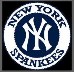
The main use for when I make goof sports logos like in the attached image.

In this case I want to make it say "Spankmees", so I would like to move the two sections apart to make room for the "M".

The Lasso tool is a mess and using the Quick Selection or Magic Wand tools on the letters leaves an outline of blue behind.

I'm hoping there's a way to use the Elliptical Marquee tool and transform the selection into a semi-circle that way, but no luck so far.

NY Spankees 2a2.jpg
 
There is no tool to directly create a semicircle. But you can make one using the elliptical marqee.
  • Create a horizontal guideline using either the built-in guildlines or by drawing the line manually .
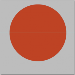
  • On a new layer, using the elliptical marquee tool, place the cursor exactly on the guideline. Then hold down Shift+Alt to create a perfect circle centered on your guideline and fill it with a color.
  • Like this:

1632006996005.png

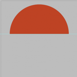
  • Now activate the rectangular marquee tool. Place the cursor exactly on the center guideline and drag down until you have covered half the circle.
  • Press the delete key, which leaves you with exactly half a circle.
  • Convert the semicircle layer to a smart object, which allows you to resize it up or down without losing crispness and resolution.

1632007343832.png
 
There is no tool to directly create a semicircle. But you can make one using the elliptical marqee.
  • Create a horizontal guideline using either the built-in guildlines or by drawing the line manually .
  • On a new layer, using the elliptical marquee tool, place the cursor exactly on the guideline. Then hold down Shift+Alt to create a perfect circle centered on your guideline and fill it with a color.
  • Like this:

View attachment 124047

  • Now activate the rectangular marquee tool. Place the cursor exactly on the center guideline and drag down until you have covered half the circle.
  • Press the delete key, which leaves you with exactly half a circle.
  • Convert the semicircle layer to a smart object, which allows you to resize it up or down without losing crispness and resolution.

View attachment 124048

Shoot, maybe "semi circle" was the wrong term, but wither way I'm not looking to make a shape and fill it with color, tho the above instructions will be helpful for other projects.

What I want to do is make a marquee/highlight area around the warped>arched text (or non-text lettering) and then to be able to move that text.

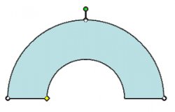
I think maybe what I need is a semi circular ring? Something like this, but again, not a shape but a transformed marquee area.
vlE7t.jpg
 
The reason I suggested to fill the shape is so that you could then use it later to make selections from it. But that's old news because you didn't really want a semicircle.

Just curious... how did you create this arch shape that you attached? Isn't that pretty much what you want? Once you resize this to fit, you can make a selection from it.


View attachment 124049

There are a couple of other ways to do what you want. If you're familiar with the Pen tool, you can use it to create a custom arch shape that exactly fits your lettering. Then make a selection from that path.


Maybe not all your images are circular like your Yankee attachment, but here's how I would do that one:
  • Make two copies of your Yankees logo on two new layers. Temporarily, reduce the opacity of these two copies down to about 50%.
  • Turn off the visibility of Copy #2 and activate the layer for Copy #1.
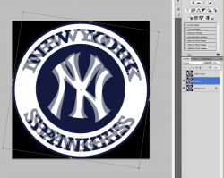
  • Go to Edit>Transform>Rotate and rotate the layer clockwise in the amount of approximately one-letter's width. The reduced opacity lets you see what you're doing to estimate how much rotation you need. Like this:
1632016366433.png


  • Now switch to Copy #2 and rotate it similarly, but in the other direction (counter-clockwise).
  • Set the layer opacity of your two copies back to 100%. Apply a layer mask to both layers and fill the masks entirely with black.
  • Using a hard brush, paint with white in the layer mask to reveal only the lettering. For copy #1, reveal the lettering only for the letters "SPANK".
  • For copy #2, reveal the lettering only for "EES".
  • You should now have something like this:
1632017074709.png

  • What's left over—circled in red—is the lettering from the original base layer. On a new layer, use a hard brush and paint white to hide that letter, which now gives you the space to insert the letter M. Something like this:
1632017328783.png
 
Last edited:
Hello.

Do you know what font the text is made from?

My first thought is to start with a centered version of the logo and then use "text on a path" to add the text. This way it would always be editable.

NYYankeeLogo_01.png

NYYankeeLogo_02.png
 
The reason I suggested to fill the shape is so that you could then use it later to make selections from it. But that's old news because you didn't really want a semicircle.

Just curious... how did you create this arch shape that you attached? Isn't that pretty much what you want? Once you resize this to fit, you can make a selection from it.


View attachment 124049

There are a couple of other ways to do what you want. If you're familiar with the Pen tool, you can use it to create a custom arch shape that exactly fits your lettering. Then make a selection from that path.


Maybe not all your images are circular like your Yankee attachment, but here's how I would do that one:
  • Make two copies of your Yankees logo on two new layers. Temporarily, reduce the opacity of these two copies down to about 50%.
  • Turn off the visibility of Copy #2 and activate the layer for Copy #1.
  • Go to Edit>Transform>Rotate and rotate the layer clockwise in the amount of approximately one-letter's width. The reduced opacity lets you see what you're doing to estimate how much rotation you need. Like this:
View attachment 124051


  • Now switch to Copy #2 and rotate it similarly, but in the other direction (counter-clockwise).
  • Set the layer opacity of your two copies back to 100%. Apply a layer mask to both layers and fill the masks entirely with black.
  • Using a hard brush, paint with white in the layer mask to reveal only the lettering. For copy #1, reveal the lettering only for the letters "SPANK".
  • For copy #2, reveal the lettering only for "EES".
  • You should now have something like this:
View attachment 124052

  • What's left over—circled in red—is the lettering from the original base layer. On a new layer, use a hard brush and paint white to hide that letter, which now gives you the space to insert the letter M. Something like this:
View attachment 124053

I found that shape on google searching for something that would be an example of what I'm trying to do.

I'll try your suggestion maybe tomorrow when I have more time.
 
Hello.

Do you know what font the text is made from?

My first thought is to start with a centered version of the logo and then use "text on a path" to add the text. This way it would always be editable.

View attachment 124054

View attachment 124055

Actually "text on a path" is something I've always had trouble with. Mainly getting the text on the inside of the circle and oriented the correct way top vs bottom.

That was something I always meant to post about.

I'm not sure I ever had luck finding this exact font, or I would have at least used it for the bottom part and warped it to an arch. Tho warping it does make the letters taper.

The font might be a version of College or Collegiate style.
 
Hi @ar-pharazon
A lot of good suggestions on how to proceed.
All I will provide is a way to create the selection(s) you described to separate out the letters. You are still left with having the right font to put the "M" in. That begs the question though if you have the right font, you could use one of the other techniques already describes to type in anything you want.

Here is a way to create the selection(s) without too much difficulty

1) Select the entire ring by using the Quick Selection Tool and follow around the inside of the ring. You should get an image with marching ants such as:

Screen Shot 2021-09-19 at 10.22.34 AM.jpg

Now use the command Select > Modify > Contract to shrink the selection just a bit to make a slightly smaller ring (I contract by 5 pixels):

Screen Shot 2021-09-19 at 10.22.53 AM.jpg

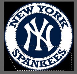
Not use the polygonal selection tool with the mode sent to "Intersect with Selection" and draw a trapazoid to cut across the ring in the spot desired. In this case I just selected "SPANKEES" yet you can make the cut anywhere you want:

Screen Shot 2021-09-19 at 10.25.12 AM.jpg

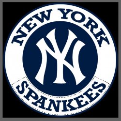
The resulting selection as Intersected would be:

Screen Shot 2021-09-19 at 10.34.10 AM.jpg

Note that you can save any selection with Selection > Save Selection and load in back in later with Selection > Load Selection for making different selections and saving work so you don't have to repeat all of the original steps along the way.

Hope that gives you another direction to consider.
John Wheeler
 
Hi @ar-pharazon
A lot of good suggestions on how to proceed.
All I will provide is a way to create the selection(s) you described to separate out the letters. You are still left with having the right font to put the "M" in. That begs the question though if you have the right font, you could use one of the other techniques already describes to type in anything you want.

Here is a way to create the selection(s) without too much difficulty

1) Select the entire ring by using the Quick Selection Tool and follow around the inside of the ring. You should get an image with marching ants such as:

View attachment 124067

Now use the command Select > Modify > Contract to shrink the selection just a bit to make a slightly smaller ring (I contract by 5 pixels):

View attachment 124068

Not use the polygonal selection tool with the mode sent to "Intersect with Selection" and draw a trapazoid to cut across the ring in the spot desired. In this case I just selected "SPANKEES" yet you can make the cut anywhere you want:

View attachment 124069

The resulting selection as Intersected would be:

View attachment 124071

Note that you can save any selection with Selection > Save Selection and load in back in later with Selection > Load Selection for making different selections and saving work so you don't have to repeat all of the original steps along the way.

Hope that gives you another direction to consider.
John Wheeler

I don't believe I have the exact font. I do have an "M" I created from the "W" by flipping and narrowing the wider part.

I'm going to tinker with all these options tomorrow when I have more time. It can never hurt to have multiple options in PS.
 
Hi @ar-pharazon
A lot of good suggestions on how to proceed.
All I will provide is a way to create the selection(s) you described to separate out the letters. You are still left with having the right font to put the "M" in. That begs the question though if you have the right font, you could use one of the other techniques already describes to type in anything you want.

Here is a way to create the selection(s) without too much difficulty

1) Select the entire ring by using the Quick Selection Tool and follow around the inside of the ring. You should get an image with marching ants such as:

View attachment 124067

Now use the command Select > Modify > Contract to shrink the selection just a bit to make a slightly smaller ring (I contract by 5 pixels):

View attachment 124068

Not use the polygonal selection tool with the mode sent to "Intersect with Selection" and draw a trapazoid to cut across the ring in the spot desired. In this case I just selected "SPANKEES" yet you can make the cut anywhere you want:

View attachment 124069

The resulting selection as Intersected would be:

View attachment 124071

Note that you can save any selection with Selection > Save Selection and load in back in later with Selection > Load Selection for making different selections and saving work so you don't have to repeat all of the original steps along the way.

Hope that gives you another direction to consider.
John Wheeler

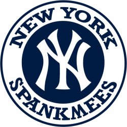
I had some free time today and tried your way. Worked really well and was a lot easier than selecting any other way. Like I said, I had the "M" ready to go from the Yankmees logo I did a while back.

NY SpankMees 1a1.jpg

One of the others mentioned using text on a path. Is there a thread for that on here? I'd like to figure that out as an alternative to warping text.
 
The reason I suggested to fill the shape is so that you could then use it later to make selections from it. But that's old news because you didn't really want a semicircle.

Just curious... how did you create this arch shape that you attached? Isn't that pretty much what you want? Once you resize this to fit, you can make a selection from it.


View attachment 124049

There are a couple of other ways to do what you want. If you're familiar with the Pen tool, you can use it to create a custom arch shape that exactly fits your lettering. Then make a selection from that path.


Maybe not all your images are circular like your Yankee attachment, but here's how I would do that one:
  • Make two copies of your Yankees logo on two new layers. Temporarily, reduce the opacity of these two copies down to about 50%.
  • Turn off the visibility of Copy #2 and activate the layer for Copy #1.
  • Go to Edit>Transform>Rotate and rotate the layer clockwise in the amount of approximately one-letter's width. The reduced opacity lets you see what you're doing to estimate how much rotation you need. Like this:
View attachment 124051


  • Now switch to Copy #2 and rotate it similarly, but in the other direction (counter-clockwise).
  • Set the layer opacity of your two copies back to 100%. Apply a layer mask to both layers and fill the masks entirely with black.
  • Using a hard brush, paint with white in the layer mask to reveal only the lettering. For copy #1, reveal the lettering only for the letters "SPANK".
  • For copy #2, reveal the lettering only for "EES".
  • You should now have something like this:
View attachment 124052

  • What's left over—circled in red—is the lettering from the original base layer. On a new layer, use a hard brush and paint white to hide that letter, which now gives you the space to insert the letter M. Something like this:
View attachment 124053

This is also a cool option I hadn't thought of using.
 
One of the others mentioned using text on a path. Is there a thread for that on here? I'd like to figure that out as an alternative to warping text.

Here's a tutorial for typing text on a path. You said you have CS3, which is old (I have CS5, also old), but this tutorial should work for you.

 
Here's a tutorial for typing text on a path. You said you have CS3, which is old (I have CS5, also old), but this tutorial should work for you.


This was made mostly from scratch using that tutorial. The basic circular part was a template I used for other logos.

Still feels like the bottom text lettering isn't as well aligned as the top.

Chicago Scrubs 2b2.jpg
 
Last edited:
Still feels like the bottom text lettering isn't as well aligned as the top.

It looks right to me. I'm not seeing anything about the bottom text that looks misaligned.
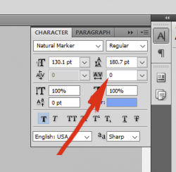
Are you familiar with this text control where the arrow is pointing? It controls the spacing between the letters. Maybe if you play with that it will look more like what you want.

1632092664525.png
 
It looks right to me. I'm not seeing anything about the bottom text that looks misaligned.
Are you familiar with this text control where the arrow is pointing? It controls the spacing between the letters. Maybe if you play with that it will look more like what you want.

View attachment 124087

I use the spacing option a lot with these types of projects. Here, I used the baseline shift (one to the left and two down) instead of stretching the path (per the tutorial you posted).

IDK, the lettering at the bottom looks a little off to me somehow, like it isn't following the path as cleanly as the "Chicago", but maybe it's just an optical illusion.

Considering the bottom text is a copy of the layer for the top text, I'm not sure why it would be different.

This is really the best way to go when I have the correct font, and @thebestcpu 's option for moving existing parts around feels best for when I don't have a font to use.

There's a few team logo fonts that are just not available, as no one has created a font for them yet. A lot of them just use a Collegiate type or Arial Black.
 

Back
Top