What's new
Photoshop Gurus Forum

Welcome to Photoshop Gurus forum. Register a free account today to become a member! It's completely free. Once signed in, you'll enjoy an ad-free experience and be able to participate on this site by adding your own topics and posts, as well as connect with other members through your own private inbox!

Need Help of PS Gurus...


aqeel_bestluck

New Member
Messages
3
Likes
0
I want to paint masonry surface houses and make some color options in Adobe Photoshop..
It takes so much time and lengthy process to make all wall layers and then apply colors on it .. and it gives some artificial look of house.
can you suggest me any plugin or filter or action to perform that task real quick ?
or what can i do to make it more smooth and in original shape and in presentable form ..
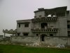
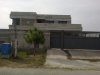
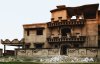
i am attaching some pictures please take a look and help with this matter ..

Thanks ..
 

Attachments

  • zahid 20430.jpg
    zahid 20430.jpg
    1.7 MB · Views: 3
  • Safdar 20293.JPG
    Safdar 20293.JPG
    431.8 KB · Views: 2
I would duplicate the layer with the top layer,Go to >Image> hue/saturation play around with sliders to get the color you want then put top layer in color mode merge………. be sure to save original image before merge
 
you may need to cut out just areas you want changed on house first
 
View attachment 28763 just look in ps you can also do like this I used hue/saturation top layer . very rough trim work but you'll get it
 
Last edited:
Thanks for the reply and your time ..
i have done this before but the same issue is patches and color can't match properly..
i want the images like in attachments original and treated ...
it took much time and i want your help to get it done real quick ..
so please let me know if you have something in your mind like filter or plugin thing..

Thanks...
Original.jpg Treated.jpg

Original-2.jpg 2.jpg
 
I thought you wanted the result to look like a realistic photograph (say, like the attached tweaked version), but the images you just posted look completely artificial ... like they are graphics for an older computer game. Which do you want?

Tom
 

Attachments

  • zahid_20430-01_ps01a-02_650px_wide-sepia.jpg
    zahid_20430-01_ps01a-02_650px_wide-sepia.jpg
    244.5 KB · Views: 33
If you will take into account the light source in your images, your shadows are off. This will account for the mismatch.

Your use of earth colours are fine. All it needs is proper shadows. You should make areas shaded from the sun darker. Add shadows cast by ledges towards wall darker as well as under sareas like under ledges and car port darker.

Add reflection to your windows (eg. sky & clouds) . Tho your chosen window glass color is smoked, add a tint of blue.

One more trick that I use in creating architectural renders , is the use of color done in gradient from light to dark - lighter color from the top to a darker shade going down. Take the dark red roofing material .... you start with a slightly lighter red at the top and end with a slightly darker red at the bottom. It's like adding hilights to the surface.

Here's a rough quickie to illustrate....

paint.jpg

I used color for the layer modes (quicker to do... lol ) but this will cause discoloration coz of the cement texture. Which is why its a good idea to "prep" the image - color adjust , increase brightness , etc - to minimize this. GET THE IMAGE CLEAN AND SMOOTHED OUT before coloring.

You can try other modes or a combination of modes. Apply and play with adjustment layers to get the color tone you want.
 
Last edited:
I still think iDad's advice, not to overlook the others which are fantastic pointers, but the blend mode will make a lot of difference to having the color not look like it is pasted on. There are many modes at your disposal. Try them out with different layer opacity settings. Like hard light and multiply in particular.
 
If you will take into account the light source in your images, your shadows are off. This will account for the mismatch.

Your use of earth colours are fine. All it needs is proper shadows. You should make areas shaded from the sun darker. Add shadows cast by ledges towards wall darker as well as under sareas like under ledges and car port darker.

Add reflection to your windows (eg. sky & clouds) . Tho your chosen window glass color is smoked, add a tint of blue.

One more trick that I use in creating architectural renders , is the use of color done in gradient from light to dark - lighter color from the top to a darker shade going down. Take the dark red roofing material .... you start with a slightly lighter red at the top and end with a slightly darker red at the bottom. It's like adding hilights to the surface.

Here's a rough quickie to illustrate....

View attachment 28899

I used color for the layer modes (quicker to do... lol ) but this will cause discoloration coz of the cement texture. Which is why its a good idea to "prep" the image - color adjust , increase brightness , etc - to minimize this. GET THE IMAGE CLEAN AND SMOOTHED OUT before coloring.

You can try other modes or a combination of modes. Apply and play with adjustment layers to get the color tone you want.

Thanks for the information .
maybe it could work with surface preparation and after make it smooth ..
can you please explain how can i do that in better way ..
like make the surface smooth and then coloring like you did . i mean brief that with with options..

I just tried to make it presentable how the house will look like after getting use of this color paint ..
but its seems artificial if i fill solid color on layers and shadow them. i want house in its actual look and with the actual color.

i think you getting my point ..
so what do you suggest me (1). better in this way filling with color and shadow and give idea in artificial look or (2). make the surface smooth and color adjustment like you did .

can i get the actual color i want to show after multiply the upper layer .
problem is its change the tone of that color because of surface :(
 
What you did was good. The only problem is you lack the shadows in the areas that I mentioned as well as the gradients and hilites .

Cleaning up a photo in preparation for coloring may take time. Which is why I would take snapshots on a bright, sunny day. This will minimize unwanted shadows caused by textures in the materials.

What you can do is to raise the brightness and add contrast to your photo. this will clean up the surface problems a bit.

I do the coloring in sections and merge sections of the same color. In this way, when I use the color correction tools it will affect only those sections.

And play with the hue and saturation or color balance to get the color you want.

Just remember that shadows and hilites will add depth and a bit of realism to the image. What I created above is to show you the difference if you add shadows.

But if you have the perfect image, the use of the color modes can help.
 
Additionally, if you pick the color you want and fill the selection, once you add the blend mode, it will water down the color for the most part. Hard light and multiply modes with a lowered opacity will overcome this problem for the most part. You can then duplicate the blend mode layer and further adjust the opacity or once again change its blend mode to maybe soft light or overlay if the set mode is not quite right. Overlay tends to brighten up the effect. Or, if I understand dv8, you activate the selection, make another layer, and add a different color and this changes the tone or shade of the color. You can also initially pick your fill color, knowing in advance that it needs to be darker/more saturated, so that it will translate better once blended down.
 

Back
Top