Photoshop Gurus Forum
Welcome to Photoshop Gurus forum. Register a free account today to become a member! It's completely free. Once signed in, you'll enjoy an ad-free experience and be able to participate on this site by adding your own topics and posts, as well as connect with other members through your own private inbox!
You are using an out of date browser. It may not display this or other websites correctly.
You should upgrade or use an alternative browser.
You should upgrade or use an alternative browser.
Need Help in creating this effect.
- Thread starter cteq1
- Start date
- Messages
- 23,906
- Likes
- 13,636
Hello. This is very easy.
Create a new project.
In your project, create your type on a new layer with the Type Tool and the font of choice.
The color of the type will make no difference.

Click and hold then drag and drop the Eagle and Flag image into the project from wherever you have the file saved.
Or you can go to FILE > PLACE EMBEDDED > SELECT FILE > HIT PLACE > HIT ENTER OR THE CHECK/TICK MARK IN THE TOOLS OPTIONS BAR.
Place the Eagle and Flag layer above the type layer.
Then right click on the Eagle and Flag layer and choose "create clipping mask".
Move the Eagle and Flag layer into position within the type/text with the Move Tool. You can also resize the Eagle and Flag image/layer using free transform - Cmd/Cntrl + T.
(I have added a background layer for visibility. You can use any color background you like or none at all when saving)

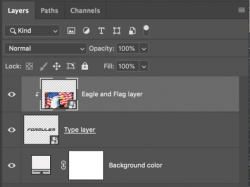
Create a new project.
In your project, create your type on a new layer with the Type Tool and the font of choice.
The color of the type will make no difference.

Click and hold then drag and drop the Eagle and Flag image into the project from wherever you have the file saved.
Or you can go to FILE > PLACE EMBEDDED > SELECT FILE > HIT PLACE > HIT ENTER OR THE CHECK/TICK MARK IN THE TOOLS OPTIONS BAR.
Place the Eagle and Flag layer above the type layer.
Then right click on the Eagle and Flag layer and choose "create clipping mask".
Move the Eagle and Flag layer into position within the type/text with the Move Tool. You can also resize the Eagle and Flag image/layer using free transform - Cmd/Cntrl + T.
(I have added a background layer for visibility. You can use any color background you like or none at all when saving)


JeffK
Guru
- Messages
- 2,602
- Likes
- 2,994
To use these two specific images -
Open up the flag image in Photoshop:
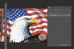
Now open up the logo image - once you open the image, click on the lock icon to unlock the image so you can move it
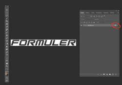
Once the image is unlocked, with layer active, click on your move tool which will prepare the logo image to move:
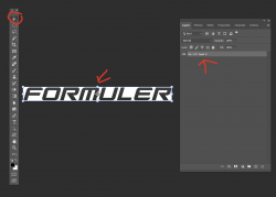
Place your cursor over the logo image, and holding down the ALT key on your computer, drag the logo image over to the tab of the flag image,
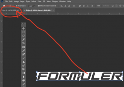
Holding down the ALT key will center the logo on the flag image when you let go:
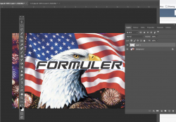
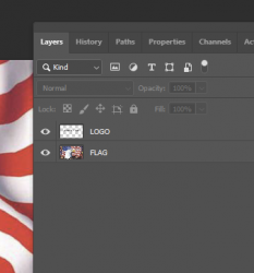
Click in any empty space to remove the handles on the logo image. We'll rename the layers FLAG and LOGO:
Now with the LOGO layer active, activate your Magic Wand selection tool - if you don't see it, it might be under the other selection tools in the panel.
Just click on the small triangle in the lower left to reveal it:
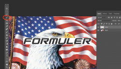
With the Magic Wand tool selected, and the logo layer active, click o the "F" or any other letter. Since they're all the same color, the Magic Wand tool will choose all of them.
The marching ants will surround the letters:

Now with that layer active and the marching ants surrounding the letters, hold down your CTRL key and click on the letter "J" on our keyboard,
This will make a copy of the letters only without the background.
The click on the flag layer and drag it to the top of the layer stack:
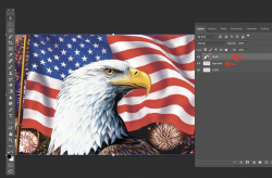
Since the FLAG is at the top of the stack, it hides everything underneath it.
This flag image is larger than the logo - so with the layer active, click on your move tool again which will give handles all around the flag image.
Holding down the ALT key, pull down on the corner handle until you just to the left and right edges of the FORMULER logo:
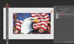
Now, with the FLAG layer still active, go to the menu at the top and click on Layer -Create Clipping Mask.
Now the flag image will be inside the type. You can see the small down arrow in the layer stack showing the flag is clipped to the type
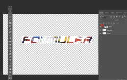
You can again using the Move Tool, and with your finger holding down the SHIFT key, pull on the handles to get more of your image to be seen inside the logo:
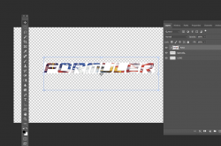
The flag image posted is much larger than the type so not much of the image can be seen. @IamSam suggested resetting type to a larger format.
All the steps can be found here:
Many other videos are available - just go to YouTube and search for "placing an image inside text photoshop"
Hope this all helps.
Open up the flag image in Photoshop:

Now open up the logo image - once you open the image, click on the lock icon to unlock the image so you can move it

Once the image is unlocked, with layer active, click on your move tool which will prepare the logo image to move:

Place your cursor over the logo image, and holding down the ALT key on your computer, drag the logo image over to the tab of the flag image,

Holding down the ALT key will center the logo on the flag image when you let go:

Click in any empty space to remove the handles on the logo image. We'll rename the layers FLAG and LOGO:

Now with the LOGO layer active, activate your Magic Wand selection tool - if you don't see it, it might be under the other selection tools in the panel.
Just click on the small triangle in the lower left to reveal it:

With the Magic Wand tool selected, and the logo layer active, click o the "F" or any other letter. Since they're all the same color, the Magic Wand tool will choose all of them.
The marching ants will surround the letters:

Now with that layer active and the marching ants surrounding the letters, hold down your CTRL key and click on the letter "J" on our keyboard,
This will make a copy of the letters only without the background.
The click on the flag layer and drag it to the top of the layer stack:

Since the FLAG is at the top of the stack, it hides everything underneath it.
This flag image is larger than the logo - so with the layer active, click on your move tool again which will give handles all around the flag image.
Holding down the ALT key, pull down on the corner handle until you just to the left and right edges of the FORMULER logo:

Now, with the FLAG layer still active, go to the menu at the top and click on Layer -Create Clipping Mask.
Now the flag image will be inside the type. You can see the small down arrow in the layer stack showing the flag is clipped to the type

You can again using the Move Tool, and with your finger holding down the SHIFT key, pull on the handles to get more of your image to be seen inside the logo:

The flag image posted is much larger than the type so not much of the image can be seen. @IamSam suggested resetting type to a larger format.
All the steps can be found here:
Many other videos are available - just go to YouTube and search for "placing an image inside text photoshop"
Hope this all helps.
Last edited:
JeffK
Guru
- Messages
- 2,602
- Likes
- 2,994
This has bothered me thru the night - which isn't unusual for me.
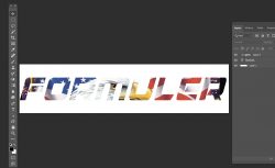
The visual problem is that the logo you chose is f=very small in relation to the flag artwork. So it's very difficult to get a sense of what's actually been placed inside the type.
I didn't have the exact font to recreate the logo so I searched onlineand found a similar font that you can download here:

Now with the artwork open, I set the type large enough to fill the entire width of the flag artwork so to pull in as much of the image a possible.
Here's my result:
You can get a better sense of the eagle which is the focal point of the artwork.
Here's the size of the type set to the width of the artwork:
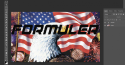
If you want a better visual than above, then you should poke around for a better eagle/flag combo artwork. The one above isn't bad if that's what you had in mind.
If you have any questions, please don't hesitate to ask. It's a relatively simple process but can be intimidating to a new user.
The visual problem is that the logo you chose is f=very small in relation to the flag artwork. So it's very difficult to get a sense of what's actually been placed inside the type.
I didn't have the exact font to recreate the logo so I searched onlineand found a similar font that you can download here:

Now with the artwork open, I set the type large enough to fill the entire width of the flag artwork so to pull in as much of the image a possible.
Here's my result:

You can get a better sense of the eagle which is the focal point of the artwork.
Here's the size of the type set to the width of the artwork:

If you want a better visual than above, then you should poke around for a better eagle/flag combo artwork. The one above isn't bad if that's what you had in mind.
If you have any questions, please don't hesitate to ask. It's a relatively simple process but can be intimidating to a new user.
[ iLLuSioN ]
Power User
- Messages
- 414
- Likes
- 419
Usually it is easier not to search for the right font, but for a logo of better quality ...I didn't have the exact font to recreate the logo so I searched onlineand found a similar font...
- Messages
- 23,906
- Likes
- 13,636
For general reference, the original image the OP was trying to emulate had a transparent BG and was 1500px x 150px

I do understand that the OP's "logo image" example had a white BG and that the OP did say "this logo image" and "this flag". I don't feel that the OP was implying the use of those exact images. It's much easier to start from scratch. Not to mention, that using the exact name and font of a copyrighted logo is not recommended. On the off chance that the OP was dealing with the company, they would have provided them with the exact font.
I felt that the OP just wanted to know how to get the Eagle and Flag image into text.
I may have mistakenly misinterpreted the OP's needs, but for me, the idea here was to demonstrate how to add the Eagle and Flag image to the text. The BG color can easily be added with a new layer and the resizing of the text and the rectangle can be done at anytime as well as the overall size of the finished "logo".
If I were to interpret the reconstruction of the original image, neither of us provided the proper explanation as there were some distinct properties of the original that neither of us addressed, and that was the wrapping effect of the flag (stars) around the text generated by the layer style with B&E and the drop shadow. But the OP did not inquire about this effect.

Even though it was not stated, I felt that this was all more complicated than what the OP was asking about. So for me I made an educated call and kept things simple. Until the OP responds, I won't know if I have misinterpreted their general question.
I do understand that the OP's "logo image" example had a white BG and that the OP did say "this logo image" and "this flag". I don't feel that the OP was implying the use of those exact images. It's much easier to start from scratch. Not to mention, that using the exact name and font of a copyrighted logo is not recommended. On the off chance that the OP was dealing with the company, they would have provided them with the exact font.
I felt that the OP just wanted to know how to get the Eagle and Flag image into text.
I may have mistakenly misinterpreted the OP's needs, but for me, the idea here was to demonstrate how to add the Eagle and Flag image to the text. The BG color can easily be added with a new layer and the resizing of the text and the rectangle can be done at anytime as well as the overall size of the finished "logo".
If I were to interpret the reconstruction of the original image, neither of us provided the proper explanation as there were some distinct properties of the original that neither of us addressed, and that was the wrapping effect of the flag (stars) around the text generated by the layer style with B&E and the drop shadow. But the OP did not inquire about this effect.

Even though it was not stated, I felt that this was all more complicated than what the OP was asking about. So for me I made an educated call and kept things simple. Until the OP responds, I won't know if I have misinterpreted their general question.
JeffK
Guru
- Messages
- 2,602
- Likes
- 2,994
Completely understand what you're saying. I tend to be very literal when taking instructions so when the OP wrote use this and this, it's exactly what I did. Which isn't often what they want. 
I did consider offering layer styles as an option but decided not to make the waters even more confusing.
Hopefully the OP will respond.

I did consider offering layer styles as an option but decided not to make the waters even more confusing.
Hopefully the OP will respond.
- Messages
- 23,906
- Likes
- 13,636
You could be right!!! Which I do not mind! I just love the fact that we have multiple members offering varied opinions and techniques on the same questions about effects! It's what this forum is about!I tend to be very literal when taking instructions so when the OP wrote use this and this, it's exactly what I did.
I was lloking for a way to get text type effect but using 2 images. I could only find double expose type tutorial. So it was image with image effect i was looking for. I am new so I didnt realize background color made difference. I will study all these and see If I can make few images.For general reference, the original image the OP was trying to emulate had a transparent BG and was 1500px x 150px
View attachment 126357
I do understand that the OP's "logo image" example had a white BG and that the OP did say "this logo image" and "this flag". I don't feel that the OP was implying the use of those exact images. It's much easier to start from scratch. Not to mention, that using the exact name and font of a copyrighted logo is not recommended. On the off chance that the OP was dealing with the company, they would have provided them with the exact font.
I felt that the OP just wanted to know how to get the Eagle and Flag image into text.
I may have mistakenly misinterpreted the OP's needs, but for me, the idea here was to demonstrate how to add the Eagle and Flag image to the text. The BG color can easily be added with a new layer and the resizing of the text and the rectangle can be done at anytime as well as the overall size of the finished "logo".
If I were to interpret the reconstruction of the original image, neither of us provided the proper explanation as there were some distinct properties of the original that neither of us addressed, and that was the wrapping effect of the flag (stars) around the text generated by the layer style with B&E and the drop shadow. But the OP did not inquire about this effect.
View attachment 126361
Even though it was not stated, I felt that this was all more complicated than what the OP was asking about. So for me I made an educated call and kept things simple. Until the OP responds, I won't know if I have misinterpreted their general question.
Exactly what I wanted. Thank you very much. I think I will remove white background before for better effect. Thank you very much.To use these two specific images -
Open up the flag image in Photoshop:
View attachment 126328
Now open up the logo image - once you open the image, click on the lock icon to unlock the image so you can move it
View attachment 126329
Once the image is unlocked, with layer active, click on your move tool which will prepare the logo image to move:
View attachment 126330
Place your cursor over the logo image, and holding down the ALT key on your computer, drag the logo image over to the tab of the flag image,
View attachment 126331
Holding down the ALT key will center the logo on the flag image when you let go:
View attachment 126332
Click in any empty space to remove the handles on the logo image. We'll rename the layers FLAG and LOGO:
View attachment 126333
Now with the LOGO layer active, activate your Magic Wand selection tool - if you don't see it, it might be under the other selection tools in the panel.
Just click on the small triangle in the lower left to reveal it:
View attachment 126334
With the Magic Wand tool selected, and the logo layer active, click o the "F" or any other letter. Since they're all the same color, the Magic Wand tool will choose all of them.
The marching ants will surround the letters:
View attachment 126335
Now with that layer active and the marching ants surrounding the letters, hold down your CTRL key and click on the letter "J" on our keyboard,
This will make a copy of the letters only without the background.
The click on the flag layer and drag it to the top of the layer stack:
View attachment 126336
Since the FLAG is at the top of the stack, it hides everything underneath it.
This flag image is larger than the logo - so with the layer active, click on your move tool again which will give handles all around the flag image.
Holding down the ALT key, pull down on the corner handle until you just to the left and right edges of the FORMULER logo:
View attachment 126337
Now, with the FLAG layer still active, go to the menu at the top and click on Layer -Create Clipping Mask.
Now the flag image will be inside the type. You can see the small down arrow in the layer stack showing the flag is clipped to the type
View attachment 126339
You can again using the Move Tool, and with your finger holding down the SHIFT key, pull on the handles to get more of your image to be seen inside the logo:
View attachment 126346
The flag image posted is much larger than the type so not much of the image can be seen. @IamSam suggested resetting type to a larger format.
All the steps can be found here:
Many other videos are available - just go to YouTube and search for "placing an image inside text photoshop"
Hope this all helps.
JeffK
Guru
- Messages
- 2,602
- Likes
- 2,994
You're very welcome...and very nicely done!Well with your help I did create an image. thank you once again

