What's new
Photoshop Gurus Forum

Welcome to Photoshop Gurus forum. Register a free account today to become a member! It's completely free. Once signed in, you'll enjoy an ad-free experience and be able to participate on this site by adding your own topics and posts, as well as connect with other members through your own private inbox!

Need help creating a contoured background/border.


Messages
8
Likes
0
Hey Everyone

I am not new to graphics however I was raised up on the former Macromedia Fireworks platform (which adobe sucked up into its masses a couple years ago.

I have what I think should be a simple process, but I keep beating myself up over how to do it right, but as the name implies, you guys are the gurus. I think I just need pointing in the right direction. The issue is searching out the information whilst not knowing exactly what its called.

Ok so heres the situation, aside from the annoying "always greyed out" cut copy and paste in PS making it virtually useless, I keep running into dead ends.

I have a group of 1000 SVGS, each one is on a 100% transparent background, I want to place these on t shirt transfers, which use WHITE backing, these are printed, then fed into this cool little Cricut machine which cuts them out for heat press, the trick is it CUTS everything out that is not together, essentially creating a puzzle which has to be reassembled on the shirt. We can also do this with vinyl, but the difference is the vinyl has a "carrier sheet" that the transfers do not, which holds everything together for the heat press.

My goal is to make a "bubble" of sorts around the SVG and anything INSIDE the bubble will be white and anything outside will be the shirts color. I have tried cutting shapes, I have tried making shapes, I have tried adding borders, I have even tried "expand" and nothing works.

I have attached a few photos to give everyone an idea what I am trying to accomplish

any help would be great and even a way to run a script on every file if Photoshop can do such a thing.

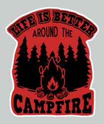
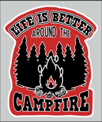
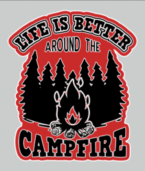
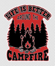
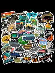
first image is the final result "bubble" I want to give you an idea

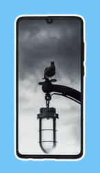
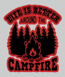
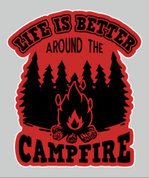
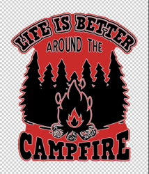
second image is an SVG file I am working with

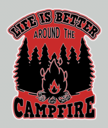
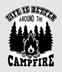
Third image is as close as I have gotten to making it work so far
1578563166f0fb9d74edb8866b242738230b02121a_thumbnail_600x.jpg

LH-91.png

examplecutout.png
 
Hello.

Call me slow but I'm not understanding the term bubble.

first image is the final result "bubble" I want to give you an idea
For me this is not a bubble. It is a collage of many stickers. The collage has a white border because each sticker has a white border that together, form one big border surrounding the entire collage.

Are you just wanting to make a white border around a sticker?

Screen Shot 2022-05-11 at 6.35.29 PM.png
 
I think @IamSam was going in the same direction I was thinking...

I'm a little unsure what you want...but...

Left image is a cell phone image on a blue background - right image is the same image with a white stroke around it:
(The phone is one layer and the blue background is on a separate layer so you can see the stroke)

1652312587803.png 1652312628212.png

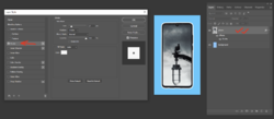
If that's what you need, just double click on the phone layer and that will bring up layer options dialog.
Then just click the stroke box. Make sure you don't just check the box but also click on the word "stroke" to bring up the stroke options:

1652312975105.png

With the Size option, you can make the stroke as wide as you want. Double click on the Color box to change the stroke color if you wish.

PS - I can't imagine doing this on a 1,000 images...maybe create an action?
 
Yes...........

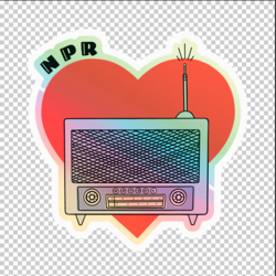
Here is a sticker on a transparent bg......
Screen Shot 2022-05-11 at 7.08.48 PM.png

Here it is with a white border applied using stroke in a layer style as Jeff explained...
Screen Shot 2022-05-11 at 7.09.22 PM.png
 
You guys are awesome, I knew this was the right place. I see what your doing and also why you were confused by my image. The "bubble" is essentially the "Stroke" around EACH image, I realize they were in a pile when I showed that example. My issue with the stroke is its NOT connected. Example in this image I applied an "outside stroke" to the image, but if you look you will see the "outside" is still disconnected, the cutter will chop this image up into sections, whereas if it went around the "entire image" it would not, is that making sense??

lifeisexample1.png
 
Thanks.............at least we now have an understanding and a starting point to which our members can offer you advice.

You're wanting an outer border that follows the contour of the elements within the graphic.
 
On your Graphic Layer.....
Create a large red stroke using a layer style.
You can make this as close or as far away from the graphic elements as you wish.
Screen Shot 2022-05-11 at 11.01.25 PM.png

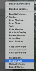
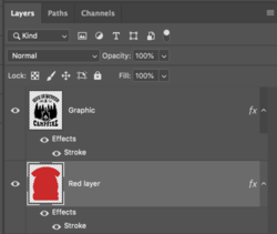
Once done, right click over the FX icon on the right hand side of the graphic layer and choose "create layer".
Screen Shot 2022-05-11 at 11.01.38 PM.png

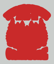
This will move the stroke to it's own layer. Call this layer "Red Layer"
Turn off your Graphic Layer.
Screen Shot 2022-05-11 at 11.01.56 PM.png

On the Red Layer, take your Brush Tool and fill in the missing red areas.
Screen Shot 2022-05-11 at 11.03.20 PM.png

Turn the Graphic Layer back on.
Create a white stroke layer style for the Graphic Layer.
Screen Shot 2022-05-11 at 11.04.13 PM.png

Chose the Red layer.
Create a white stroke layer style for the Red Layer.
Screen Shot 2022-05-11 at 11.05.04 PM.png

Or you can leave the Graphic Layer stroke off.
Screen Shot 2022-05-11 at 11.20.35 PM.png

Screen Shot 2022-05-11 at 11.11.23 PM.png

A different version with a slightly adjusted beginning stroke...
Screen Shot 2022-05-11 at 11.34.31 PM.png
 
On your Graphic Layer.....
Create a large red stroke using a layer style.
You can make this as close or as far away from the graphic elements as you wish.
View attachment 129519

Once done, right click over the FX icon on the right hand side of the graphic layer and choose "create layer".
View attachment 129520

This will move the stroke to it's own layer. Call this layer "Red Layer"
Turn off your Graphic Layer.
View attachment 129521

On the Red Layer, take your Brush Tool and fill in the missing red areas.
View attachment 129522

Turn the Graphic Layer back on.
Create a white stroke layer style for the Graphic Layer.
View attachment 129523

Chose the Red layer.
Create a white stroke layer style for the Red Layer.
View attachment 129524

Or you can leave the Graphic Layer stroke off.
View attachment 129526

View attachment 129525

A different version with a slightly adjusted beginning stroke...
View attachment 129527
OMG SAM, yes that is EXACTLY what I have been looking for, so essentially I am creating a fill layer with a border, and the rest outside of this can be transparent

I am going to try it now with a different graphic, and of course the middle doesnt have to be red, it actually should stay white, although that may cause an issue with the white total border, not sure on that one

Ill report back after I have tried one for myself
 
so essentially I am creating a fill layer with a border, and the rest outside of this can be transparent
I just had a grey bg layer, it can be turned off and the bg would be transparent.
Screen Shot 2022-05-11 at 11.49.18 PM.png

Or without the stoke...
Screen Shot 2022-05-11 at 11.49.31 PM.png

and of course the middle doesnt have to be red, it actually should stay white,
The stroke can be any color you like!
Screen Shot 2022-05-11 at 11.50.46 PM.png
 
Ok technically this is what I am going for, but I noticed if I adjust the stroke on the fill layer I created, it doesnt even show up at all, and I would like it to be a little thinner more crisp,

So close though, I am starting to get the hang of it, I imagine I can create a preset to each graphic to create a certain defined stroke and make that a layer style?

contouredborder2.png
 
Ok I created a layer style that turns the words black with a color burn, then starts off with a light stroke, looks like the rest is very subjective to how the final look is needed, so each image will have to be dealt with on a case by case basis, its going to be grueling but at least now I understand how the process works, also its probably a good idea to keep the red background there, if I miss a speck of the fill the cutter will mark it as transparent and attempt to cut the transfer in that spot, a big no no. here is my second try, a bit cleaner

contouredborder3.png
 
Ok Sam, Looks like that will work, we can even use this method to knockout words we want the shirt color to highlight!

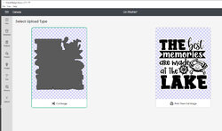
here is what it looks like on the cutter

Thanks so much, I am sure ill be back again, you guys were an amazing help!

2022-05-12_1-29-21.jpg
 

Back
Top