What's new
Photoshop Gurus Forum

Welcome to Photoshop Gurus forum. Register a free account today to become a member! It's completely free. Once signed in, you'll enjoy an ad-free experience and be able to participate on this site by adding your own topics and posts, as well as connect with other members through your own private inbox!

Need creative & technical advice for compositing


_alexbrandt_

Well-Known Member
Messages
66
Likes
8
Hey there,

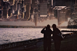
So I'm working on a composition. I've got essentially two images composited together. One on top and one on bottom.
This is my first attempt to do this in PS...

What would be a good way to smoothen the transition between top and bottom ?
Should I separate the top image in a few different layers, for foreground, and background (so I can better fade the background) while keeping the foreground nice and visible ?
Screen Shot 2019-01-31 at 17.58.29.jpg
 
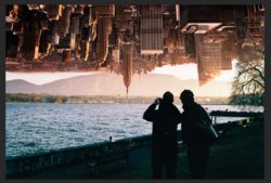
I think it would look better without the mountain in the back. Also, the background is more in a golden color and the foreground is more greenish-blue. So, I think it would look more realistic and professional if it matched just a bit more. Other than that, the picture looks good and great idea!
 
What sousou707 suggested is very good.


1. Straighten the upside-down City layer, and enlarge it. Desaturate the colors a little. Move the layer down to the lake.
2. On the main image you might have to fill in some parts of bright the sky with the clonestamp tool. Darken the mountains with the curve tool.
3. Desaturate the lake and the dark foreground to get rid of the blue and greenish tint.
4. Open the curves tool. switch to the red chanel and change the curve in this chanel to get more brownish colors.
5. The 2 image layers now blend nicely. The result should be similar to my posted image.

Good luck with your great composite!

Screen Shot 2019-01-31 at 17.58.29chrisdesign.jpg
 
Last edited:
What sousou707 suggested is very good.


1. Straighten the upside-down City layer, and enlarge it. Desaturate the colors a little. Move the layer down to the lake.
2. On the main image you might have to fill in some parts of bright the sky with the clonestamp tool. Darken the mountains with the curve tool.
3. Desaturate the lake and the dark foreground to get rid of the blue and greenish tint.
4. Open the curves tool. switch to the red chanel and change the curve in this chanel to get more brownish colors.
5. The 2 image layers now blend nicely. The result should be similar to my posted image.

Good luck with your great composite!

View attachment 95616


Hey guys,

Thanks for the feedback. It's very appreciated.

I agree with some stuff but not with making the image to dark and desaturated...
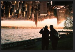
The reason I chose the city image on the top is because it was a nice end of day light hitting the buildings that could match the sunset the bottom image.

I did remove the mountain to place a sky and it looks better.

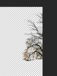
What I'm having trouble with is the tree on the right side. It looks like crap right now.
I have the top part of it selected set as a separate layer (see screenshot). Thant's because it needs to be on the foreground. And the bottom image is actually on the background so that the Empire State Building comes out on top from the other side of the lake...

I'm having an issue to properly mask out the tree and to integrate that separate layer with the rest.
Also behind the tree, the city is actually in the shade so it makes it harder to make it look integrated.

Any tips are welcome.

Screen Shot 2019-02-04 at 17.46.21.jpg

Screen Shot 2019-02-04 at 17.42.35.jpg
 
It looks great what you did.

Is ist correct that the tree is part of the lake image? If so, I would get rid of it. Solves you big problems.

Screenshot+.jpg

Then do the following:
1. Select a part of the lake image (see screenshot), soften the selection 1pix, and copy/paste it on a new layer. Move this square to the right.
Then make duplicate of the layer and move this one to the right again till the tree is covered.
Important:
the first layer (people,lake, sky) must be the bottom layer.
the 2nd and 3rd layer are the squares. (on top of the first layer).
the 4th layer (Sky scrapers) must be on top of the layer stack. It covers up some trees with it buildings.

Finally there are just small tree parts visible you can retouch with the clonestamp tool on each layer.
When you see receptions like a pattern, use the clonestamp tool for these details too.

Regards Chris
 
Last edited:
It looks great what you did.

Is ist correct that the tree is part of the lake image? If so, I would get rid of it. Solves you big problems.

View attachment 95713

Then do the following:
1. Select a part of the lake image (see screenshot), soften the selection 1pix, and copy/paste it on a new layer. Move this square to the right.
Then make duplicate of the layer and move this one to the right again till the tree is covered.
Important:
the first layer (people,lake, sky) must be the bottom layer.
the 2nd and 3rd layer are the squares. (on top of the first layer).
the 4th layer (Sky scrapers) must be on top of the layer stack. It covers up some trees with it buildings.

Finally there are just small tree parts visible you can retouch with the clonestamp tool on each layer.
When you see receptions like a pattern, use the clonestamp tool for these details too.

Regards Chris

Hey Chris,

Thanks for the tips.
Yeah, I know removing the tree makes it easier - it’s the simple way out ;)
But I do like the tree, it makes it interesting, it created more depth, more contrast, etc.

I'll play around with it tomorrow and try the having it in multiply.

Thanks
Alexandre
 

Back
Top