What's new
Photoshop Gurus Forum

Welcome to Photoshop Gurus forum. Register a free account today to become a member! It's completely free. Once signed in, you'll enjoy an ad-free experience and be able to participate on this site by adding your own topics and posts, as well as connect with other members through your own private inbox!

My problem with clean compositions


Foto Schlumpf

New Member
Messages
4
Likes
0
Hello all,

I have some experience with simple compositions. But this simple coposition have some disadvantages, the fell of integration without e.g. covering objects is not easy. I am playing with colors, lights, shadiws, sharpness and contrast but the result is not really good.

Ma composition consists of an abstract background and a model, I am not a fan of Fantasy or a big number of objects and textures.

But here some examples:
museum_of_natural_history_by_lightplutonium-d6tq11b.jpg

last_train_by_lightplutonium-d6tldeo.jpg

autumn_fashion_by_lightplutonium-d6t4nz8.jpg

dancing_by_lightplutonium-d6rirf2.jpg

1450895_673811749305263_429903567_n.jpg

What do you mean? What can I improve to get out a more realistic integration?

Best wishes from cold and rainy Bavaria

Markus
 
Hey Markus, I'm not a huge fan of this type of imagery.

Other than the fourth (4) image from the top, the backgrounds do not share a common interest with the subjects, thereby negating the need for a more realistic integration. They are simply meaningless backdrops for the models. You should try to incorporate a more fitting background for the subject and subject matter. Your technique is very good and your blending is very well done! The colors are a bit too bland, but you may have been going for this type of effect.

Remember, this is only an opinion and not meant to demean your work!
 
Markus, I like all 4 images. They are excellent!

Sam already mentioned that your PS work is very good and I fully agree with him. But I do not agree with him on his comment about the backgrounds. I think you made a good choice there.

The only change I suggest you could do is on the first image. You could darken the BG a bit, to give your composition more depth.
 
Hi Sam and Chris,

thanks for your comments. First, I think a background must not interact with the model, thinks on a red brick wall and a piece of light. You need not more, this can be perfect for a model shot. But I must say that I have the view of a photographer.

The darkness of image one is no problem, I can try it, But do you think that the perspective can be a problem? Or the sharpness of the model edges. You see I am not happy yet, I am missing something but I can't say that it is in detail.
 
I see what you refer to. In both images one and three, the FG, the ground on which the model sits or stands, does not have the same sharpness nor tones. They need some curve or levels adjustments perhaps. Otherwise they do look like backdrops and the models float in front of them, not on the surface.

As for the BGs, they do like like backdrops, painted canvas for example, like old movies or plays. So if you meant them this way, fine. If the model is supposed to be incorporated into a scene with depth, then I agree with Sam.

Your PS skills are good and I do like the imagery even if, like Sam, they are not my favorite kind of work. Still they have a subtle beuaty.

One very small point: the shadow under the toe of the boot in the first image doesn't seem angled quite right. I think it should be angled downward more, further away from the toebox, or it seems to me the light has shifted to push the shadow backwards.

Keep up the good work and the questioning of yourself. And thanks for bringing your images here to share with us!
 
Hi ibclare,

this is a good hint, I think the tones are ok but maybe the sharpness. of ground and model does not match.

Yes, this old movies are in focus,, I will create a series now. The shadow is quick and dirty, this is true. But I think this is not the reason for this inperefect integration look.

The tones are not so easy keep it right, but my feeling is they are ok. Maybe Ic heck it with the pipette again.
 
I think there are shadow problems.

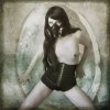
Pic 1 The light source for the model is predominantly from the viewers right yet the gas mask has highlights on both sides, agree with Clare with shadow on shoe being off. Background much brighter than foreground with different light source (above) I think takes away from composition.

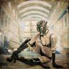
Pic 2 Hot model, wow. Again the light is off. The model imo needs to be back lit to sell the light from the train.

Pic 3 Same again, light source from back yet shadows from right viewer light source.

Pic 4 What's going on with her back?

Pic 5 Shadows seem to have a mind of there own and some are missing.

Overall not bad.
 
besmirched, you bring up more good points.

I think part of the problem is that the shadow and highlight on each model is not manipulated at all. The ladies are just set into a scene in most cases. What might need to be done to have them work in the overall lighting has not been given a lot of attention. If an area is too bright and should be in shadow that can be done. It is one of the things an editing program is used for, especially in making manipulations.

I think the last is a good example of having everything blend and share a color palette and tone. The first one I like because it does almost the opposite and creates an interesting contrast.

The others in between do absolutely nothing for me and like I said seem to just pick a beautiful woman and place her in a setting. Of those three, the lady on the stage is most successful because she has a relationship there. I still think the stage does not work alongside the model in its present state. And the back lighting you mentioned . . . weird. An oversight maybe?
 

Back
Top