Photoshop Gurus Forum
Welcome to Photoshop Gurus forum. Register a free account today to become a member! It's completely free. Once signed in, you'll enjoy an ad-free experience and be able to participate on this site by adding your own topics and posts, as well as connect with other members through your own private inbox!
You are using an out of date browser. It may not display this or other websites correctly.
You should upgrade or use an alternative browser.
You should upgrade or use an alternative browser.
My New B/Card & Logo Design.
- Thread starter Inkz
- Start date
TheSketcher
Well-Known Member
- Messages
- 52
- Likes
- 9
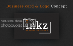
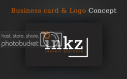
these are nice! i think if you curved the orange shape to make it like a simple flame it would look pretty cool, but out of these two i prefer the first one, it looks better with the smaller orange shape, they are both very elegant though!
Inkz
Guru
- Messages
- 2,358
- Likes
- 1,554
these are nice! i think if you curved the orange shape to make it like a simple flame it would look pretty cool, but out of these two i prefer the first one, it looks better with the smaller orange shape, they are both very elegant though!
Thank you very much for looking in and taking the time to comment.
The orange shape represents an ink drip hence Inkz lol. I should have mentioned that in the topic.
TheSketcher
Well-Known Member
- Messages
- 52
- Likes
- 9
Thank you very much for looking in and taking the time to comment.
The orange shape represents an ink drip hence Inkz lol. I should have mentioned that in the topic.
thanks you, and that makes sense lol, and the pointed side should be at the top then, also with the pointed side down it looks like a location icon/symbol.
which font did you use? just out of curiosity?
sprucemagoo1
Guru
- Messages
- 2,006
- Likes
- 1,187
I like the first one better in terms of the white corners, though that may be because of my ocd I like things to have symmetry. The problem I have with the first one is the alignment in reference to the top most part of dot on the I. It would almost definitely look better if the gap there, was the same as the gap between the word designer and the other corner.
In regards to the dot over the I, with your name being Inkz, it will always make more sense to have it looking like a drop of ink.
So To illustrate this, I hope you don't mind:-
In regards to the dot over the I, with your name being Inkz, it will always make more sense to have it looking like a drop of ink.
So To illustrate this, I hope you don't mind:-
Remote-Medic
Beast RARRR!
- Messages
- 672
- Likes
- 370
Nice, clean designs. Love them 


