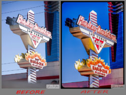
From what I can tell at the small size they were posted, your results look very nice, but to be honest, it's not very difficult to make changes like that these days.
About the only aspect of the final image that I'm not wild about is that the tan, relatively featureless, masonry(?) wall towards the bottom of the frame picked up a strong pink/red cast when you boosted the saturation. IMHO, it's better to have something in a scene be neutral, or almost neutral / weakly saturated. This provides the viewer's eye with a place of color reference, and almost makes the highly saturated colors seem to pop more, whereas if everything is highly saturated, the overall result can look garish and overdone.
I'm going to take a wild guess, but the color adjustment section of Topaz Adjust is very prone to add color where it shouldn't be. By any chance, is that what you used, or did you simply crank up the vibrance in PS?
In any case, post more pix of your area. We would love to see them. If they are not before-after shots, we have a photography section that would be very appropriate.
Best regards
Tom M


