What's new
Photoshop Gurus Forum

Welcome to Photoshop Gurus forum. Register a free account today to become a member! It's completely free. Once signed in, you'll enjoy an ad-free experience and be able to participate on this site by adding your own topics and posts, as well as connect with other members through your own private inbox!

Mirror Street


Eggy

Retired Moderator
Messages
5,313
Likes
5,085
Sitting in a waiting room reading a glossy magazine I saw a picture made in Photoshop (Sepia). I thought to myself, I can do this (In my own version). I could not rip the page because there were other people also waiting.
So I started with these pictures:

nmrzmaom2qw.jpgpoetsvrouw.pngSign-Free-Standing-Slippery-Surfaces-039298.jpgvoer-en-wateremmer-flatback_1500x1500_30097.jpg

This is the result:

Mirror Street.jpg

This was a good exercise in reflections.
Please do comment, this project isn't finished yet.
:rolleyes:
 
Hi Eggy
This is a very interesting concept, and you've done an excellent job to complete this composite. Nice detail to add the street sign.

But my first impression when I saw your image was that it should be a bit darker and with less "HDR Effect".
Then I'm not sure if a mirrored image shouldn't be slightly darker than the original scene.
Another problem are the reflections.
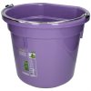
1. The bucket shouldn't show the opening.
2. The mop reflection looks now like a stack of mops.

Again, I really like your work very much, and I hope my honest words are well received.
 
@ Chris.
Thank you for the observations Chris.
At the end of the composition I made a composite snapshot on witch I applied a HDR filter. Looking closely the HDR effect is over it. No problem there, I'll make a new snapshot and do something different with it.
Actually I don't know if a mirrorreflection should be darker then the original. I'll look that up in some other pictures.
The bucketreflection, I'm really ashamed. Can't understand I did not see that mistake.:redface:
The mopreflection is another mistake. It should be a small layer not a fan-like mop.
And do not worry, your observations are always good recieved because well ment.
I'm glad someone points me the flaws in a composition.
 
Like the first one, but the second is waaaaaay better buddy, keep them coming mate.
 
A couple of other thoughts, Eggy ...

First, I have some real problems with the photo of the buildings that everything you did was based on. To start, it's not at all clear what's lighting up the LH building in his photo. There is a sharp shadow half way up the building on the RHS, suggesting that the main light source (...the sun???) is above the building on the LHS, but the visible face of LH building is just about as bright as the RH building. This is much brighter and much warmer than one would expect if it's supposed to be in shadow and receiving most of it's light from the blue sky and reflections off the RH building. IMHO, the LH building was artificially brightened and otherwise processed.

In addition, The mottled lighting on the LH building in that photo is not at all consistent with a wall that is in shadow and presumably is only lit by shadowless blue sky light and shadowless light reflected off of the face of the RH building. Kodak used to call such a lighting situation as "open shade", and it's highly sought after by photographers specifically to avoid such shadowing:
a) http://www.google.com/imgres?imgurl...d=0CCUQMygIMAhqFQoTCMLa-6Df38cCFYOVHgodiGUJyg
b) http://www.dpreview.com/forums/post/17135227

So, my 1st suggestion is that unless you want a fantasy look, you should be careful to use stock / starting images for such exercises that are not as highly processed as this photo obviously was.

I agree with the previous posts that there were some problems with your first posting, but there was one major aspect to it that I thought was actually better than your 2nd image. Specifically, in your first image, I appreciate how you reduced the mottled / shadow look imparted by the photographer when he processed his image.

One final comment: In these images, the street appears to be bathed in warm light, but the girl is much, much cooler, almost blue.

Anyway, just my $0.02 worth of thoughts to consider :-)

Cheers,

Tom M
 
Love the second one, very nicely done Eggy, I agree with Tom Mann about the girl though she looks a little cold in comparison to the rest of the image, can't afford $0.02 worth so it's just $0.01 worth :biglaff:
 
Tom Mann

Thank you Tom for the observations. You are absolutely correct about using stock photo's. In this case, the photo was altered (not by me) to please the eye. The view was not realistic. Just like you're saying, there's no way the LH wall could have been lit the way it is now. The light source is obviously coming from the left upper side of the picture.

light.jpg

So I adjusted the darkness of the LH wall and the reflection and since the added objects in the picture are placed in the shadow of that wall I made them darker and a bit desaturated too.

It was an exercise in reflection (see my first post). I did not looked at any tutorial before I started this one but it was a struggle.
I was looking for a picture with a low street angle easier to reflect.
But I learned, again...
I even found a flaw in the reflection of the LH wall.

bad perspective.jpg

I'll work on that too but for the moment this is my latest update:

Mirror Street 2.jpg

Again, thanks for the comments

And now, time for a good cup of coffee

Kopje koffie met stoom.jpg
 

Back
Top