What's new
Photoshop Gurus Forum

Welcome to Photoshop Gurus forum. Register a free account today to become a member! It's completely free. Once signed in, you'll enjoy an ad-free experience and be able to participate on this site by adding your own topics and posts, as well as connect with other members through your own private inbox!

Matching perceived differences when downscaling


cheyrn

New Member
Messages
4
Likes
0
When I downscale an image enough, the result looks like a different image. I'm not talking about fidelity. I know of the various algorithms that can be selected in photoshop when downscaling, but what is it that makes the image look different?

For example, say you have a 1024x1024 pixel image of a face, when you downscale to 64x64, it no longer looks like a face, it looks like lungs or something. There is a difference between bicubic, nearest neighbor, and bilinear, in terms of fidelity, but what is it that my mind sees that makes the image look different?

If I would manually manipulate pixels (not be selecting an algorithm when changing the image size), what would I do to make the downscaled image be perceived as the same face, but smaller?
 
Hi @cheyrn
Using standard resizing techniques in photoshop I don't seem to have the same issue you descirbe.
Could you attach before and after files. Of you process so we can compare or see what a forum member can do?
Just a suggetion
John Wheeler
 
Hi @cheyrn
Using standard resizing techniques in photoshop I don't seem to have the same issue you descirbe.
Could you attach before and after files. Of you process so we can compare or see what a forum member can do?
Just a suggetion
John Wheeler
I would think that anyone who has ever tried to make an icon or an avatar would have run into this, but I admit it's difficult to describe.
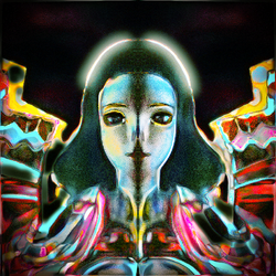
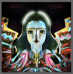
Here is an image which is 1024x1024:
cheyrn-1024x1024-photo-brighter-Enhanced-nosig.png
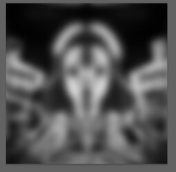
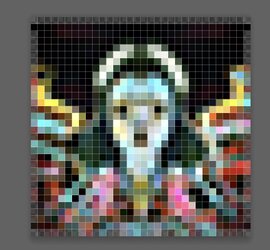
Here it is downscaled to 32x32:
cheyrn-32x32-photo-brighter-Enhanced-nosig.png

It looks different because it's smaller. Right. That's the point. What manipulation needs to be done to the smaller image, at it's smaller size, so that your mind notices: "a face", "eyes", a "halo", instead of some sort of insect wearing a "Scream" mask?
 
This actually beyond my experience so will leave it for another forum member.
My first take however is that you greatly simplifying the starting image may be a better way to go that correct the smaller image.
It is not too hard to predict what it will look like. Going from 1024 pixels to 32 pixels is grouping them in 32x32 pixel groups from the original image.
If you just blur to about 20 pixels - not even 32, you can see how the eye would interpret a much smaller image.
That would be the apporach I would pursue yet I am sure there are others with much more experience
Following is the example image with just a 20 pixel blur and it has the same look as just shrining it down
John Wheeler

Screen Shot 2023-10-08 at 12.47.30 AM.jpg
 
Thanks. Having a preview like that seems useful, even though I don't have any thoughts about what to do. With the example I gave, I tried brightening dimmer color ranges, but didn't come up with anything more recognizable, compared to the original.
 
Here are my thoughts. Your starting image has too much texture, color, lines and shapes to survive shrinking to 64 pixels. All your intricate detail becomes an indistinct muddle and the viewer's eye doesn't know what to look at. I have two ideas for how to simplify the image.

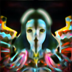
First, there is a filter called Median (found in Filter>Noise>Median). In this filter, you set a number as a pixel radius. The filter then examines all pixels and the neighboring ones within that radius, and averages them. You can look-up this filter to get a better explanation of what it does, but the overall effect is to eliminate detail and retain only the major shapes. I applied this filter with a setting of 10 pixels and got this:

Cheyrn Median Filter.jpg


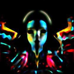
Next, I tried to further simplify the image using a very strong Levels contrast adjustment. I greatly darkened all the midtones and brightened the highlights, which had the effect of putting much more black space into the image. Whatever colors and details survived this extreme contrast adjustment are, theoretically, the most important ones. Here's what I get after doing that:

cheyrn contrast.jpg


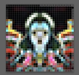
Here's the 64 pixel shrunken version. Not sure if this is what you have in mind, but maybe it will give you some other ideas.


cheyrn 64px.png
 
And here are some more ideas.
I did a basic simplication of the dark areas on the image so the starting point for reduction was this:

Screen Shot 2023-10-08 at 11.21.58 AM.jpg

Then a straight PS reduction to 32 pixel square

Screen Shot 2023-10-08 at 11.20.53 AM.jpg

And then all I did was copy the right side, flip it horizontally and used it for the left side:

Screen Shot 2023-10-08 at 11.21.04 AM.jpg

Sometimes symettry gives the eye/brain combo less to think about.

Just some quick ideas
John Wheeler
 
And here are some more ideas.
I did a basic simplication of the dark areas on the image so the starting point for reduction was this:

View attachment 140213

Then a straight PS reduction to 32 pixel square

View attachment 140214

And then all I did was copy the right side, flip it horizontally and used it for the left side:

View attachment 140215

Sometimes symettry gives the eye/brain combo less to think about.

Just some quick ideas
John Wheeler
Thanks. That adds more options to play with. Median vs blur is interesting. Playing with color balance and contrast is interesting. The original is actually based on blending left and right, so it's almost symmetrical. Keeping symmetry could be important in some cases.

I'm not sure if color brightness or contrast are always the variables. A face might be a different case than other subjects, because facial recognition relates to all sorts of things other than simply pattern recognition.
It would be interesting to characterize what properties of a cloud in the sky lead to it being recognized as a face, a horse, etc.
 

Back
Top