Hi Will - I'm glad you like the result. I will try to answer your questions, but unfortunately, I am not at my PS computer, so I can't see exactly what settings I used, but I'll do my best from memory. ...
- Using the WB eyedropper in ACR. Clicking around the image gives slightly different results. Is there a particular point you're focusing on clicking here, or just the one that starts to make the shot resemble the reference?
Here's where a bit of experience helps.
First, since I knew that I was going to be concerned with the colors of quite bright areas (eg, the wall, the lids on the jars, etc.), I didn't want to run into problems that often occur when RGB values are approaching 255,255,255. There are two ways one can help oneself: Make sure that ACR is set to output (a) 16 bit per channel (b) ProFoto images to Photoshop. So as not to interrupt the flow of this description, I won't go into why this helps, but it does. Also, since the brighter things in the scene (eg, the wall, the lids on the jars, etc.) were my focus, I decided not to brighten the "new" (individual) image until almost the very end of my color correction (CC) / white balance (WB) process. This is because one has more sensitivity to off whites in mid-tones than in highlights or nearly maxed-out areas of the image.
Second, from your description of how you will use the "new" (individual jar) images, it sounded like you were going to crop each reasonably close around the jar, and throw away all the blank wall in the image. So I wasn't distracted by color problems far from the jar, I cropped my one "new" image in this way.
Third, knowing that I needed to have accurate color, even though I have a good monitor (that I regularly calibrate with an external device), I decided not to rely on my monitor or my eyes, but rather, the next thing I did was to confirm numerically that the areas in the reference image that looked close to being pure white, actually were pure white. I did this so that I know I will be adjusting the "new" image to a pure white, not to some other color. To do this, I used the color sampler / readout tool and looked at the numerical values. When the red, green and blue values are all equal (ie, R=G=B), this means no color cast whatsoever - just a pure, colorless shadow, mid-tone, or highlight. Doing this probing was the point at which I discovered that the color balance on the reference image is wonderfully close to perfect except for a bit of a cast in the shadows below the samples, so my goal would be to balance the "new" individual jar image to pure white, not to some slight off-white color cast.
Fourth, with respect to using the WB eyedropper in ACR, I usually click around various points on the image, concentrating on areas that I feel are the most important *representative* areas to me, all the time mentally keeping track of the numerical values of the white balances that it suggests. For example, in this case, I probed things that I wanted to be white that were close to the jar, but only going slightly into the ( less representative) shadow areas.
- I've never encountered Color EFX Pro before, but have acquired a copy today and started to fiddle. With the white neutraliser I was wondering a few different things. Was there a specific colour you picked with the eye dropper? Did the other controls (Adjust Whole Image / Neutralise whites / Shadows / Highlights) play a significant role in your outcome?
The procedure I followed with the eyedropper in CEP's White Neutralizer module was almost exactly the same as what I did with the eyedropper in ACR -- I looked at a lot of areas and picked ones that I felt to be representative of my main color cast problem, ie, brighter areas such as the wall and the rim of the lid. The controls in that module make a huge difference in the success of the process. For example, the "shadow" and "highlight" sliders act differently in different modules of CEP. In this case, I let them stay at their default value of zero. Since I didn't want to take any color out of colored objects in the image, only out of things that were already nearly colorless, I put the "Neutralize Whites" slider quite high, maybe 80% (? - can't remember the exact value), but the "Adjust whole image" slider only around 25 or 30 %.
- You mention the neutrals being close to R=G=B... what exactly does this mean in visual terms? I'm a handcrafter by trade, aspects of Photoshop more related to colour theory and photographer go over my head sometimes. I'd like to learn though!
I already described what R=G=B means in an earlier paragraph, but let me add one comment here. You are doing very color-critical work, so you are exactly right in wanting to learn how to work "by the numbers". Sometimes relying on your eye and a good monitor is the best way to go, whereas in a case like this, working by the numbers is exactly what you should be doing.
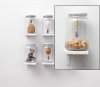
The point about shadowing that you raised; the shadow under the platform is uniform throughout all single shots, but the shadows differ somewhat dependent on the content of the jars. As you suggested, I think I'll dodge / burn correct the shadows to an extent, but they don't have to match the reference completely. The focus of the images is the contents of the jars, and as long as the viewer doesn't instantly distinguish a difference between the single shots and that of the reference I'll be a happy man.
Unfortunately, I can almost guarantee you that the shadow discrepancy is significant enough that many viewers will notice it. I don't think the discrepancy in shadows between the individual jar images and the reference image has much to do with the content of each jar. Rather, I think it is occurring because the person who prepared the reference image somewhat reduced and smoothed out the shadows between the jars to give a nice visual effect. However, this hasn't been done to the individual jar images.
I don't know if you picked up on the suggestion I made in my previous email not to use the conventional dodge and burn tools on a real image layer, but to effectively do the same thing by painting lighter and darker grays on it's own layer set to "soft light" blending mode. There are many reasons to D&B this way in general (just Google the many descriptions of the advantages over the old D&B tools), but for your situation, it's particularly important and could save you a huge amount of time and offer consistency that would be otherwise impossible. Specifically, if the shadowing in the individual jar images is consistent (other than the small contribution of the contents of each jar), doing it this way allows you to simply bring a copy of that layer over each of the individual jar images and immediately get a very good correction with no further work.
If you have any more questions, don't hesitate to ask.
Best regards,
Tom