What's new
Photoshop Gurus Forum

Welcome to Photoshop Gurus forum. Register a free account today to become a member! It's completely free. Once signed in, you'll enjoy an ad-free experience and be able to participate on this site by adding your own topics and posts, as well as connect with other members through your own private inbox!

make something realistic pop up/ out of another


Michael1980

Well-Known Member
Messages
53
Likes
4
Hi again you great people.
I am making this different month style for a calender I will make to my self. the idea is they can be used every year instead of creating 12 new each year.

now im stock with this juli thing.
I want this balloon effect wich different styles on each balloon. for J im trying to make a pop up/ out effect with the beach chair etc. anyone who can help me out there. either by doing it or by telling how to. or is it a bad idea then hit me with something better


thanks a lot
 

Attachments

  • help 1.jpg
    help 1.jpg
    450.1 KB · Views: 1
  • help 2.png
    help 2.png
    1 MB · Views: 1
  • help 3.png
    help 3.png
    334.5 KB · Views: 1
I don't know if this helps, but I added a double drop shadow and some slight shading to the chair.

The shadows were made on their own layers from a selections. I added layer masks to differentiate between the near and farther shadows.
Screen Shot 2017-09-03 at 2.29.52 AM.png
Screen Shot 2017-09-03 at 2.36.53 AM.png

This seems to stand or Pop out a little better.
 
thanks it look great and are definately something i forgot to think about. but I were trying to use the perpective tool to make is seem like it were a structure on the J like i did on the others. only this one should have a pop up effect too. And your work with the shadows is really greate and helps a lot on that, but dont feel im there yet
 
but I were trying to use the perpective tool to make is seem like it were a structure on the J like i did on the others, only this one should have a pop up effect too.
Not sure what your talking about. Do you have an example of the perspective and the "pop up" effect your trying to create? Please explain further.

This is like the others you created.
Screen Shot 2017-09-03 at 11.30.23 AM.png

If you want more of a top perspective, you won't be able to alter this images perspective at all.
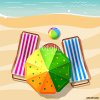
You may need a different image such as:

500_F_86193180_orcocVK4MbrhAgsVlWm6UO7bn2XgDZhs.jpg

stock-photo-red-and-white-deckchair-on-the-beach-top-view-614973449.jpg
 
An effect like this could be called an out of bounds. Note the high perspective of the umbrella.

Screen Shot 2017-09-03 at 12.25.39 PM.png
 
Uhh what did you do to make it look like the others
I just did the same thing you did with the other letters.

I think you missed my question, let me ask again. I'm not not sure what your talking about. Do you have an example of the perspective and the "pop up" effect your trying to create? Please explain further.
 
I will try to make the letter like yours and play around with the image in another layer to see if i can make it work and to show you more accurate what i want.
The idea is to see the balloon like a paper with the beachchair on. Just like a flat 2dimension picture. But then its like it come to live and the top sort of pop up to create a 3d effect
 
I will try to make the letter like yours........
What does this mean? Like mine?

Are you referring to this effect I did here?
Screen Shot 2017-09-03 at 11.30.23 AM.png

I was under the impression that you had made the same effects on the other balloon letters. Was I mistaken?
 
Your link is to an effect called OUT OF BOUNDS.

Please read my post #5 again.

IamSam said:
An effect like this could be called an out of bounds. Note the high perspective of the umbrella.

I did make a comment on that effect as well as providing an example.
 
I know you gave an example and yet it looked good i werent blown total away. It didn't quite show the effect i wanted. Which is a out of bondery or pop up effect. MY images dont support that effect so ill go with what i made and remember your work with shadows etc. Because that improves the result dramatically
 

Back
Top