What's new
Photoshop Gurus Forum

Welcome to Photoshop Gurus forum. Register a free account today to become a member! It's completely free. Once signed in, you'll enjoy an ad-free experience and be able to participate on this site by adding your own topics and posts, as well as connect with other members through your own private inbox!

Logo design help with TEXT!


forum77

New Member
Messages
2
Likes
0
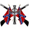
Alright well first off I am new here and a first time user of photoshop CS4. I am trying to create a T shirt logo for a friend and have come up with this so far.
tshirt.jpg

trying to get it to look like this.
IMG_1831.jpg

Can anyone help me out with the text and cleaning up the image and give me a slight idea what I am doing as I am pretty lost and any help would be awesome.

Thanks!
 
the text should be easy, just use Warp text and you can get it to look like that.

The three images combined in what you have so far don't seem to match eek other well. The guns are very pixelated and look like they are from a low res image... try to find some higher resolution guns. The Flags are kind of 3D looking with shadows and light giving them depth, but the cross is very flat.

I would try to get them looking more uniform.
 
Is something like this what you are going for? If it is, I made a work path using the Marque tool and drew a perfect circle, by holding shift while dragging, then went to the layers pallet and clicked on paths, clicked the make path from selection button, double clicked the path to save as a new path. Went to the Horizontal text tool, then clicked on the path to make the text follow the path. Did it once for the top, again for the bottom. The bottom had to be turned so I just double clicked the text layer, held the control key, an an icon comes up the the Ibeam with a little arrow pointing left or right, click there to flip the text around on the path. As far as the text you pick what ever text and effects you like, what I have done probably wouldn't work for a tshirt. That should get you started on the right path. :) As far as the clean up goes......the quality of the rifles with the flags and cross really doesn't mix. You need to images that are more consistent with one another in size and quality. Hope this helps. tshirt1.jpg
 
Ok sounds good. Will give it another try. Thanks! ps if anyone has any time and could do up a better one for me that would be awesome. I am not to sure what I am doing but givin it my best.
 
Is something like this what you are going for?
Nice job Stric9
icon14.gif
 
If i was to design this, i would make the text the non focal point, i would bring the graphics to the foreground and make the text a bit more non focal, if that makes sense lol!!!
 

Back
Top