What's new
Photoshop Gurus Forum

Welcome to Photoshop Gurus forum. Register a free account today to become a member! It's completely free. Once signed in, you'll enjoy an ad-free experience and be able to participate on this site by adding your own topics and posts, as well as connect with other members through your own private inbox!

Logo Concepts | Critique


Inkz

Guru
Messages
2,358
Likes
1,554
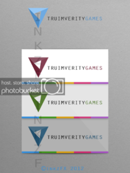
Here are two logo concepts I came up with after working closely with the client.Me and a few friends have been taking on by a gaming company to produce certain graphics for the new upcoming RPG game and for they website.They wanted simplicity but still eye catching. And with that in mind, I think colour scheme plays an important part.logov1pres.pngzx.png
 
Last edited:
The second look real good, I like the colours and the way it just seams to flow, looks really nice. The first is not my style personally but it is well made and the colours work perfect together. I like the way you have used the meaning of the word for the logos.
 
I do prefer the 2nd one the most...

Thanks for looking in and commenting mate. I appreciate it.
 
Inkz,
As usual, if you ask 10 people you will get 10 different answers! I'm partial to the first! It's much more creative and unique. It focuses the viewers attention and, as was stated above, the color harmony is fantastic.

The second is a great design, but for me, it seems more generic or common. I'm not a gamer, so the logo seems removed from from the company name unlike the first which could very well stand on it's own as a memorable identifier for the company.

Thanks for the feedback matey...
 
As with what IAmSam stated, ten different people, ten different opinions. With that said, I'm leaning toward the first graphic in that the colors used contrast and compliment each other. There's also something else about this graphic which may not have been intended. I got the impression that it could also serve as a business card for the company you're contracted to.
 
Call me slow . . .

How many logos are we looking at? The "first" if I'm correct is the first post but looks to me like two logos. The first one appeals to my tendency, as my husband used to say, to "lily gild." But I like it. The next batch just seem lacking, boring, IMO. Although if the stack of 3 is the one logo, then it would be my choic. Even though the fancier one appeals . . . the triangular logo is very cool. Pardon my confusion. BTW, the spelling is different - I think wrong - in the second batch of images.
 
Last edited:
The first two concepts are the fella's I'm looking for critique on....

The other batch are just spin off's as the client preferred the second logo and wanted to see how versatile it is with different background shades and logo colours.
 
I like the second one myself as it portrays a clean and fresh look, i like that.
 
I think it's going to come down to the client's personal preference. You have the right idea offering a choice and since the design has been approved, I'd say that's all you can do (till you get further direction which wouldn't surprise me).
 
It true that color scheme is playing a vital role in design pattern.
I love second one logo design,all designs are good also but 2nd one is more likable for me.
 

Back
Top