CyberNexxus
Member
- Messages
- 17
- Likes
- 2
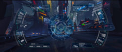
After messing with it for quite some time I finally came up with a draft for my Cyberpunk virtual interface for a retinal implant. It's something else...

I love and hate it simultaneously. Something is bugging me and I would really love some input so if you have a moment to read this post, check it out and contribute I would be very grateful.
First, I feel like the layout of the whole thing just needs some tweaking. I was looking at it and for whatever reason it just kind of reminded me of a PSP Vita. So if anyone has ideas for a better or more sensible layout I'm all ears.
Second, there is quite a bit of unused space around the focal point. Should I add something? Would putting something around the crosshair be unnecessarily cluttering up space?
If you click on the large image don't worry about that stupid little man on that whacked hoverbike in the background, I have a subject to go over the focal point and behind the crosshair to cover him up, but it's a bit racy and I didn't want to offend anyone so I didn't include her.
Overall, I think it's lacking punch and it either needs something more or it needs some tweaking of some kind. I'm just not sure what to do at this point.

