What's new
Photoshop Gurus Forum

Welcome to Photoshop Gurus forum. Register a free account today to become a member! It's completely free. Once signed in, you'll enjoy an ad-free experience and be able to participate on this site by adding your own topics and posts, as well as connect with other members through your own private inbox!

Lamborghini & lava


Redz166

Member
Messages
18
Likes
19
Hey guys this is perhaps one of most recent artworks, it is mostly brush work with small areas of the background taken from various images in the world, i just wanted to make something abit crazy, but super cool too.the vehicle body was created using a combination of the pen tool, and both soft and hard brushes, please do leave feedback on areas i can make improvements.

Thanks a bunch.
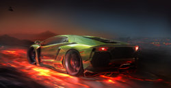
Aventador Redz-2000x.jpg
 
I really like! I'm practicing a lot this kind of lighting and the whole brush mechanics lately.

The only thing I would say, If I was in a nitpicking mood hehe, is that I'm not entirely sure about this source of light from above?
Nonetheless, fantastic work!
 
Thank you Regismathias, i appreciate the feedback, yes initially i didnt have that extra source of light when creating it, but the whole vehicle felt a little flat :/ so added abit of a strange light source.
Thank you again!

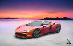
I actually completed another vehicle design today, couldnt edit the last post so il just post it here no point making a new post.
Ferrari SF90 redz-Complete.jpg
 
Both look awesome to me ^^, i can't draw so i can't give too much feedback in this kind of jobs, the only thing a little bit off to me is in the second one, the white line reflection on the side of the car looks a little bit harsh to me, being on the shadow side looks like it shouldn't be any. Maybe being with the sunset right behind it could use a long soft shadow on that side as well.

Cheers!
 
Last edited:
Those are pretty cool. I kinda wonder about lighting too... Mostly on the second one... I feel like it would look even better if we didn't feel such a strong light on the top... to have it more integrated with the background... Sunset looks oversaturated for my own taste, but that's just me... I also feel that Argos is right...that strong white highlight at the bottom feel a bit odd.

Oh and... wouldn't it be nice if the car in the second shot had left tracks in the sand ? :)

All in all... well done. Looks great !
 
Thank you Argos ^^ i appreciate the feedback, you are right the lighting on the near side of the car does not match up, its unfortunately a by product of me trying multiple very differant light angles and then giving up :D then just putting together the background, the aim was to give the overall design a lighter feel to it not heavy on too much shadow but you are right and thank you!

JKemp thank you for the feedback, im going to try to keep all these things in mind on future works, the sun in indeed a little too over saturated i wanted to give it an almost paradise feel to the whole thing, not sure how effective that has been, the white lines on the side where also sadly the result of me changing lighting angles so often it became abit too much as i kept going back and forward brushing the body,
in the future i plan to just stick to 1 main light source ^^ thank you again.
 

Back
Top