What's new
Photoshop Gurus Forum

Welcome to Photoshop Gurus forum. Register a free account today to become a member! It's completely free. Once signed in, you'll enjoy an ad-free experience and be able to participate on this site by adding your own topics and posts, as well as connect with other members through your own private inbox!

Instagram Profile Photo


Status
Not open for further replies.

AuronFF

New Member
Messages
2
Likes
0
Hey guys,

I'm getting crazy out here. hope you can help.

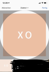
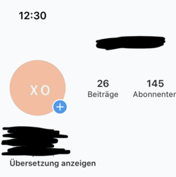
I've read on multiple websites that the best option to make and export an instagram profile pic is 180px x 180px. I did that but no matter what I try (I tried everything from 180px to 1080px), the profile photo is always blurry.

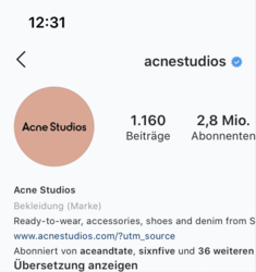
I attached it so you can see. Also I find it weird that when I'm choosing the pic from my library it doesn't seem to fit in the preview window (see pic below). I also attached an example of a popular fashion account that is close to what I'm trying to achieve. Their profile photo is not perfect because of instagram hard filter I know. But I'm not even close to that.

I use the following export options:

180px x 180px - JPEG - Quality 73%

Pls help.Unbenannt-1.JPG2.png3.png4.png
 
Hi AuronFF

It is hard to diagnose since you are not providing the original 180x180 image. Without that origianal, here are some observations
1) How sharp this image looks also has to do with the visual luminosity contrast. The image below is an XO in white and black. The black version looks sharper.
2) The other main issue is that the version you provided has gone through some lossy compression algorithm somewhere in the process which has introduced compression artifacts. That is also a big factor in it looking blurry. We would need to know your exact workflow step by step to debug in further.
Hope this helps
John Wheeler
ADDED EDIT - The image not fitting is either you don't have the right pixel size or did not resize the image properly. I you are using Photoshop, create the starting image the exact size you want and put in a Text Layer with XO. That is all I did below. FYI

2-contrast.png
 
Hi John,

thanks for your answer. I did provide the original 180x180 image in my post. It's the first image. The other ones are just screenshots from instagram. However if the forum's interface somehow compressed my posted image, can you tell me how to post it properly?

to 1)
I understand that, however my profile image is very very blurry compared to other profile pics and making it black just so make it a tiny bit less blurry is not a good option to me.

to 2) "The other main issue is that the version you provided has gone through some lossy compression algorithm" - I know. That's instagram's compression and I'm trying to get around it the best possible way. I just don't know how. Every website online is recommending 180px. Why doesn't it even fit the preview window then?

So this is my process:
1) Open a new file in PS with 180px x 180px, resolution 72, RGB.
2) Choose the color for the background and type XO in white on it.
3) Export via "Export for web" with JPEG Quality to 73% (also a recommendation of the internet, cause people say then instagram won't compress that much)

Hope this helps?

Cheers :)
 
Hi AuronFF
Thanks for pointing out the original image. I had overlooked that.

Instagram is pretty notorious for compressing the profile image. Trying to find the right combination of sizing or compression to best defeat what Instagram is doing on their end is not really a Photoshop issue rather an Instagram issue.

What I can tell you is the visually, the eye detects sharpness by the level of luminosity contrast. Having higher contrast through various approaches will make a difference yet you have to choose which is best for you

- Darker background compared to white letters
- add some edge effects to increase contrast (you can do this with sharpening or Layer Styles such as stroke, outer glow, inner glow with the appropriate settings.

Having higher contrast between background and letter color will help. The issue you face is the same for all Instagram users and I don't think you are doing anything wrong wrong in your creation process that I can tell.

Below is an example of where I added a soft drop shadow behind the upper letters yet not the lower and put this through the instagram process after saving as you did with save for web at 73% (not sure about that magic :) ). It should appear slightly sharper to show my point.

Also, if you look closer, the example you gave from another web sight is higher contrast from letter to background and also has a slight white glow around the letters which enhances the perceived sharpness.

I think that is the limit of my knowledge on this topic and hope this helps
John Wheeler

dropshawdow.jpg
 
Status
Not open for further replies.

Back
Top