Photoshop Gurus Forum
Welcome to Photoshop Gurus forum. Register a free account today to become a member! It's completely free. Once signed in, you'll enjoy an ad-free experience and be able to participate on this site by adding your own topics and posts, as well as connect with other members through your own private inbox!
You are using an out of date browser. It may not display this or other websites correctly.
You should upgrade or use an alternative browser.
You should upgrade or use an alternative browser.
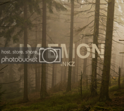
Inkz In The Woods....
- Thread starter Inkz
- Start date
ibclare
Queen Bee
- Messages
- 11,033
- Likes
- 4,638
One possible improvement: Everything in the scene except the text is three dimensional. If the text were made 3D / extruded, I bet the floating in space look would be even more convincing.
Just a thought.
T
I thought the same thing at first, but I now think the contrast of 2 and 3D is better. And the choice to change the FG-BG position of the trees is an artifice I actually appreciate; maybe not if it were a realistic rendition, lol.
I can't say this is one of my favs of your work - I can think of others that fit into my top 10 and more before this one - but I like it nonetheless. IMO, if the inkz were a bit brighter it would be a stronger statement. But that's just me.
Inkz
Guru
- Messages
- 2,358
- Likes
- 1,554
Guy's, as always...
I really appreciate your feedback and comment.
@Tom, nice idea. It may give me an excuse to open C4D and see what can be done.
@Paul. I see what you mean, to be honest, I never looked at the bottom of the trees when making this.
@Aunty C. I do like the contrast between 3d and 2d, makes a more surreal image.
@Sam, as always, thanks and yeah...top 5 lol
Have a go at this yourself guy's. It's a good little exercise if anything.
MikeMc
McGuru
- Messages
- 1,872
- Likes
- 1,202
I agree, Clare, 3d would decrease the visual contrast, but I think that's exactly what I would like -- something more subtle that you have to look at for a while to really see what's going on. Almost a little optical treasure hunt. LOL.
T
My issue (small) IS the letters seem too contrasty, though they really aren't I think the 3D extrusion might be the difference. The Image is so dreamy, soft, and almost surreal and the text detracts from that, rather than giving the message by more "in your face"
I always have this fight with "fonts 'n fotos" I spend far more time with "simple" letters, the photo work seems to fly....until the dreaded TEXT layer is started

