What's new
Photoshop Gurus Forum

Welcome to Photoshop Gurus forum. Register a free account today to become a member! It's completely free. Once signed in, you'll enjoy an ad-free experience and be able to participate on this site by adding your own topics and posts, as well as connect with other members through your own private inbox!

Image degradation when saving for web - png's and jpegs


MiXt Creative

New Member
Messages
3
Likes
1
Hello,

I have been having a HUGE issue with saving images (as I have done for years) and having them come out "soft" especially text. The image is razor sharp in the main file
and when I save it for web (either png or jpeg) it looks terrible. I have tried keeping the dpi at 300 and then just change the pixel size to output it.

Also when I take a screen shot of the image it looks perfect. If I adjust the size even slightly it goes soft.

I have attached to of the outputs but also took a screen shot of the psd file at 50%. You can see the contrast in quality between the two. I have never had this problem
in the past. Am I doing something wrong ...any insight would be greatly appreciated.

Thanks you

600x250.jpg

600x250.png

Screen Shot 2019-03-14 at 9.56.40 AM.png
 
Hi MiXt Creative
There are a variety of possible reasons for this issue. It would be faster to help get root cause if you could post the PSD file and if too big provide a link to that PSD file on a job sharing site.
Also, it would help to know the specific pixel dimensions of the final image which your are trying to create.

Before you provide that here are a few thoughts

- There may be some confusion (yours or mine :) ) about pixel dimensions and ppi. When you talk about "pixel size" are you referring to the pixel dimensions of the image?
- Viewing screen shots can be very misleading. Also, viewing at anything other than 100% magnification can also be misleading as at reduced magnification, the image is rendered and is less accurate
- Sometimes viewing images with Layers (vs a stamped Layer copy) may not view correctly
- In save for web, you get to choose the rendering algorithm for resizing. Which option did you choose.

Having the files for forum members to review will be helpful. I am providing a link below that covers some of the issues in resizing. Your issue may be much simpler than what the article describes so if the info is too much, just skip it and provide the files for members to review and provide more targeted suggestions.
Just a recommendation
John Wheeler
https://www.cambridgeincolour.com/tutorials/image-resize-for-web.htm


Hello,

Thanks for the response. Sorry if I was not clear. Here is a link to the PSD file. https://www.dropbox.com/s/5vs6d7s031r5zgq/Linked in high res.psd?dl=0

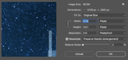
I am attaching a screen shot of the file size and DPI info. What I am trying to do is to make a screen res version. I saved for web at both 30 and 20% size reduction
and in each of the saved files the edges of all of the text are jagged and soft. They are razor sharp in the PSD file. I have tried all other methods of saving the file from
screen exports, Save As, and save for web.

I have attached also the jpgs.

Any insight into this would be greatly appreciated.

Thanks

Screen Shot 2019-03-22 at 9.37.25 AM.png

TEST_1.jpg

TEST_2.jpg
 
Hi MiXt Creative
Took a good look at the PSD and resizing to 30% and 20% size. You may or may not like my answer/suggestions/thoughts
First, The PSD did not contain the Honeywell fonts so Photoshop had to substitute alternate fonts. Also, some of the Layers indicated that they were a Vector Smart Object yet they were rasterized and/or unlinked to the orignal vectors. So wanted to prefaced that my analysis was limited by those factors.

To the first order, the reduced sized images when viewed at 100% looked pretty sharp to me for the pixel dimensions to which you resized. That may be the limit of a lower resolution image. Yet that does not answer why compared to other images you have done.

I will give a variety of things to try related to text below yet first, part of the issue is that the background itself with the random star pattern will give a soft feel to the text. The easiest way to demonstrate a change is to add Layer style to those Layers with a stroke of black. Adjust it so it is not noticeable relative to the background yet provides a higher contract edge to the text. That contrast to the edge of the text helps the eye perceive sharpness.

Here are the other factors that come in to play especially for low resolution images (resize to 20% and the font is sub 6pt
- Choice of font type makes a big difference
- Choice of regular vs Bold
- Font size (or course)
- Choice of anti-alias for the text (e.g. none, sharp, crisp, strong, smooth, etc
- When resizing what rendering option you choose. Reduction are often done with bicubic sharper and will softer with many of the other options

So I suggest that you always view at 100% magnification when comparing sharness, try the Layer Style trick, and plays with some of the text options I mentioned and I bet you will end up with some improvement

Hope this helps
John Wheeler
Hi John,

Thank you for such a detailed response and taking the time to do it. Non of the anti-alias options made a difference. I think this is inherent to the type choices. I have made them bolder which has helped a bit but i am still surprised on how bad the reduced sizes looks. These ar eweb and Social media applications biut we have to make much larger banners and signage which I think should be fine.

Thanks again
 

Back
Top