Photoshop Gurus Forum
Welcome to Photoshop Gurus forum. Register a free account today to become a member! It's completely free. Once signed in, you'll enjoy an ad-free experience and be able to participate on this site by adding your own topics and posts, as well as connect with other members through your own private inbox!
You are using an out of date browser. It may not display this or other websites correctly.
You should upgrade or use an alternative browser.
You should upgrade or use an alternative browser.
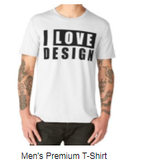
i love design
- Thread starter yasmin
- Start date
-
- Tags
- i love design t shirt
yasmin
Active Member
- Messages
- 39
- Likes
- 32
do you mean it's need to be creative ?It is a simple modern design just like many others...
chrisdesign
Guru
- Messages
- 4,200
- Likes
- 6,197
Print the message like this and you'll sell thousands more.
I LOVE DE$IGN
I LOVE DE$IGN
yasmin
Active Member
- Messages
- 39
- Likes
- 32
Print the message like this and you'll sell thousands more.
I LOVE DE$IGN
can i ask you somthing
why do you think it will be better if i do it as you said ?
yasmin
Active Member
- Messages
- 39
- Likes
- 32
thank you I prefer the simple design tooNice simple clean design.
I think Tee design is personal preference. Based on what I've seen, there are some fairly creative designs out there, but I prefer the simple, easy to read designs.
chrisdesign
Guru
- Messages
- 4,200
- Likes
- 6,197
can i ask you somthing
why do you think it will be better if i do it as you said ?
What I suggest is my personal preference, and maybe wishful thinking.
It's still a simple design, but for the buyer it'll be a signal to the imagination of possibly achiving an exclusive and expensive lifestyle.
inkpad.t
Guru
- Messages
- 1,016
- Likes
- 823
I agree with Chris.... not only that, i think a monetary symbol shows your imagination as a designer on this design even though its a basic design , but for me as a buyer i would be more tempted to buy your T shirt with the symbol , Why?... because i would feel a sense of pride, and achievement wearing it.
Jitendrayadav
Member
- Messages
- 6
- Likes
- 2
Design with words is difficult for wearers to recognize, symbols make such designs much better which attracts users to buy because of creativity. After all It is simple design, and beautiful work done by you.
JazzyScotsman
Banned
- Messages
- 141
- Likes
- 134
As a designer, we are trained to create things that appeal to our consumers on a variety of levels. For instance, take color. Certain colors invoke natural associations to the viewer. Red usually suggests warmth, heat, passion, etc. Blue, is more associated to coolness, water, etc. The use of symbols, or creative typography, in a design also invoke certain associations. Especially very familiar symbols. The dollars sign, for example, takes our mind instantly to thoughts of money, success, promise, and opportunity. Thus, when we see something like a dollar sign appearing in basic text, it implies that there is something profitable here for etiehr the wearer or the viewer.  Thing of it like subliminal messages...little designing tricks that designers use to perk a viewers interest, to get them thinking, and to spark interest. I was alwys taught that the very best designs are the ones that cause you to take a second looks and go, "What? *then the light bulb goes on* Ohhhh! I GET IT!!"
I tend to think slightly differently. Given the two options, I would prefer a T shirt without the $ sign. If I as a generic person were rich, it could mean that I am flaunting. If I were not rich, it could portray elements of greed and betray my love for money. But, I agree with others in saying it is a personal preference.
I like the Tee just the way it is, with emphasis on LOVE to emphasise the degree of liking for design.
I like the Tee just the way it is, with emphasis on LOVE to emphasise the degree of liking for design.

