First of all, I’d like to say thanks in advance for your time. This is my first post in here, so I apologize if I’m asking for help in the wrong section. I’ve been using PS for a few years now, but if I’m being honest, I still feel like I’m always still learning. I wanted to mention that I don’t have Adobe Illustrator. I know that is often recommended when it comes to jobs like this. I hope to learn illustrator at one point, but for now PS is the only one I’m familiar with.
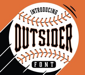
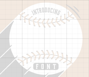
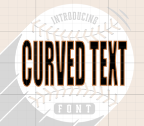
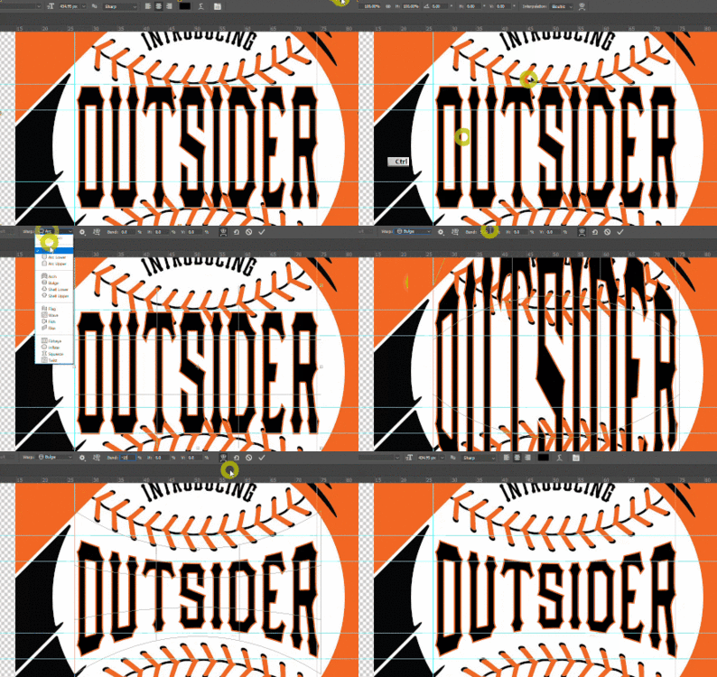
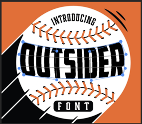
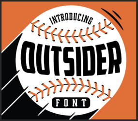
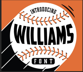
This is why I came here for help. I was asked by my nephew’s little league team if I could help out with their shirts. They knew I had PS, and I have made them a few “easier” designs in the past using PS. They wanted to use this style to make a shirt for each individual player, so where you see the name “outsider” it would instead say the players last name. I have tried going into the text warp option, but I’m not having any success making the names look like the picture.
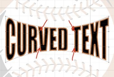
I tried a few days ago, and if I remember correctly, I think I tried the arc or arch feature, curved the top part, saved it as a smart object, then tried to curve the bottom somehow. I instantly knew I was doing it all wrong. The text just looked curved at the top and bottom, but it wasn’t symmetrical to go along the baseball seams. If anyone in here can walk me through some suggestions it would mean the world to me.
