What's new
Photoshop Gurus Forum

Welcome to Photoshop Gurus forum. Register a free account today to become a member! It's completely free. Once signed in, you'll enjoy an ad-free experience and be able to participate on this site by adding your own topics and posts, as well as connect with other members through your own private inbox!
I’m asking for advice


bella_alien

Member
Messages
11
Likes
5
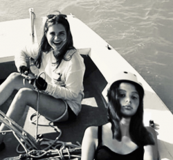
Okay so I took this photo right:
E788151B-45F9-4074-A7F9-13FC083455D7.jpeg
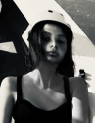
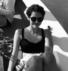
And I swapped the face of the bottom girl with another face and now it looks like this:
40B92A62-8489-429D-A813-AD1DF12CC058.jpeg
How do I make the hair of the girl in the bottom of the second pic look a bit less.. fake? Like how do I add that natural look/effect?
 
Retain:
Good thing about the face you selected is that the lighting and shadows match.
The amount of blur applied on the new face layer is good.

Improvements:
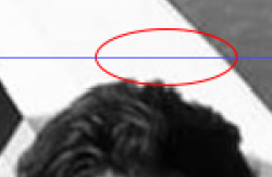
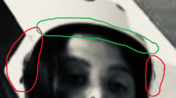
The previous girl's hair still shows where the Red outline markings are. (Sugggest using a new layer on top of the short haired girl's layer and clone stamping the background to eliminate the bleed)
The Green marking shows the head is too oblong without any interfacing between hair and background. By this I mean little tufts of hair getting disheveled and flying out. (Suggest adding a hat / other head covering or make a better selection of the hair)
A1.png
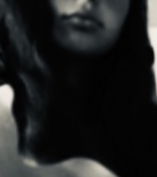
Again, if you see the hair in the clipping below, you see that the hair does not interact with the background layer that much. There is no definition to the hair - where it parts, or how it flows and there is no lighting on the locks of hair, which is why it does not look real. All the hair in the center is devoid of sunlight and highlights. If she is leaning backwards, there should have been more sun light on her hair.
A2.png
 
The Green marking shows the head is too oblong without any interfacing between hair and background. By this I mean little tufts of hair getting disheveled and flying out. (Suggest adding a hat / other head covering or make a better selection of the hair)
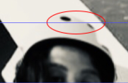
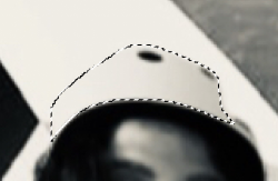
I think she is wearing a hat???? I could be wrong.
There is a faint outline.
Screen Shot 2020-08-12 at 10.46.35 AM.png
Screen Shot 2020-08-12 at 10.49.41 AM.png
Screen Shot 2020-08-12 at 10.49.53 AM.png

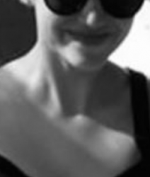
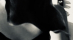
In addition to @polarwoc 's advice, the neck and it's lighting is completely gone.

Screen Shot 2020-08-12 at 9.45.16 AM.png
Screen Shot 2020-08-12 at 9.45.36 AM.png

This is a 2 minute job so it's not perfect! But maybe more like this.
Shaping the hair with the layer mask and adding hair with the Brush Tool.
{Note: the replaced head is too high)
Screen Shot 2020-08-12 at 10.31.50 AM.png
 
Here are my thoughts:
  • You appear to have darkened the original image, trying to match the lighting of the new girl's face. I think it should be the other way around—you should lighten the new girl because (as Polarwoc also says) there is no definition or highlights in her hair. Try using Image>Adjustments>Shadows & Highlights. Move the Shadows Amount slider to the right, maybe to around 50%.
  • The new girl's eyes are facing upward more than the original girl, so her eyes should be a bit higher. But even so, I think you have positioned the new girl's face too high. One tip for positioning the new face is to temporarily reduce the opacity of the new face down to about 60%, so that you can see through it. Then try to match the position of the eyes of the new girl with the eyes of the original.
  • The main problem is the deep shadows under the new girl's neck. Try some layer masking to reveal the original girl's neck, and also to provide some shape to the hair. I tried this last step very quickly (and a bit sloppy on the hair) just to see what it might look like. Still need to lighten the very dark shadow under the chin, but I think you get the idea.

1597248036068.png
 
Hi Bella_alien,
Just to amplify the thoughts about the head being too high, I created a before after GIF of your proposed image that makes that issue stand out a bit more. I find that if you change your head position where the face moves some, it still pivots approximately the ear. Not the case in your image so visually implies a rubber neck capability.
Sometimes switching back and forth from the original image helps determine why it is not so realistic. This can be down with GIF yet more easily just by overlaying the new image over you old image and turn the upper layer visibility on and off. Its usually quite revealing.
Hope this helps
John Wheeler

animation-of-head-swap.gif
 
I think she is wearing a hat???? I could be wrong.
There is a faint outline.
View attachment 114547
View attachment 114548
View attachment 114549

In addition to @polarwoc 's advice, the neck and it's lighting is completely gone.

View attachment 114543
View attachment 114544

This is a 2 minute job so it's not perfect! But maybe more like this.
Shaping the hair with the layer mask and adding hair with the Brush Tool.
{Note: the replaced head is too high)
View attachment 114546


Thanks so much for the help everyone! I took great note of all the tips and corrections and will continue trying to grow in my photoshop/editing skills
 

Back
Top