What's new
Photoshop Gurus Forum

Welcome to Photoshop Gurus forum. Register a free account today to become a member! It's completely free. Once signed in, you'll enjoy an ad-free experience and be able to participate on this site by adding your own topics and posts, as well as connect with other members through your own private inbox!

How to removed specific background tips ?


asahid

Guru
Messages
804
Likes
257
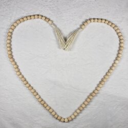
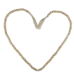
Hi all, I need help, maybe you guys can share some tips, how to remove a background that has a shadow like this,?
Untitled-1.jpg

this original image
20230422_164515.jpg

I know if it's manual I use the pen tool to select, but it's a pain, because it's not just 1 image like this, maybe from Can any of you share tips, to make it easier to select images like this, thanks in advance!
 
Hi @asahid
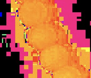
Before I give one type of approach I want to say that the best results would be achieved when you have the image at decent resolution and most importantly without any lossy compression such as with JPEG. As an example, here is the Hue channel that shows how much data is lost (blocked up). This limits some techniques that could otherwise be used and may also may the selection less desirable: The image below is of 3 1/2 beads of the necklace

Screen Shot 2023-04-25 at 12.03.59 AM.JPG


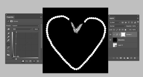
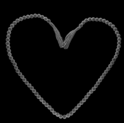
The approach I used was pulling out the Saturation component of the image and using a curves adjustment Layer to make a higher contrast per this screenshot:

Screen Shot 2023-04-24 at 11.57.38 PM.JPG

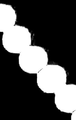
The image below shows a blowup of just a bew beads of the necklace. Note that the result would be a lot crisper if the starting image did not have lossy compression:

Screen Shot 2023-04-24 at 11.58.03 PM.JPG

I hope this gives a one direction to consider.
John Wheeler
 
The approach I used was pulling out the Saturation component of the image and using a curves adjustment Layer to make a higher contrast per this screenshot:

View attachment 136932

The image below shows a blowup of just a bew beads of the necklace. Note that the result would be a lot crisper if the starting image did not have lossy compression:

View attachment 136933

I hope this gives a one direction to consider.
John Wheeler
Thanks John, Looks like this method will work, I'll try it after I'm in front of the PC, will give feedback after that.
 

Many months ago, John once explained how to isolate the saturation component of an image, so I wrote it down in a Word file that I keep that contains instructions for various techniques. Here's how to do it:

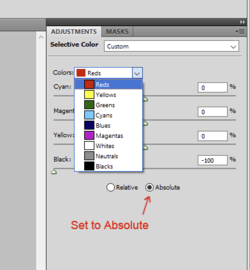
Above the image, open a Selective Color adjustment layer. At the bottom, click the button for "Absolute".

1682438286622.png


Now go into the drop-down for each color channel. For each of the colors Red through Magenta, set the Black slider all the way to the left at negative 100%.
For the last three color channels (White, Neutrals, Blacks), set the Black slider all the way to the right to positive 100%.
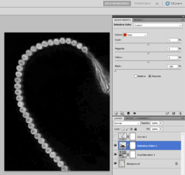
In the resulting image, the darker an area is, the less saturated it is. The brighter it is, the more saturated.

In this particular situation with the beads, John then added a curves adjustment to boost the contrast.
 
Many months ago, John once explained how to isolate the saturation component of an image, so I wrote it down in a Word file that I keep that contains instructions for various techniques. Here's how to do it:
Thanks!! I see so much and work to the point that I forget past posts! Very grateful for the reminder!
 
Hi @asahid , @Rich54 , and @IamSam
I actually do not remember posting the approach you posted @Rich54 yet would not be the first time as I don't do a good job or archiving approaches that I have suggested. Kudos to whomever posted that approach.

For @asahid specific problem I did use a different approach and specifically extracted out the Saturation component as it is based on the Saturation Blend Mode. I will document that below. Not Sure this is the best place to document vs in the General Photoshop forum or the Tutorials forum yet if it is needed to be moved I will leave that to @IamSam

"Selections Using Saturation Blend Mode"

Until I find some application (maybe AI) that makes excellent selections in a wide range of circumstances, I will constantly examine images with an eye for how to separate components that I want to treat differently in post-processing.

There are many techniques, and sometimes I use them in a trial and error approach to see what gives me the best result.

This post is about one of those techniques: the Saturation component of the image. Photoshop uses the term "Saturation" rather loosely. In Photoshop there are several versions of Saturation, such as Saturation in HSB or HSL and Saturation used in the Saturation Blend Mode. My post is about the last version.

Before explanation of the technique, here is some background for reference.

The Adobe Acrobat, online reference document contains equation details for all of the Photoshop Blend modes: https://opensource.adobe.com/dc-acrobat-sdk-docs/standards/pdfstandards/pdf/PDF32000_2008.pdf

All the blend math is on pages: 324-328

Specifically, the Saturation Blend Mode Math is on page 327:

Screen Shot 2023-04-25 at 6.00.38 AM.JPG

The good news, if you want the absolute value of the Saturation Component, the equation is just:

Screen Shot 2023-04-25 at 6.00.50 AM.JPG

For each pixel, it is the minimum value among that pixel's Red, Green, and Blue values.

I found a pretty easy way to use Adjustment Layers to match this function, as shown below. Here is the test image that I will use in the example:
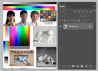
Screen Shot 2023-04-25 at 3.48.09 PM.JPG

-Bottom Layer is the image from which you want to extract Saturation.
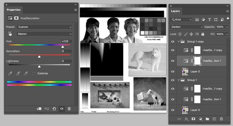
-Add two Hue/Sat Layers directly above with both set to Hue shift of 120 and a blend of Lighten.
- Put these three Layers into a group
- These first three steps create a Grayscale image with the maximum value among the Red, Green, and Blue pixel values.
Shown is an example image below:
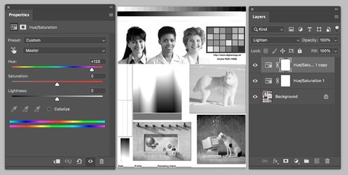
Screen Shot 2023-04-25 at 3.50.05 PM.JPG

- Duplicate this group and change the Blend mode of the duplicated Hue Sat Layers from Lighten to Darken. This group will create the minimum value of the Red, Green, and Blue pixels.
Example below
Screen Shot 2023-04-25 at 3.51.26 PM.JPG

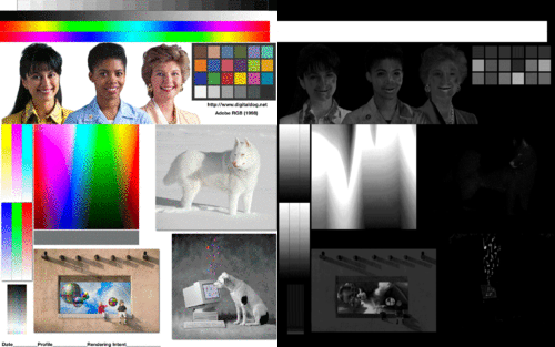
Now all that is left to do is change the Blend mode of the top group to Subtract, which takes the minimum values of this group and subtracts them from the maximum values of the lower group, which results in the Gray level value to the Saturation as defined from the Blend Mode of Saturation:
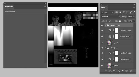
Screen Shot 2023-04-25 at 3.52.12 PM.JPG

From there, I use luminosity adjustment Layers to isolate further the specific desired Saturation areas, e.g., Levels Adjustment, Curves Adjustment, Threshold adjustment, etc.

Here is a GIF that is an animation from the Color image and the Saturation Component of the Saturation Blend Mode (GIFs have limited detail):
Saturation-Animation.gif

I hope you find this helpful.
John Wheeler
 
Hi @asahid , @Rich54 , and @IamSam
I actually do not remember posting the approach. Kudos to whomever posted that approach.

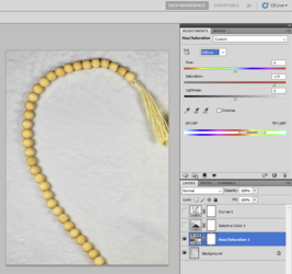
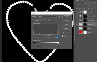
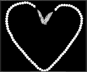
That's funny, because now I don't know where I got it from. Anyway, once I learned (from John original post above) that isolating the saturation was a workable solution to this very difficult selection, I have fine-tuned the approach:

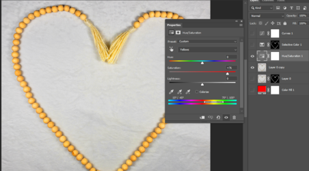
First, I noticed that the beads are yellow-ish. So in order to even further distinguish the saturation of the beads vs. the background, I opened a Hue/Saturation adjustment and greatly increased the saturation of the Yellow channel.

1682474112206.png


Then I added the Selective Color adjustment layer, using the technique I described above:

1682474180203.png


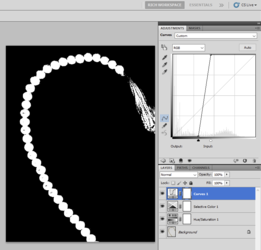
Then I added a curves adjustment at extreme settings to boost the blacks and whites. There's a little manual cleanup required, but this final image would make a very good mask.

1682474295814.png
 
because it's not just 1 image like this,
There have been some absolutely awesome suggestions here! But as JW pointed out in post #2, there's just too many compression artifacts, at least in the sample image you provided, as well as poor resolution. The photo was taken with poor lighting and on a poor background. If the rest of the photos are the same, then you simply have your work cut out for you!

No matter which approach from above you take, you will still have some clean up work to do! Sorry that I don't have the best solution, but sometimes the best solution can be the most challenging!

I know if it's manual I use the pen tool to select, but it's a pain,
Yes it is! But if you want the best possible results, you will need to put in the time with the Pen and Brush Tool. I would certainly increase my fee for such poor photos!

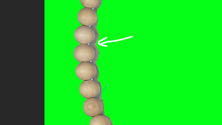
This took me about 10 minutes using only the Brush Tool on a layer mask from the start, no other shortcuts.
Screen Shot 2023-04-26 at 10.23.15 AM.png
Screen Shot 2023-04-26 at 10.22.12 AM.png
 
You all are amazing. I really appreciate it.
Thank you for the knowledge, it's very extraordinary, I have to know more about selective color (relative) I haven't used it at all, it's still confusing for me, because my understanding of English is bad (not the main language) so I have to really can understand it:

The technique I use is,
1. Increase the yellow color on the beads.
Screenshot_1.png
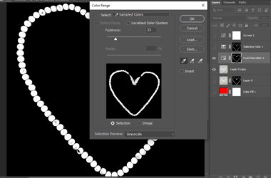
2. Use the color range to select the yellow color.
Screenshot_2.png
3. Increase the contrast on the masking results
Screenshot_3.png

I know these results are not perfect, because of the poor quality of the photos, it still requires manual cleaning, maybe if the process takes too long, it would be better to use manual techniques to select them.
Screenshot_4.png

Note : sorry if my explanation is confusing, I'm not good at explaining things :cry:
 

Back
Top