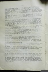
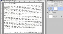
1) Make a copy of the background layer.
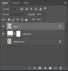
2) Have a White layer underneath it. So, at this stage there should be three layers - Background copy, White, Background - from top to bottom on the layers list.
3) Hide the Background layer. This is how the layers panel should look like.

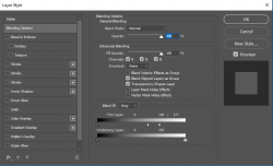
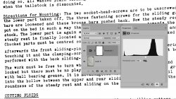
4) Double Click on the top layer (do not double click on the layer name or thumbnail, but beside it), to open Layer styles window. As "Blending Options" is selected by default, look at the "Blend If" options. Ensure "Grey" is selected. We will not need to alter the "Underlying Layer" sliders. Now, move the White slider in "This Layer" towards the center while noticing the Grey colour background in the picture disappear. If you move it too much, the black text will start disappearing too. Find the right balance. I found it at about 164.
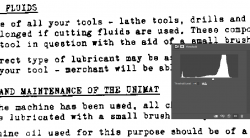
5) Now, while keeping the Alt key pressed, click + drag on the White slider to split it. Move the two halves to suit. This is how my Layer Styles window settings look like:

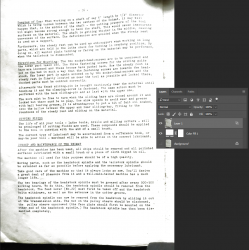
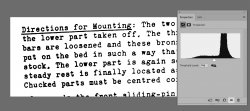
6) Accordingly, here is how my picture looks like:

Note: There is still grey visible, but this is not within the text, so it can be easily erased or masked.
Note: There are several ways of doing this, but I think this is the quickest way.
 .
. .
.
