What's new
Photoshop Gurus Forum

Welcome to Photoshop Gurus forum. Register a free account today to become a member! It's completely free. Once signed in, you'll enjoy an ad-free experience and be able to participate on this site by adding your own topics and posts, as well as connect with other members through your own private inbox!

"How to" on gradients


intcon

Member
Messages
7
Likes
1
Hi guys...question. I'm doing a series of 18 book covers. the customer wants each book cover and spine to be a gradient background, that when placed in a line on a shelf, the spines would also make a gradient. the first 11 she wants red/oranges....next 4 are yellow green...last 3 are crimsons. How is the best way to put this together? I keep thinking i should make the approximate size of 18 spines..then make a gradient that's orange/yellow..then yellow/green...then crimson, then divide it into 18 and make a front cover graphic to match the spine? or am i making it too complicated? if you have an easier/better idea, please let me know.
thanks!

carrie
 
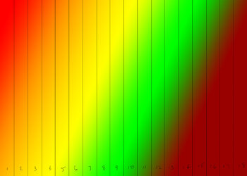
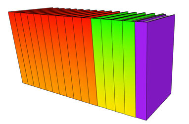
Are you saying that each individual spine needs to be a vertical gradient, and at the same time, the entire series of books forms a horizontal gradient? Is something like this anywhere near what you're thinking?

Gradient Books.jpg
 
yes. damn that's close...but no green until 11'ish, but yes. and yes, somehow that needs to translate to a front/back cover of the same gradient as the spine. damn you did good. that's just what my brain sees...i bet the green could start sooner than 11 like you have here...this is beautiful...i could take the top and bottom of each one, make it a gradient for the front/back cover and that would be it. freaking awesome...
 
I keep thinking i should make the approximate size of 18 spines..then make a gradient that's orange/yellow..then yellow/green...then crimson, then divide it into 18 and make a front cover graphic to match the spine?
I think this is the way to go ahead. Once you divide the thus prepared gradient into 18 parts, label them and have each of them in a different layer. Then, make 18 more layers that suit the matching front covers. Each of the spines are matched to their respective front cover artwork. With all layers off, only make visible the pair you are printing before you print.

You need to be extremely accurate with your prints, because any slip up is likely to make the spine gradient look bad. You might want to take a few mock print outs to do a dry run.

All the best and let us know how it went.
 
thanks everyone, yup, i think this is the way to go....thanks for putting what was in my head into actual art. =) makes me visualize it so much better!
 
yes. damn that's close...but no green until 11'ish, but yes. and yes, somehow that needs to translate to a front/back cover of the same gradient as the spine. damn you did good. that's just what my brain sees...i bet the green could start sooner than 11 like you have here...this is beautiful...i could take the top and bottom of each one, make it a gradient for the front/back cover and that would be it. freaking awesome...

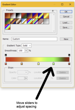
It's hard to get the gradient exactly precise, but there are two basic ways to control, for example, how quickly the green shows up.

First, you can go into the gradient editor and adjust the spacing of the color stops. If the green isn't supposed to appear until book #11, then the green and crimson sliders can be pushed further to the right.

1686239370448.png


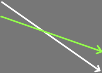
The other thing that controls the appearance is the angle at which you draw the gradient. In my example above, I dragged-out the gradient from left to right following the path of the green arrow below. Changing the direction of that path, either steeper or shallower, will affect how the gradient colors appear.

1686239579001.png
 
Thanks Rich! Much appreciated....one more question, then to match the spine to the front cover, just use the eye dropper to get the colors from the spine and draw it at the same angle?
 
Thanks Rich! Much appreciated....one more question, then to match the spine to the front cover, just use the eye dropper to get the colors from the spine and draw it at the same angle?

Yeah... I've been thinking about that: exactly how will the gradient for each individual spine be extended to wrap around to the front cover? I guess it depends on how you envision the final product to look.

For book #1, the spine has a gradient of only red and yellow. Would you want the front cover of book #1 to also be only red and yellow? Or would the front cover contain the full range of colors: red>orange>yellow>green>crimson ?
 
the front cover would only have the red and yellow gradient. there's a symbol that would be used in the center of each one. and of course title/author's name. sometimes i think i'm overthinking it, lol...and sometimes I'm not thinking enough about how it'll work or if it CAN work. if the books are all different lengths by like a LOT, it would throw off the entire pattern i would think.
for some reason i feel mathematical equations should be involved...lol...like the first book gets 1/18 of the gradient, if the next book is bigger it gets 1/18 PLUS some number. but that makes my head hurt. =)
possibly a better idea would be to have the first group be all the same gradient, then the second group the same, then the third, it wouldn't be as beautiful but maybe more practical. like kabak's version above.
if i had all the books up front i could maybe do it the first way, but they're coming out over the course of a year.
 
I was thinking the same thing. If the spines are all different widths—depending on the number of pages of each volume—then I think it becomes almost impossible to figure out. Kabak's version is much more practical.

This is a good brain teaser, though, so I'll keep thinking about it.

One more question: what is the back cover supposed to look like? Does the back of each book have the gradient, as well?
 
Ok, I came up with an idea that's much easier to implement and—I'm pretty sure—can accommodate spines of varying widths. I made a mock-up for a book with dimensions of 8.5 wide, 12 high, and a one-unit spine. That makes the overall dimension of my Photoshop file as 18 wide x 12 tall. But this will work for any book dimensions.

Starting with just the first eleven books (the Red-Yellow ones):
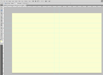
  • Activate the Photoshop Ruler (the menu command is View>Ruler)
  • Make two vertical guidelines, representing the one-inch spine.
  • Make eleven horizontal guidelines, which will aid in the placement of eleven slightly different gradients.
  • At this point you have this:
1686278346898.png


  • Now make eleven gradients, each on its own layer.
  • Set the foreground color to yellow and the background color to red.
  • Activate the gradient tool and select Radial Gradient.
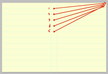
  • Drag-out gradient #1 where the starting point touches the first horizontal guideline and ends in the upper right corner. (see first red arrow)
  • On a new layer, drag-out gradient #2 the same way, but starting at the second guideline.
  • Drag-out gradients 3-11 the same way, each one starting one notch lower than the previous one.
1686279063284.png


  • When the book is opened and laid flat, you can see both the front and back covers as well as the spine.
  • Here is the sequence of the eleven individual books, where the center point of the gradient steps down one notch for each book.

1686279388709.png
1686279566425.png
1686279584809.png
1686279602104.png
1686279619527.png
1686279636873.png
1686279652760.png
1686279671979.png
1686279686921.png
1686279707673.png
1686279722259.png


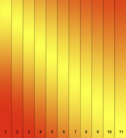
If I now isolate just the spines of these eleven covers as if they're all sitting on a bookshelf, it looks like this.
The radial gradient should be flexible enough so that there will be no discernable "errors" if the spines are of different widths.

1686279825780.png


Once you've gotten this far, repeat the entire process for the next set of books that need to be different colors.
 
holy cow that's fantabulous! i'll have to read through it like a dozen times but i think you've cracked it! and it looks great! I've tried it various wys with linear, but radial never crossed my mind. brilliant job. thank you SO much. can't wait to try it out!!! thank you thank you!!! great job!
 

Back
Top