What's new
Photoshop Gurus Forum

Welcome to Photoshop Gurus forum. Register a free account today to become a member! It's completely free. Once signed in, you'll enjoy an ad-free experience and be able to participate on this site by adding your own topics and posts, as well as connect with other members through your own private inbox!

How to make text look like it has been painted on a street sign/slight 3rd


mashoid

New Member
Messages
2
Likes
0
I am a photoshop newbie.
I want to put text on a street sign so it looks painted. The effect makes the text look slightly raised like it is painted on.

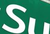
This is an example I found in a jpg of how I want it to look but I don't know how to give it that effect in photoshop. It has a slight 3D effect with the slight shadow on the left and the bottom of the text letters looking like it is painted on.
_text raised.png
 

Attachments

  • _text raised.png
    _text raised.png
    87.3 KB · Views: 36
If you type the text that you want to alter. You can achieve the above by doing the following.

1) Use the Free Transform tool to get the desired angle of text. (select the layer then press CTRL T for free Transform)

2) Double click on the layer to bring up the layer fx window. You will need to experiment with it to get exactly what you want, but play with drop shadow & a very low setting on Bevel & Emboss.

That should get what you want.
 
It often helps to change the blend mode to multiply or hard light and adjust the opacity if necessary. This makes it sink into the street a bit better and mold with bends, imperfections, rocks, etc. If your street is perfectly smooth or cartoon, just follow the steps SPWA outlines. If your street is more textured, like cobbles or bricks, etc., try making a displacement map to get the letters to warp individually around the shadows and highlights in the street surface. Of course, follow the steps from SPWA first.

If you have never used filter>distort>displace, come back for an explanation. It is a process, a few steps and some experimentation beyond default settings occasionally, but actually quite easy once you've tried it.
 
Thanks for the help. it was simple enough. Choosing a font was the most difficult choice.

I added a drop shadow of distance 5 px size 3 px
Inner bevel of 5% so the text doesn't look so white.
Outer bevel 1% Chizel soft
 
I can understand the confusion. I don't know about your monitor, but when I click on the New Posts link in the top left corner of my 1680x1050 monitor, the subject reads as How to make text look like it has been painted on a street instead of How to make text look like it has been painted on a street sign/slight 3rd. The forum software cuts off the part that reads sign/slight 3rd, so there seems to be nothing wrong with your eyes Clare. :)
 
Yeah, does on mine too so I let my first impression guide me. Still, focusing on the text of the post, is pretty direct, lol. It's Aunty Clare btw, Ye Olde Aunty Clare!
 
● added text
● made a selection of the text
● filled it with black
● placed it underneath white text
● moved it slightly left/down
● slight blur
● slight opacity
● added a slight bevel & emboss with minimal settings, just to get a slight rounding effect on the white text near the shadows

View attachment 38328


As always a image says it a million times better, along with correct and defined text content.:thumbsup:
 
That is some good advice for me to remember or better yet write it down. :)
 

Back
Top