What's new
Photoshop Gurus Forum

Welcome to Photoshop Gurus forum. Register a free account today to become a member! It's completely free. Once signed in, you'll enjoy an ad-free experience and be able to participate on this site by adding your own topics and posts, as well as connect with other members through your own private inbox!

how to improve this composite?


Sura

Member
Messages
15
Likes
4
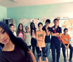
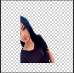
Hello, i'm creating different strange exercise to push myself and sometimes i get stuck in the last 10%. I want to blend this two layers even if the hair selection is not perfect. I'm studying how to improve selection using channels and it will take time, meanwhile i want to improve in changing lighting and things like that to blend two pictures because this tecniques make two pictures look realisitc even if selection is not perfect.

I used curves for the upper layers because i toghout that working on the kids layer would be more complex, i decreased ble and green with curves because the background layer is more yellowish.

Please check what i did if you have time so you can tell what are my limitis, it looks i'm improving faster in selecting and slower in blending!

thank you!
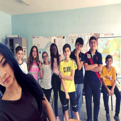
workonprogressKIDS.jpg
 

Attachments

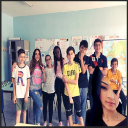
I took a look at the file and I don't know if it is your intention to squeeze the whole background vertically.
Even the girl in the foreground is squeezed and that doesn't look very natural...The fact that she is tilted makes it worse.
But a composite choice is personal...
I can't tell you what you want for the background colors, that's personal.
The same goes for the foreground picture. You decide.
In the next picture I restored somewhat the natural sizes.
The 'cut out' of the girl in the foreground needs more work. Hair is difficult to tackle.

Untitled-1.jpg
 
Last edited:
Hello and welcome. Thanks for posting, this shows that you have the desire to learn.

You've done a pretty good job but if your asking opinions on what or how to improve, then I might share some with you.

As Eggy stated, the first thing I notice is that the aspect ratio is off..........not sure if that was on purpose or not. I see that your image is very small 509 x 510. With the aspect being off and the size, I would guess that your trying to meet size requirements of some website.

I suggest that you always work on the largest images possible since they can be sized down. When resizing, always keep your height and width linked in order to maintain the proper aspect.

The next thing I noticed was something that Eggy mentioned as well and that is the girl that you were adding is turned sideways. In your layers panel the image of the girl has been destructively edited. We can't straighten her up. You should always use layer masks and never destroy the image.
Screen Shot 2018-06-30 at 12.39.48 AM.png

The next thing I noticed was that the lighting of the guys in the background is different than that of the girl you tried t add. The stronger BG lighting is coming from our right and the subtle lighting on the girl is coming from our left.

The selection of the girl is pretty good. As you pointed out, you might benefit using different techniques. The hair could be better and you have some leftover color matting. Provided but not limited to the use of a layer mask, you can use the "decontaminate colors" setting on the output of select and mask. You can also use "Defringe" under
LAYER > MATTING
Screen Shot 2018-06-30 at 12.55.38 AM.png

The adjustment layers that you used to adjust the girls colors are well on track. You did fairly well with this but it still needs a bit more. She needs to have the highlights on the lighter side of her face enhanced to match that of the guys in the BG.

When blending, layer masks will help tremendously. I also like using the Blur Tool for hard edges.

This background image was really not a good candidate for adding the girl. As for the girls lighting, you could have just reversed her and put her on the right side. You could have darkened her hair on the left and it would have been more consistent with the BG.
Screen Shot 2018-06-30 at 1.10.43 AM.png

Keep up the great work!
 

Back
Top