What's new
Photoshop Gurus Forum

Welcome to Photoshop Gurus forum. Register a free account today to become a member! It's completely free. Once signed in, you'll enjoy an ad-free experience and be able to participate on this site by adding your own topics and posts, as well as connect with other members through your own private inbox!

How to get this effect. please help


Bartekunited

New Member
Messages
4
Likes
0
z11178407O.jpg
Burberry-AW-09-10-HQ-emma-watson-7684320-1420-1024.jpg
emma-watson-burberry-095614_L.jpg

This is some photos from burberry campaign. Can you help me to get this kind of dark photo effect? This pictures looks so proffesional but I think they have some photoshop effects.
 
FWIW, if I had to give a number, good solid photography and lighting technique outweighs Photoshop technique by at least 10 to 1 in all of these images. Yeah, you can approximate almost anything in PS, but one can almost always tell if the 'shopping was done to fix lighting and other errors / inadequacies - it's never as good as "the real thing".

For example, most of the background is obviously blown to full white in all of these images (ie, intentionally overexposed) without veiling lens flare (look it up), or off-color light from the surroundings reflecting on objects in back and to the sides of the photographer and making the foreground either lose contrast, color balance, black point, etc. To do this, they either shot from inside a tunnel / mine-shaft / archway / hall / etc. looking out, and/or used lots of "flags" (Google "flags, lighting, photography") in back and to the sides of the camera.

Tom M
 
Last edited:
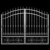
PS - In principle, someone could have composited three (or more) layers to come up with something that looks fairly close to this image. The three layers I'm thinking of are: (1) the overexposed background; (2) the iron gate(s); (3) the subject.

However, my gut feeling is that as I said earlier, this was most likely done in-camera.

T
 
Just for yucks, I tried to quickly find some stock images that I could use to put together a composite like I mentioned in the preceding post. The problem was that in a reasonable amount of time, for a little demo like this (ie, under a few minutes), I couldn't find any stock images that I considered really appropriate.

The following are about the best I could come up with without wasting too much time on this demo.

stock_bldgs.jpg stock-gate-200px_wide.jpg stock-man-200px_wide.jpg

In spite of this handicap, I tried to forge ahead and make a quick composite (see attached). As you can see, it's far from convincing. A lot of this is probably just me rushing through the process, but this supports my contention that the photo referred to by the OP was probably done mostly in-camera, not by compositing in post.

It would be interesting to see what someone who is really good at compositing (and there are many people on this forum in that category) would come up with.

Cheers,

Tom
 

Attachments

  • composite-acr-ps02a-01_sRGB_690px_wide.jpg
    composite-acr-ps02a-01_sRGB_690px_wide.jpg
    240.2 KB · Views: 38
To me.. these are excellent shots and as Tom Mann mentioned could be a result of a number of shots... HDR .. where you shoot 3 or more images with different exposures (negative, 0 , positive) and them merge them in PS as a HDR to get such result..
 
Hi Chitkaran - I'm sorry, but if there is one thing I'm sure of, it's that none of the example shots posted by the OP were done using HDR techniques -- neither exposure fusion / blending nor any of the tone mapping / local contrast techniques (including adaptive).

The reason is simple: the whole purpose of HDR is to tame a large brightness range by converting it to a much more limited range so that one can see detail everywhere from the deepest shadows to what would otherwise be blown highlights.

However, in the pix that were given as examples, their "look" derives from the existence of deep, dark shadows all the way to blown highlights (in the background).

T
 
Last edited:
Chitkaran, for comparison, if my composite shot was real, and it had been taken using HDR techniques, it probably would have turned out looking something like the attached. Compared to the earlier version, note the greatly reduced global contrast, but the greatly increased local contrast in this version.

Tom

(Disclamer: there are many different HDR looks. This is only one possibility).
 

Attachments

  • composite-tjm11_HDR_sim-acr-ps02a_flattened_sRGB-01_600px_wide - Copy.jpg
    composite-tjm11_HDR_sim-acr-ps02a_flattened_sRGB-01_600px_wide - Copy.jpg
    282.6 KB · Views: 28
Re: Emma & the Klingons, ain't that the truth!

BTW check out her waist in the first image -- it redefines "wasp waisted".

T
 
Although in in the examples given, the high contrast and the nearly monochrome background was almost certainly obtained by good lighting and very careful selection of the location, framing the shot, choice of time of day and weather, etc., for ordinary mortals who don't have the time and/or access to the necessary lighting equipment, one can use post processing techniques to approximate that look even if you have to start with a more casually snapped photo.

For example, I started with this photo ...

desat_to_brown-bleach_bypass.jpg

and then performed the following steps:

a) made masks to select the model, and a separate mask to select just the model's head;

b) saved the model's head to its own layer at the top of the stack;

c) fully desaturated the background;

d) used the "bleach bypass" technique on the clothing to bring more visual attention to it;

e) adjusted the brightness and contrast of the background to taste.

f) For yucks, changed the model's jacket from the dull olive drab color to a brown, a bit closer to the garments in some of the examples provided.


BTW, to speed up the production of this demo, instead of using Photoshop's native tools to do a "bleach bypass" effect (many on-line tutorials available), I used the similarly named tool from NIK Color Efx Pro's set.

The result was:

desat_to_brown-bleach_bypass-acr-ps02a_sRGB_8bpc-04.jpg

This certainly is not identical to the look in examples provided by the OP, but at least it's sorta-kinda moving the image in the right direction.

HTH,

Tom

PS - Pls. ignore the lousy masking job around the model's hair. I didn't feel like spending time to refine it as this is a demo of colors and tonalities, not masking.
 
Last edited:
I couldn't resist one final touch, curves, to better match the dark look of the clothing in some of the examples.

T

desat_to_brown-bleach_bypass-acr-ps02a_sRGB_8bpc-08.jpg
 

Back
Top