What's new
Photoshop Gurus Forum

Welcome to Photoshop Gurus forum. Register a free account today to become a member! It's completely free. Once signed in, you'll enjoy an ad-free experience and be able to participate on this site by adding your own topics and posts, as well as connect with other members through your own private inbox!

How to erase errant text stroke


whdesign

New Member
Messages
3
Likes
0
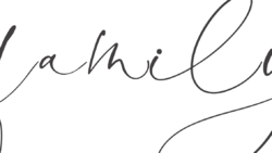
Hi all, fairly new to PS here but I'm doing my best to learn as my wife and I run a home decor shop and one of our new products involves a bit of PS work. Here's an problem we've run into that I haven't figured out how to best solve. We have a high-detail print we want to do but the font we've purchased doesn't connect well in a particular instance. Where two letters connect there's an errant stroke that we need to delete without leaving a noticeable area in the print. Here are pics of the problem area.


If we change the tracking of this particular word we get a worse problem.


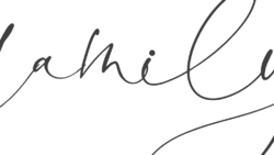
Same deal if we change the tracking in the opposite direction.


I've tried selecting and deleting this area, but I'm afraid I'm not terribly experienced here. I'm not sure which tool is best suited for this.


Here's the best I was able to do. As you can see, there is a noticeable change in the outline, which I worry will show up in this high-detail print.


Sorry for the multiple links. If it's better for me to simply attach the images let me know as I am new to this forum and am not sure which is preferred. Thanks in advance!

Mod edit - please upload all images to the forum, thanks.
 
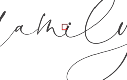
Okay, I've uploaded the pics. Basically, see ps_box.png to see the stroke I'm looking to delete. See ps_closeup.png to see my attempt, where you'll see detail that might not print well. Thanks in advance for any suggestions for the best way to approach this. :)

ps_stretched.png

ps_cramped.png

ps_stroke.png

ps_box.png

ps_closeup.png
 
I will assume that you wanted a font that exactly touched with no underlap and no overlap between the characters.
Just as a side note, if that really was not critical, it might look fine the way it is which is the simplest yet will go ahead and give you another choice.
Do note that the way your font was designed, you are likely to see this issue depending on font size, if you put the text on a curve or if the the text is transformed in any way (e.g. rotation etc)
So if you are going to be redoing the text often in various ways, you are setting yourself up for a lot of touchup work which should be considered. If you are making just a couple documents and have to do the touchup once, then the following approach is reasonable.

I will assume that the issue is on one Text Layer yet you can duplicate the process if it is on multiple Layers.
This approach also means you need to learn about how to manipulate paths and associated tools with paths.

Once you have finalized the text with spelling checks etc, convert the Text into a Shape Layer. If you right click on the right side of the Text Layer in the Layers Panel that is one of the options in the dropdown that appears

You now have all individual letters turned into shapes.

Using the Path Selection Tool you can select an individuals Text Shape and using the Direct Selection Tool you can select any particular anchor point on the Shape boundary. Those anchor points can be deleted or moved to get rid of the extra part hanging out.

If you use this approach, you will keep the clean crisp edges you desire.

I am including a link here to text and video on how to do these Shape modifications.
Best of skill on your project.
John Wheeler

https://helpx.adobe.com/photoshop/using/modify-shapes.html
 
Super helpful, thanks so much John! We don't use this font a ton, and generally don't run into this kind of problem so it's not a common issue. It's probably not noticeable for most clients, but we make and sell home decor items that our buyers are going to see every day so we're pretty particular. I'll def check out the video and give it a shot, thanks again.
 

Back
Top