What's new
Photoshop Gurus Forum

Welcome to Photoshop Gurus forum. Register a free account today to become a member! It's completely free. Once signed in, you'll enjoy an ad-free experience and be able to participate on this site by adding your own topics and posts, as well as connect with other members through your own private inbox!

How to do this in photoshop? (color correction)


Tom11

Member
Messages
10
Likes
1
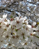
I found this image on Wikipedia under 'Image Enhancement'

Example_of_color_correction_in_photoshop.jpg

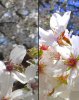
I wonder what method (or methods?) were used to do this?

I have tried saturation, vibrance, contrast, levels, but no matter what I try, I just can't get it as good as they did. For example, their (white) petals look much better (softer and natural/colorful) than mine. Mine have an odd tint to them. Also, their flowers are much more vibrant than mine without spoiling other areas of the photo.

How do you guys think it was done? Do you think they just used a single option, or do you think they spent a lot of time and many options to get it to that degree?

Thanks for your help.
 
EDIT: Also, in the bottom right, where you see the flowers far away, you can see it has a mild pink tint. How to get that without tinting everything else (without manually selecting that area?)
 
TBH, I prefer the wiki one. Yours has too much contrast, and you've lost all the colors in the white petals. Also their sky is more vibrant.
 
The original was probably Tweaked at 300 dpi or more you're taking a 72 dpi and tweaking it The results are not going to be as good or the same
 
TBH, I prefer the wiki one. Yours has too much contrast, and you've lost all the colors in the white petals. Also their sky is more vibrant.

See, to me mine looks 100x better than theirs. I intentionally took most of the color out of the bottom petals to give a cleaner and more eye catching look, as well as added depth to the photo. In fact, with their photo they tried to sharpen it too much and it just distorts when I saw it at full resolution. BUT, to each's own.

My petals are also softer >:)
 
Last edited:
TBH, I prefer the wiki one. Yours has too much contrast, and you've lost all the colors in the white petals. Also their sky is more vibrant.


The beauty of PS...that can be tweaked. But is sure is close...A NIK filter pack will change that.
 
Speaking of Nik...Color 4 , Contrast Color Change/Magenta with brightness increased..1 minute topsView attachment 31686
The beauty of PS...that can be tweaked. But is sure is close...A NIK filter pack will change that.
 

Attachments

  • Color correction example.png
    Color correction example.png
    442.7 KB · Views: 38
Last edited:
I'm with BC. I like his more than the example given. In particular, one of the things I like is that he lifted the shadows on the leaves.

Take a close look at the full rez version: I hardly would deem their attempt a good enhancement. For example, look at the noise they brought out, look at the blown highlights, etc. (see attached).

If I was going to tweak this image, my changes would probably be even more subtle than BC's.

Tom M
 

Attachments

  • Example_of_color_correction_in_photoshop-tjm01_crop.jpg
    Example_of_color_correction_in_photoshop-tjm01_crop.jpg
    211.2 KB · Views: 2
I agree that they over sharpened it and burned the lighting a bit, but the purpose of this thread was to discus the color enhancement.

So, no one knows how they did it?
 
(sorry can't find edit button)

See, to me mine looks 100x better than theirs. I intentionally took most of the color out of the bottom petals to give a cleaner and more eye catching look, as well as added depth to the photo. In fact, with their photo they tried to sharpen it too much and it just distorts when I saw it at full resolution. BUT, to each's own.

To me, yours looks like a high quality post-photoshop photo. Theirs looks like a high quality photo taken straight from the camera (to some degree anyway).

Maybe for a magazine cover or something yours could be good, but if say it was a video, I would prefer theirs.
 
I agree that they over sharpened it and burned the lighting a bit, but the purpose of this thread was to discus the color enhancement.

So, no one knows how they did it?

Thought ALB68 posted this....


"Speaking of Nik...Color 4 , Contrast Color Change/Magenta with brightness increased..1 minute topsAttachment 31686"
 
Here is how I did mine. 5 minute touch up. If it was for a client, I would definitely take my time with it and perfect it, but this was just to show you how to get a similar effect.


Screenshot-(3).jpg
 
Well it's hard to know how anybody did something in PS, there are a bunch of ways to do the same thing.
This example isn't perfect but it can give you an idea where to start.
The next steps could be a white point adjustment, boost the green, and increase contrast or sharpness whatever looks best.

You can check out the "Vibrance and Saturation" and "Selective Colors" adjustments I made.

Exactly how this guy did it is impossible to tell.
 

Attachments

Steve, thanks very much for that. I have never used/noticed 'selective color' before. I have a feeling this is exactly the very feature I was missing/looking for.

Pretty much all of my previous problems/questions can be solved with this. :)

(Before I would actually do a manual selection of an object or color and then perform certain things - so SC is much quicker.)

I had a feeling there must have been a simple way to do something like this.


Thanks again.
 
Last edited:
Thats why I love the Gurus!......Never saw "selective color" before time to play !
 
Doesn't look like this made it before. I upgraded it a bit but it was processed using Nik filters, plus tweaked it with Nik Vieza 2 and PS.
Color correction example.png
 

Back
Top