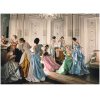
This is a photo by Cecil Beaton that appeared in Vogue Magazine in 1948. It's currently being used in advertisements for a fashion exhibition at the Metropolitan Museum in New York. I'm trying to put my finger on what specifically gives this image it's interesting, painterly quality. I think I see that the dresses are high-contrast and saturated, whereas the skin tones are the opposite. The white walls also appear to be somewhat desaturated, which make the clothes pop. Is there anything else going on here that I'm not seeing? What kinds of Photoshop adjustments would give a normal photo this kind of appearance?
Also, how in the world was this done back in 1948, when Photoshop ran on wood-burning computers?
P.S.
I hope I'm not violating any copyright rules by posting the photo here. Apologies if I am.

Also, how in the world was this done back in 1948, when Photoshop ran on wood-burning computers?
P.S.
I hope I'm not violating any copyright rules by posting the photo here. Apologies if I am.


