Hi all,
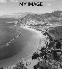
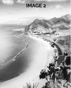
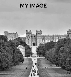
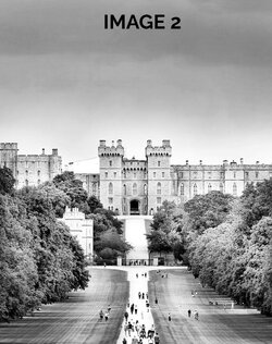
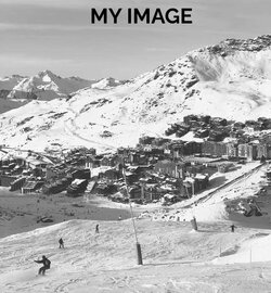
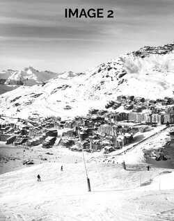
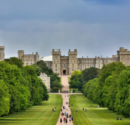
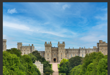
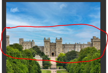
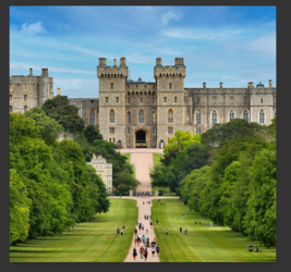
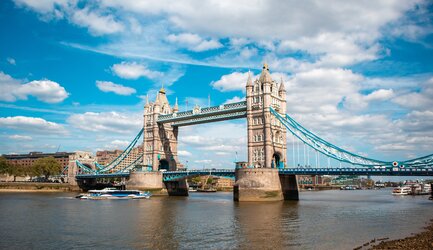
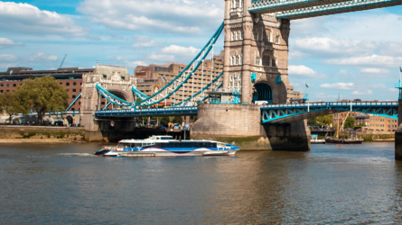
I am trying to make some posters for my apartment, downloaded some images from unsplash and now trying to edit them to make them pop. I found the same images, edited, on another forum (but they are low res) and now I am wondering how they achieved the "dramatic" effect that really makes them stand out?
I converted images to black and white, and played with saturation, brightness and some photo filters, but can't achieve anywhere similar results.
What do you think the person used to turn the images the way they did? Are there any tutorials you can point me to?
Thank you so much for your help
