What's new
Photoshop Gurus Forum

Welcome to Photoshop Gurus forum. Register a free account today to become a member! It's completely free. Once signed in, you'll enjoy an ad-free experience and be able to participate on this site by adding your own topics and posts, as well as connect with other members through your own private inbox!

How to achieve 3D cut out from text effect with shadow


jonahky

New Member
Messages
2
Likes
0
Hi folks

I was wondering if I can get some advise on how to achieve this attached effect:

a.) Text over photo - I can get this done quite easily.

Would be good to get some steps to get the

b.) Font over photo to appear to have some thickness

c.) How to achieve the "peeled off" effect font, shown peeling downwards like 3D

Thanks

Capture_3d text.JPG
 
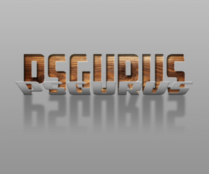
I briefly played with this and put more of a graphic spin on it with some perspective (too much actually) giving a more realistic lean to the letters.......................still not the same as the example. May need to try a similar font to example. A work in progress!

I'll work on something more like the sample image and offer some instruction if I figure it out.

Screen Shot 2024-03-24 at 1.12.13 AM.png
 
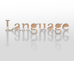
OK.....I have gotten this far. This was actually a slight challenge.

@jonahky , you stated above that you can get the text over photo quite easily, can you post what you have so far?

You did not ask about the shadow in your description, so I will assume you know how to do that.

Adding depth to the font "cutout" was only a matter of adding a drop shadow to the cutout layer.
The Gradient Overlay is for adding depth to the back and foregrounds.

Screen Shot 2024-03-24 at 1.02.14 PM.png

Screen Shot 2024-03-24 at 12.56.58 PM.png

Not sure if this is the same as the sample image, but it's close. Waiting to hear from @jonahky !
Screen Shot 2024-03-24 at 1.20.33 PM.png
 
@IamSam,
I'm wondering about your reflection, specifically how it treats the two letter g's, which hang down below the other letters. It seems to me that a reflection implies that there is a surface upon which the reflection is projected. Most of the time, that surface would be a flat plane such as a lake or table top, in which case it's hard to imagine a situation where the reflection of some letters starts at a different "height" than the reflection of the adjacent letters.

In the image here, the dancers have one foot on the ground and one foot raised in the air. It seems to me that the two g's are analogous to the "foot on the ground". Therefore, all the other letters would have a gap in the reflection, like on the right.

This is a tricky one and I could probably be talked out of my position.

1711305046591.png
 
@IamSam,
I'm wondering about your reflection, specifically how it treats the two letter g's, which hang down below the other letters. It seems to me that a reflection implies that there is a surface upon which the reflection is projected. Most of the time, that surface would be a flat plane such as a lake or table top, in which case it's hard to imagine a situation where the reflection of some letters starts at a different "height" than the reflection of the adjacent letters.
No need to wonder! I totally agree about a reflection! I was just matching the OP's sample image!

One thing I might add is that the original creator may have been intending to produce shadows for the peeled letters and the shadows were not meant to be a reflection of the cutout letters.........which makes some sense.

If you look closely, the "peeled" G letters are also lowered. They were inline with the other letters when I "squished" them down. I had to move them down to be in contact with the bottom of the cutout G's. All in all, as a reflective effect is not an "accurate" depiction of flat text.............it's more like the G's are on a closer plane to the viewer...............in reality they would then also be larger.

Again...............just matching the example.
 
@Rich54 Sorry so late.........

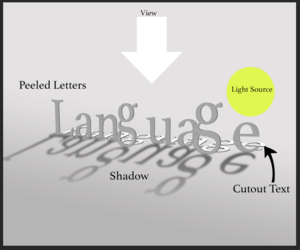
Maybe this might explain what the graphic is supposed to represent.
(Note: quick and sloppy 3D representation! The peeled G's are too big but it was the best I could do on the fly! LOL!!)

Screen Shot 2024-03-30 at 8.46.54 PM.png
 

Back
Top