What's new
Photoshop Gurus Forum

Welcome to Photoshop Gurus forum. Register a free account today to become a member! It's completely free. Once signed in, you'll enjoy an ad-free experience and be able to participate on this site by adding your own topics and posts, as well as connect with other members through your own private inbox!

How do I make these drawings bleed in better?


tomeriksen

Member
Messages
6
Likes
0
Can anyone tell me how to make the scarf blend into this picture?

This image is a composition of a stock footage of three fingers with some "happy faces" scribbled on before it was shot (aka "in camera"). Now, I have added some improvements: The stars, the dollar signs and the scarf. These are vecotorized paths, some from illustrators, others from inside PS.

QUESTION: What I want to achieve is for the scarf to pick-up the texture from the fingers. In other words, to emulate what was done "in camera".
Any suggestions?

NOTE: This is not a final art project. But it could become one.three fingers.png
 
Hi and welcome to PSG

You could try using a Displacement Map
Thanks! Displacement really helps bring the smart layer into the picture by smudging the outlines (look below). Especially the stars and dollar-signs look good. Anyone having any clues on how to make the content of my add-ons feel more textured?

Three fingers + scarf-Recovered.jpg
 
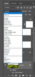
You need to try different blend modes for the layer. Start off with Multiply or overlay.

Untitled-1.jpg

Cheers

John
 
You need to try different blend modes for the layer. Start off with Multiply or overlay.

View attachment 79709

Cheers

John

Sure! I know blend modes. Guess it boils downs to the skills then ;-)

Anyway, after some tweaking I decided to divide the stars+dollars and the scarf.
For the stars, I created a superblack fingerprint, and then used my star vectors as masks. Same with the dollar signs
For the scarf I created a high contrast version of the fingers, added it above the scarf with a soft light blend. The result of the scarf is a bit metallic.

To be continued…
 
Weird… I'm trying to attach the file to share my work with you, but after the file is uploaded the name is crossed out and the file disabled. Why?
 
Weird… I'm trying to attach the file to share my work with you, but after the file is uploaded the name is crossed out and the file disabled. Why?

Hi, there's issues with uploading images to the forum at the moment, it has been reported!
 
Last edited:
Sure! I know blend modes. Guess it boils downs to the skills then ;-)

Anyway, after some tweaking I decided to divide the stars+dollars and the scarf.
For the stars, I created a superblack fingerprint, and then used my star vectors as masks. Same with the dollar signs
For the scarf I created a high contrast version of the fingers, added it above the scarf with a soft light blend. The result of the scarf is a bit metallic.

To be continued…

Sorry if it sounded like I was trying to teach grandma to suck eggs. It isn't always apparent the skill level of users - I would rather tell you something you already know than assume that you know it and you miss out on something that you didn't know.

The reason I suggested blend modes was that it looks to me like the scarf doesn't have any blending at all and in my opinion that is why the underlying texture detail isn't showing through.

Cheers

John
 

Back
Top