Well, aside from the flames at the bottom, the red/yellow effect is pretty straightforward. There's probably other ways to do this, but the quickest and easiest is probably a gradient map. My understanding of the gradient map command is this: You set a gradient (so, at the simplest, two colors that fade into one another, but you can do as many as you want inbetween), and gradient map applies colors to portions of the image based on the brightness of each pixel in the image. For example, you set a gradient from red to blue. Gradient map would then convert pure black pixels to pure red, and pure white pixels to pure blue. Anything inbetween would be filled with varying shades of purple, based on their brightness.
So, to get roughly what you want, we're going to take the original image, and create a gradient map based on the sample image.
So, you've got two ways to access the gradient map command. You can either go to Image > Adjustments > Gradient map, or, (a better way), create an adjustment layer above the layer you're working with, so that you can adjust the settings later if you want. This is the way we're going to go over.
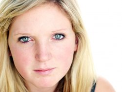
First, load up the new image that you want to adjust, as well as the sample image, and make sure you can see them both. This is the image I used:

With the new image selected, click the "Adjustment layer" button, then select "Gradient Map":

This should present you with a gradient map dialog box:

In this box, click on the gradient itself (where the cursor is in the above image), to access the gradient editor:

Now we're in the home stretch. Next, double-click on the button below the gradient on the left-hand side (where the cursor is, above). This will open the color picker. Use the eyedropper to select the darkest color (or whatever appears to be representing black) in the sample image, and hit OK. I chose the red on her jacket. You've just set the color that will represent black.
Next, double-click the button below the gradient to the right. This time, use the eyedropper to select the lightest portion of the sample image (or whatever should be representing white), and hit OK. You've just set the color that will represent white. I chose the lightest parts of the girl's hair.
Now, we're pretty close, but it still doesn't look quite right. It appears we need to add another color into the mix somewhere. To do so, just click once below the gradient (between the two existing buttons) in the gradient editor window, and it'll add another button for you to double-click. This time, let's use the eyedropper to select a color kind of in the middle. I used the darker part of the girl's cheek (far left side of the image).
Finally, all you have to do is adjust the mixing of the gradient. To do so, just drag the colored boxes around, or drag the diamonds between them. This takes a little bit of playing, but you should be able to get a pretty accurate approximation with just these three colors.
Here's what I came up with:
 Here's
 a PSD of what I did. To see the gradient settings I used, just double-click the gradient icon on the adjustment layer.
Hope this helps!


