What's new
Photoshop Gurus Forum

Welcome to Photoshop Gurus forum. Register a free account today to become a member! It's completely free. Once signed in, you'll enjoy an ad-free experience and be able to participate on this site by adding your own topics and posts, as well as connect with other members through your own private inbox!

How can I make this look better?


Lucky_Could

New Member
Messages
4
Likes
0
I've been using Photoshop for like 3 days now and I made this...
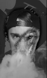
AlWolf.jpg

I'm somewhat happy with it for a first try, but I feel it could be better and little more blended.

If someone could take a look and tell me what steps I need to take that would be great.
I'll attach all the photos I used and the original Photoshop file.
 

Attachments

  • lOGO2.png
    lOGO2.png
    30.9 KB · Views: 0
  • Wallpapers 1920x1080.jpg
    Wallpapers 1920x1080.jpg
    513.5 KB · Views: 0
  • 26994985_159580048019176_1666822107_n.jpg
    26994985_159580048019176_1666822107_n.jpg
    40.5 KB · Views: 0
  • alwolf1.psd
    alwolf1.psd
    3 MB · Views: 0
Well............it all depends on what your going for. Maybe you could explain what is you were trying to accomplish.
 
Erm, I don't know how to explain it really. I thought the picture itself would answer that question.
I want the face to be half human half wolf, but look somewhat more "natural" and the wolf size to blend in a bit more instead of
looking like a sore thumb if you catch my drift?
 
OK.........what is the purpose of the smoke? Not a fan, but it is interesting coming out of the nose of the guy, however it's obliterated in the composite (not coming out of the nose anymore) and serves no apparent purpose other than to cover up the muzzle of the Wolf. Do you have a different photo you would rather use for the composite?

I'm moving this to the General Photoshop forum since you have requested that we teach you what needs to be done. Since your just learning, it's best if you make changes for yourself.
 
That's fine, I just threw it on here in case anyone else wants to give it a try, and the reasoning for the smoke is vape, this is a picture of my friend and he vapes.
 
OK.......here's what I suggest for how you can make this look better.

You should go ahead and isolate your subject (shoulders up) from the existing background and add something more creative.
Your blending of your subject and Wolf is not that bad. I would probably not follow the facial contour of your subject on the right side, just use and blend in the Wolfs right side.

I would duplicate the subject and use Free Transform + Warp to adjust the smoke coming out of the subjects nose so it matches the Wolfs nose. Then use a layer mask to blend. This way it looks more like the Wolf is vaping.

I think the logo would look cool if it was placed in the smoke as an effect. I will play with an example and explain how I did it.
 
This is not an edit request. Please only offer suggestions and instructions that would be helpful for the OP.
 
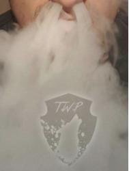
Here is the logo in the smoke effect that I suggested earlier.

Use a black version of the logo and position it over the smoke.
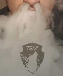
Change it's blending mode to soft light.
Screen Shot 2018-01-16 at 11.43.44 PM.png

Lower the logo's layer opacity to 25%.
Screen Shot 2018-01-16 at 11.44.10 PM.png

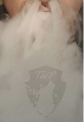
Add a layer style with an outer glow to the logo.
Screen Shot 2018-01-16 at 11.51.44 PM.png


Add a layer mask and use a cloud or smoke brush to blend the edges.
Screen Shot 2018-01-16 at 11.51.59 PM.png

Create a new layer and use the Brush Tool with a cloud or smoke brush to add in more smoke over and around the logo.
Screen Shot 2018-01-16 at 11.52.10 PM.png

Photoshop Smoke Brushes
Photoshop Cloud Brushes

Here's an example of what I was talking about with the smoke coming out of the Wolfs nose as well.
I just used a duplicate of the subject, added a layer mask, then used the Brush Tool to blend.
Screen Shot 2018-01-17 at 9.39.52 AM.png
 

Back
Top