
Photoshop Gurus Forum
Welcome to Photoshop Gurus forum. Register a free account today to become a member! It's completely free. Once signed in, you'll enjoy an ad-free experience and be able to participate on this site by adding your own topics and posts, as well as connect with other members through your own private inbox!
You are using an out of date browser. It may not display this or other websites correctly.
You should upgrade or use an alternative browser.
You should upgrade or use an alternative browser.
How can i get such tipe of photo
- Thread starter betepok
- Start date


Tom Mann
Guru
- Messages
- 7,222
- Likes
- 4,343
These images all seem to come from Dmitry Shaman Shlygin:
http://shlygin.livejournal.com/
http://shlygin.livejournal.com/117235.html?thread=1254899
Have you sent him an email or looked to see if he has described his methods somewhere on the web?
I ask this because almost always, there are many ways to approximate a given effect, but none of these may be the actual method used by the original artist.
For example, to get a look similar to one of the images you posted, I can turn green-yellow trees orange in seconds using a plugin called "Color Mechanic" (see attached). OTOH, I'm almost positive that this was not the method he used because my quick-and-dirty method accentuates noise and other problems in the original, and I'm sure he would not have accepted this.
Tom M
Attachments
ibclare
Queen Bee
- Messages
- 11,033
- Likes
- 4,638
Of course he doesn't! Proprietary information and all that!
If you want to stick to native Photoshop tools, it looks to me like you could try HDR techniques and on duplicates of the original, try out filter and blend mode effects, blurs, sharpening, different adjustment layers, and so on. . Use blend modes and opacities to give effects. These are just guesses. If I have some time later, I'll play with it . . . but these examples take considerable skill and experience to achieve; not for a novice except to try and emulate an exact replica. Don't expect that.
If you want to stick to native Photoshop tools, it looks to me like you could try HDR techniques and on duplicates of the original, try out filter and blend mode effects, blurs, sharpening, different adjustment layers, and so on. . Use blend modes and opacities to give effects. These are just guesses. If I have some time later, I'll play with it . . . but these examples take considerable skill and experience to achieve; not for a novice except to try and emulate an exact replica. Don't expect that.
ibclare
Queen Bee
- Messages
- 11,033
- Likes
- 4,638
Here is a before and after I made using 6 layers. I have no idea if this is the kind of thing you're looking for, but if it's close or a start, I can tell you what I did. It does nevertheless take some understanding of PS. So it can be a short tut or long. Either way, you must have basics to take on the project of emulating his technique (as I am rather tediously repeating). BTW, I did not fix the snow which lost all kinds of detail - maybe not the best image for demo.
original

after

added a gradient to the sky here

ugh. Made this one smaller and got some ugly artifact. Sorry.
original
after
added a gradient to the sky here
ugh. Made this one smaller and got some ugly artifact. Sorry.
Last edited:
Tom Mann
Guru
- Messages
- 7,222
- Likes
- 4,343
Attempting to emulate the last image of his that you cited ("the goal image"), I started with a fairly conventional shot of NYC, looking up between buildings, and then did the following:
1. Brought it into PS via ACR, and then, to enhance the local contrast (ie, give it an "HDR look"), I maxed out the "clarity" slider, and adjusted the contrast and some of the other tonal controls to keep the overall range of tones low enough so as not to blow any significant number of pixels into pure white or pure black. I also used a combination (in ACR) of sharpening (with r=3, low detail) + some luminance NR to further add to a grunge look such as seen in the stone texture of the walls in the goal image.
2. I then brought the result of ACR into PS, and developed a mask that selected only the buildings.
3. Next, I added a hue/sat adjustment layer to remove substantial amounts of color from everything but the reds, and slid a few nearby hues around in the direction of red. I applied this only to the buildings.
4. Proceeding up the layer stack, I added a "levels" adjustment layer where I moved the endpoint and gamma sliders to give the buildings a rust-red color. I applied this only to the buildings.
5. The result was a bit too bright, so I brought down the brightness (more in the shadows, not quite so much in the lighter tones) using a "curves" adjustment layer.
Below (reduced to 700 px wide for display in this forum) are the image I started with and the result of the above procedure.
Note that since I produced the enhanced local contrast in my ACR step, it was applied to the entire image, including the sky. The goal image doesn't have this much local contrast (aka "HDR look") in the sky, but I decided I liked it, so I left it in.
I suspect that Dmitry used a similar method on all the images you cited, masking in and out the effects as appropriate for each scene.
IMHO, it's a fun look, but quite harsh, and like most HDR-like images, I suspect it's popularity will slowly drop back to a relatively small group of hard-core aficionados in the long term.
HTH,
Tom M


PS - Since the approach I outlined above relies on masks, Dmitry would have to use some care to mask the trees in those images that include trees. A suitable method would likely include the "color range" selection tool or something similar that relies on color, to produce spatial selections.
1. Brought it into PS via ACR, and then, to enhance the local contrast (ie, give it an "HDR look"), I maxed out the "clarity" slider, and adjusted the contrast and some of the other tonal controls to keep the overall range of tones low enough so as not to blow any significant number of pixels into pure white or pure black. I also used a combination (in ACR) of sharpening (with r=3, low detail) + some luminance NR to further add to a grunge look such as seen in the stone texture of the walls in the goal image.
2. I then brought the result of ACR into PS, and developed a mask that selected only the buildings.
3. Next, I added a hue/sat adjustment layer to remove substantial amounts of color from everything but the reds, and slid a few nearby hues around in the direction of red. I applied this only to the buildings.
4. Proceeding up the layer stack, I added a "levels" adjustment layer where I moved the endpoint and gamma sliders to give the buildings a rust-red color. I applied this only to the buildings.
5. The result was a bit too bright, so I brought down the brightness (more in the shadows, not quite so much in the lighter tones) using a "curves" adjustment layer.
Below (reduced to 700 px wide for display in this forum) are the image I started with and the result of the above procedure.
Note that since I produced the enhanced local contrast in my ACR step, it was applied to the entire image, including the sky. The goal image doesn't have this much local contrast (aka "HDR look") in the sky, but I decided I liked it, so I left it in.
I suspect that Dmitry used a similar method on all the images you cited, masking in and out the effects as appropriate for each scene.
IMHO, it's a fun look, but quite harsh, and like most HDR-like images, I suspect it's popularity will slowly drop back to a relatively small group of hard-core aficionados in the long term.
HTH,
Tom M
PS - Since the approach I outlined above relies on masks, Dmitry would have to use some care to mask the trees in those images that include trees. A suitable method would likely include the "color range" selection tool or something similar that relies on color, to produce spatial selections.
Tom Mann
Guru
- Messages
- 7,222
- Likes
- 4,343
The more I think about this, the more I'm becoming convinced that the photographer you cited probably used commercial plug-ins such as Topaz Adjust and/or modules from NIK Color efx Pro such as Skylight, Color Stylizer, possibly Cross Balance, etc.
I say this because when I look at more of his images, I see a certain consistency in the efx he generates that is more likely to come from plugin presets than if he had taken a DIY approach to the efx on each image. Of course, I could be completely wrong and he might have developed a set of his own actions that he regularly uses. It would be fun to know the answer.
T
Tom Mann
Guru
- Messages
- 7,222
- Likes
- 4,343
He could have used that, as well, but because of the HDR-like qualities, I think he would have needed help from another program besides Restyle. I think I only see color mapping, not tone mapping in Restyle. Then again, I haven't spent much time with it.
Even if the OP has stopped participating, it would be fun for us regulars to see how close u / we could get using different programs like Restyle.
T
Even if the OP has stopped participating, it would be fun for us regulars to see how close u / we could get using different programs like Restyle.
T
Tom Mann
Guru
- Messages
- 7,222
- Likes
- 4,343
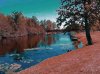
For yucks, I next decided to try to emulate the 2nd image that the OP cited. I started with this:

As far as I can tell, it's a relatively unprocessed shot of the same river (taken well to the right of the cited shot) by a different photographer and used by Wikipedia: http://commons.wikimedia.org/wiki/File:Girona_Spain_buildings_along_the_river.jpg and available for this sort of use under a Creative Commons license.
After an embarrassingly large number of steps, I wound up with this, which certainly isn't a perfect match to the target image, but at least it's moving in the right direction:

For reference, here's a copy of the "target" look that I'm trying to emulate:

All I can say is that if Dmitry had to use the same number of processing steps as I did on each of his shots that has this look, he probably would have given up on photography a long time ago. . He undoubtedly has found some quicker way to get this look, but even using commercial plugins like the ones I mentioned earlier to try to save time, there were still a lot of fussy little adjustments needed to get a reasonable match. Also, Mike, FWIW, I browsed through Topaz ReStyle, and couldn't find anything close that I thought would be useful.
Also, to come back to the OP's original question, everything I did was based on specifics of the particular image I started with. If it had been a bit warmer or cooler, brighter or darker, less or more saturated, many of my adjustments would have been wrong, so I don't think the technique I used to get this look can be considered "general" in any reasonable definition of the term.
If anyone has any bright ideas on other, more general ways to "get this look", or even just to match the look of this one image, I'm all ears. :-(
Cheers,
T
PS - BTW, doesn't Girona look like a wonderful, classically "picturesque" town for photographers?
As far as I can tell, it's a relatively unprocessed shot of the same river (taken well to the right of the cited shot) by a different photographer and used by Wikipedia: http://commons.wikimedia.org/wiki/File:Girona_Spain_buildings_along_the_river.jpg and available for this sort of use under a Creative Commons license.
After an embarrassingly large number of steps, I wound up with this, which certainly isn't a perfect match to the target image, but at least it's moving in the right direction:
For reference, here's a copy of the "target" look that I'm trying to emulate:
All I can say is that if Dmitry had to use the same number of processing steps as I did on each of his shots that has this look, he probably would have given up on photography a long time ago.
. He undoubtedly has found some quicker way to get this look, but even using commercial plugins like the ones I mentioned earlier to try to save time, there were still a lot of fussy little adjustments needed to get a reasonable match. Also, Mike, FWIW, I browsed through Topaz ReStyle, and couldn't find anything close that I thought would be useful.Also, to come back to the OP's original question, everything I did was based on specifics of the particular image I started with. If it had been a bit warmer or cooler, brighter or darker, less or more saturated, many of my adjustments would have been wrong, so I don't think the technique I used to get this look can be considered "general" in any reasonable definition of the term.
If anyone has any bright ideas on other, more general ways to "get this look", or even just to match the look of this one image, I'm all ears. :-(
Cheers,
T
PS - BTW, doesn't Girona look like a wonderful, classically "picturesque" town for photographers?
Tom Mann
Guru
- Messages
- 7,222
- Likes
- 4,343
PS - re: the picturesque aspects of Girona, I just did some reading about the town and found this passage that should be of particular interest to photographers:
"... Characteristic of Girona are the picturesque houses overlooking the river Onyar. These were built over over many years and give the flavour of a small Mediterranean city. The façades are painted according to a palette created by Enric Ansesa, James J. Faixó and the architects Fuses and J. Viader. ..."
"... Characteristic of Girona are the picturesque houses overlooking the river Onyar. These were built over over many years and give the flavour of a small Mediterranean city. The façades are painted according to a palette created by Enric Ansesa, James J. Faixó and the architects Fuses and J. Viader. ..."