Photoshop Gurus Forum
Welcome to Photoshop Gurus forum. Register a free account today to become a member! It's completely free. Once signed in, you'll enjoy an ad-free experience and be able to participate on this site by adding your own topics and posts, as well as connect with other members through your own private inbox!
You are using an out of date browser. It may not display this or other websites correctly.
You should upgrade or use an alternative browser.
You should upgrade or use an alternative browser.
How can I best resize / trip / crop this image
- Thread starter kiwis
- Start date
thebestcpu
Guru
- Messages
- 3,203
- Likes
- 2,954
Thanks so much for the reply. It's a great suggestion but it's show casing some products and other images can't be repeated like this.Not sure of your requirements for the banner yet something such as the attached image was not to hard to do
John Wheeler
View attachment 115842
Perhaps I could center this current image and blend/blur out to the edges somehow? making this image or a good part of this photo the center of the new banner with new content either side
Any thoughts on how to do this or what this could look like?
About do 2000x400 in size too
thebestcpu
Guru
- Messages
- 3,203
- Likes
- 2,954
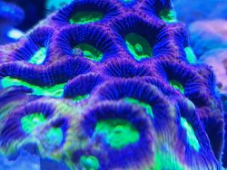
My first step would be to just find a better starting image. Here is an example of some brain coral off google images that had more detail. I just rotated and cropped, then resized the image.
Your total requirements are not clear on what the image needs to be yet if what you want is specifically your starting image there are lots of ways to make a fill yet not sure given the large aspect ratio of a banner that they would look very good.
I suggest to have forum members target the recommendations with a bit more precision, that you spell out in more detail what the end banner requirements in size and in content a bit more clearly.
Here is my try with different brain coral. The pixel dimensions are 2000 x 400
John Wheeler

- Messages
- 23,872
- Likes
- 13,629
Yes, I would agree. If we're not talking about your original coral image here, then I suggest that you post the actual image(s).I suggest to have forum members target the recommendations with a bit more precision, that you spell out in more detail what the end banner requirements in size and in content a bit more clearly.
I do apologies if what I mentioned wasn't clear enough.My first step would be to just find a better starting image. Here is an example of some brain coral off google images that had more detail. I just rotated and cropped, then resized the image.
Your total requirements are not clear on what the image needs to be yet if what you want is specifically your starting image there are lots of ways to make a fill yet not sure given the large aspect ratio of a banner that they would look very good.
I suggest to have forum members target the recommendations with a bit more precision, that you spell out in more detail what the end banner requirements in size and in content a bit more clearly.
Here is my try with different brain coral. The pixel dimensions are 2000 x 400
John Wheeler
View attachment 115843
The size is around 2000px x 400px. It doesn't have to be exact and I'll use CSS to place it on the web correctly. Obviously it could be smaller with a similar ratio but I feel that size would be an okay starting point.
As for what the banner needs to look like. It's not really defined other than.
I want to use my photos of my coral.
This is why I'm scratching my head of how to use these images and am reaching out for help and ideas. Unfortunately a google search for better sized images isn't possible.
So far I have 5 images, some like this could be repeated but another as a fish in it which couldn't be repeated.
- Messages
- 23,872
- Likes
- 13,629
Thanks so much for the reply. It's a great suggestion but it's show casing some products and other images can't be repeated like this.
I want to use my photos of my coral.
So far I have 5 images, some like this could be repeated but another as a fish in it which couldn't be repeated.
Without repetitive editing or the combining of images, you can't place a a larger, or smaller for that matter, image into a 2000px x 400px area without distortion.
If the white rectangle represents the space you have to work with (2000px x 400px)
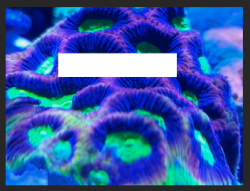
You would have to transform the coral image to fit within the rectangle.

Any attempt at trying to fit the image to the rectangle would result in distortion.

Will be rotating the 5 images as a slideshow effect.It would realy help to see the five images. Merging and combining is probably the best solution.
- Messages
- 23,872
- Likes
- 13,629
Will be rotating the 5 images as a slideshow effect.

Without repetitive editing or the combining of images, you can't place a a larger, or smaller for that matter, image into a 2000px x 400px area without distortion.
If the white rectangle represents the space you have to work with (2000px x 400px)
View attachment 115845
You would have to transform the coral image to fit within the rectangle.
View attachment 115846
Any attempt at trying to fit the image to the rectangle would result in distortion.
View attachment 115847
What about using that middle screenshot, from that step try make a blur/colour gradient of some type? filling out to either edge?
thebestcpu
Guru
- Messages
- 3,203
- Likes
- 2,954
Similar, I was thinking about just colour not the actual photo. My idea would be worse I think. That's very well done. I think the cutover from image to background is to sharp.Is this what you are talking about?
I took a center strip of your rotated image and a larger image on the outside faded to white and then faded between the two
John Wheeler
View attachment 115848
Either way, you're bloody cleaver but I don't think it's going to work.
How else could I turn these images into a banner... I do have words I'm going to overlay but could place them on the image and use some other effects and start with a clean slate.
Exactly like that, how did you do that?
I love the second one.
- Messages
- 23,872
- Likes
- 13,629
Easy.............a layer mask, the Gradient Tool set to the Foreground to Transparent preset, linear and black as the foreground color.
Work the Gradient Tool from the inside edge outwards on both edges of the coral photo layer while holding the shift key.
The color of the rectangle determines the color of the sides.........so to speak!
(Note: I have the Coral image layer clipped to the rectangle layer.)
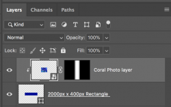
Work the Gradient Tool from the inside edge outwards on both edges of the coral photo layer while holding the shift key.
The color of the rectangle determines the color of the sides.........so to speak!
(Note: I have the Coral image layer clipped to the rectangle layer.)

Easy.............a layer mask, the Gradient Tool set to the Foreground to Transparent preset, linear and black as the foreground color.
Work the Gradient Tool from the inside edge outwards on both edges of the coral photo layer while holding the shift key.
The color of the rectangle determines the color of the sides.........so to speak!
(Note: I have the Coral image layer clipped to the rectangle layer.)
View attachment 115855
I've very new to PS.
So I create a canvas 2000x400 and set a background color based on a deep tone within my image?
then create a layer mask? Are you able to do a quick step by step?
- Messages
- 23,872
- Likes
- 13,629
Sure, just give me a few.Are you able to do a quick step by step?
- Messages
- 23,872
- Likes
- 13,629
I did not realize this. I will show a simple version.I've very new to PS.
Create a new document that's 2000px x 400px.
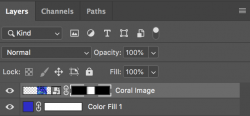
Go to > NEW FILL LAYER > SOLID COLOR
Set your color for this layer by using the color picker (which opens automatically)
(note: I do this for the ease of changing colors.)

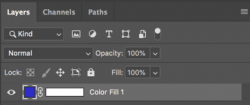
Drag and drop your Coral image into the document
It will open on a layer above the Coral layer.
It should size itself to fit in the canvas. If not, it will open with control handles and you can manually size it down to fit.
It will also convert itself into a smart object.

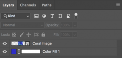
Now select the "Coral Image" layer and add a layer mask. (click on the layer mask icon located at the bottom of the layers panel)
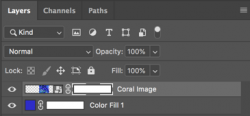
Now select the Gradient Tool
Click the gradient editor window at the top left of the tools options bar....
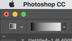
This will open the gradient editor.
Select the "Foreground to Transparent" preset. (Second on the top left)
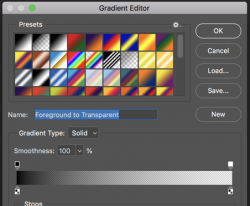
Hit D on your keyboard. This sets the Foreground and background colors to black and white default.
Click on the layer mask.........you should see white brackets around the layer mask.
Work the Gradient Tool from the inside edge (white line) outwards (red line) on both edges of the coral photo layer while holding the shift key.
You will have to do this multiple times for each side!!!

Done.

