What's new
Photoshop Gurus Forum

Welcome to Photoshop Gurus forum. Register a free account today to become a member! It's completely free. Once signed in, you'll enjoy an ad-free experience and be able to participate on this site by adding your own topics and posts, as well as connect with other members through your own private inbox!

Help finishing a little project


tinchito

Member
Messages
9
Likes
0
Hi guys,
I'm having a little trouble finishing up a little (tattoo idea) project for myself.
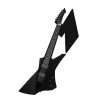
Attached is the (almost finished) image.

As you can notice, it lacks a bit of proportion (the guitar is bigger than the M).. Also, there are some parts of the edges in the upper part of the guitar (the head) that are not straight and also seem quite unreal (the original guitar head from the picture is way smaller than the longer version I tried to produce in the image).

Please if you can "sharpen" it a little, that would be great!

Thanks,
Martin.

View attachment phase2.psd
 
Hi tinchito, would you mind posting a jpeg of the image on the forum so we can see what we'd be dealing with before downloading anything. Thanks a bunch.
 
Hmmm, I'm not a tattoo expert though we do have some on the forum, Paul included. The strings and the clef symbol seem pretty intricate for a tattoo. My understanding is that the artist, him or herself, will prefer to perfect the design for you. Of course, I don't know your situation in that regard. One comment, indeed the M is too small; in fact it is very unclear, either by its shape or positioning, that it is an M, as I see it.
 
Matter of fact is the clef symbol is less important .. I can get rid of it - but it does not bother me right now and in fact it's nice as of the picture itself (and not needed in the tattoo).
My question is, should I do a simple "Free Transform" on the M to get it a little bigger (don't need much, right?)? Because sizing only the guitar would be too much work and it will loose detail. And regarding the head, you can see it's not right don't you? I cannot seem to get the borders straight enough without making it look photoshoped :D. Any advises there?
 
If you want to make a design that is as complete to your liking before you deliver it to the tattoo artist, or you are just working on a design, the best way to make clean, smooth lines is to make paths in Photoshop. The best way to make paths not already in the shape tool menu is to use the pen tool to create them/ Their are tons of tutorials on google and here on the forum to learn the simple basics of it. This design would only require basic knowledge and a little practice. The pen tool "mastery" takes a lot of practice to become skillful. I;ve been using it for over two years and am still learning and improving.

With the pen you can make those edges really nice and give you M a little more flair. Unless you make that M relate shapewise a little better with the neck or the headstock or echo the tuning pegs or something, it gets lost in the guitar shape and only confuses the image's significance. Are you planning to add any color? This would help distinguish the separations. Personally, I would move the M over somewhere else, I'd put it to the right of the head so the whole guitar swings in the direction you presently have it going. You might even make notches on the left side, the beginning side of the M, and make it look like bites made out of it by the pegs. Or have it coming off the guitar as if it were a puzzle piece with a connection to the pegs. Just a thought.
 
If you want to make a design that is as complete to your liking before you deliver it to the tattoo artist, or you are just working on a design, the best way to make clean, smooth lines is to make paths in Photoshop. The best way to make paths not already in the shape tool menu is to use the pen tool to create them/ Their are tons of tutorials on google and here on the forum to learn the simple basics of it. This design would only require basic knowledge and a little practice. The pen tool "mastery" takes a lot of practice to become skillful. I've been using it for over two years and am still learning and improving.

With the pen you can make those edges really nice and give you M a little more flair. Unless you make that M relate shapewise a little better with the neck or the headstock or echo the tuning pegs or something, it gets lost in the guitar shape and only confuses the image's significance. Are you planning to add any color? This would help distinguish the separations. Personally, I would move the M over somewhere else, I'd put it to the right of the head so the whole guitar swings in the direction you presently have it going. You might even make notches on the left side, the beginning side of the M, and make it look like bites made out of it by the pegs. Or have it coming off the guitar as if it were a puzzle piece with a connection to the pegs. Just a thought.

I played around with some ideas and cleaned up the lines. I am not sure I got the M shape right since it was hidden but that's irrelevant at the moment. I didn't really change much, but I definitely would try some different shapes for the M. I like the guitar though. I did remove the extraneous bolt at the bottom. After all, you only need the abstract essence -- I think.

GuitarM.jpg
 
Well, the whole idea of the design is actually more about the M itself (referring my name, hh) and the guitar is just a nice addition.. but still.. the beauty of it should be that they are aligned and the guitar is just an extension of one of the M's side lines..

The details in the guitar are less relevant, as I discussed it with a tattoo designer yesterday over phone and said that for all the details in the image (I sent it over phone), the tattoo needs to be about 20cm. tall - and that's way too much for me.
I'm trying to omit as many irrelevant details as possible (such as the clef symbol) - the problem still being the thin lines of the guitar strings..

I sidetracked there for a moment.. Back to the main topic:
- The image should be only in shades of grey (no colors wanted).
- The M is the main focus, so somehow in need to make it less "background-y".
- The shape of the M is also important (yup).
- Need to less the details on the guitar so it'll be simpler to tattoo it (without it being a leg long, hh)
- Didn't quite get the use of the pen tool in here (and I actually kind of fear that tool, been using photoshop for some time here and there - and never understood it, hh).

Thanks !
 
Do I take it you are still wanting our help to refine this for you? Or just more tips on how to finish it yourself. I'm sorry to say, we're on such different time zones that I didn't save the psd I did, which included the pen tool paths to clean up the guitar edges. But I can play with the jpegs if you like. Too bad I didn't save them as pings.

Fear of pen tool. A basic phobia of new PS users, and even some intermediates. Their ought to be a term, suitably multi-syllabic.

You can do a lot of straight edge cleanup using the polygonal lasso tool, much more straightforward than the pen tool. Since you have mostly straight edges. I would suggest placing a layer mask on the guitar layer, Then position the lasso just inside the borders, make selections a few at a time; select along the edges, the take the lasso out into the negative space, with the mask selected, fill with black. That will smooth the edges for you.

When it comes to curves, you can make the selection manually using the regular lasso tool or the brush on the mask using black. Sometimes when I have a small curve to maneuver with the brush, I remove more with the black. Then I use the round brush on the inside of the image, find the right size to fit the curve, and restore the img with white.

I tried to make the M less background-y yet related to the guitar in my examples. I would suggest you make it a lot larger and if either the guitar or the M is for instance black, then make the other 50% grey or whatever works best. That will differentiate them even if there is overlap.

No worries on simplifying the guitar. Duplicate the layer, ctl/cmd click on the new layer thumbnail and fill it with solid grey/black/etc. Then you can add back the details you like.

PS: for the fear of pen tool syndrome: PSypentropophobia!
 
I had a little time to remove the white BG and play a little. Well, here's just an idea. It could be pared down, elements moved around, etc., etc.

guitarTattoo.jpgguitarTattoo2.jpg
 
Last edited:
I would like to finish it myself..
But I wont say no to a little help :)

You are still missing the point a little bit though..
The whole idea of the picture is that the guitar neck is a part from the M - and not that they are two different "layers" (if you would call it that).

I did a little work on the size of the M, and change the head style of the guitar to be a little bit more attractive..
Still managing to simplify the guitar body.. Filling it with grey/black in another layer like you did in the previous post is not pretty, no offense.

Here is what I did:

phase3.1.jpgphase3.0.jpg
 
Nice alignment.

The edges still a bit jagged but that is probably irrelevant in the making of a tattoo. Personally, I would bring the left hand side of the M out just a bit so that it appears more to be the letter M or to some it may appear to be a shape only. But it's working well as a design I'd say.

And layers really is irrelevant to the discussion. But by using layers, what I/we mean is that you would put the M on a layer below the guitar so you can position it separately. That's all.

What do you mean exactly with: I would bring the left hand side of the M out just a bit so that it appears more to be the letter M or to some it may appear to be a shape only.

SPWA - The simplification of your design might work- I'm dealing with a dilemma on that matter since the stings are so slim that it may be impossible to tattoo them on the scale I have in mind.. - Thanks :)
 

Back
Top