What's new
Photoshop Gurus Forum

Welcome to Photoshop Gurus forum. Register a free account today to become a member! It's completely free. Once signed in, you'll enjoy an ad-free experience and be able to participate on this site by adding your own topics and posts, as well as connect with other members through your own private inbox!

help creating plastic banner in photoshop


dustinwronka

Member
Messages
22
Likes
1
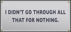
Im trying to create a plastic banner in photoshop. I have attached what I'm trying to replicate and what I came up with. Any thoughts on what I can do to give it more of a realistic look. My project is the "I didn't go through all that for nothing" image

Screen Shot 2020-02-06 at 12.10.06 AM.png

Image 2-6-20 at 12.47 AM.JPG
 
Hmm, I would try overlaying a texture with the illusion of the fabric being pulled taught, if you know what I mean. If you look at your example, the realistic look comes from the texture and shadows of the banner‘s material, rather than it being a flat shape/color. Next, you could add more plants or branches sticking in front of the banner from the bottom or sides. You’re on the right track though! I like the way you’ve started hooking/folding the material under the fencing so it doesn’t just look pasted on. Also, the text looks really good, like it is actually printed on the banner. And the shadows going from left to right to mimic the tree above adds the realistic look as well.
 
Hello @f . a . m i l l s and welcome to the forum.

Sometimes the best way to explain techniques and procedures is to offer some examples of your own. Would it be at all possible to see how you might place a plastic banner on this fence?

Click to expand.
chain_link_fence_81.jpg
 
@f . a . m i l l s - This thread would benefit greatly if you could post an example of how your banner would look. Just so you know, I am genuinely interested and I'm not trying to goad you. You seem to be very knowledgeable and I really want to see how you would approach the matter of creating a plastic/vinyl banner.

I created a banner from scratch on the fence image I posted above and I would like to see how mine compares to yours! :)
 
Ok..........no response from @f . a . m i l l s

I first created a rectangle with the Rectangle Tool.
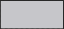
Screen Shot 2020-07-18 at 7.50.24 AM.png

I converted the rectangle to a Smart Object.
I then opened the PSB file and did the following....

I added dotted line border.
Added a pattern overlay and a Bevel and Emboss.
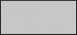
Screen Shot 2020-07-18 at 7.50.41 AM.png

I then added a second dotted line.
Screen Shot 2020-07-18 at 7.50.55 AM.png

I also added a gradient overlay.
Screen Shot 2020-07-18 at 7.51.18 AM.png

I then used the Ellipse Tool to create the grommets. Copied and positioned to the corners.
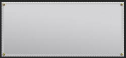
Screen Shot 2020-07-18 at 7.51.30 AM.png

I then added the text.
Screen Shot 2020-07-18 at 7.51.47 AM.png

I then saved the changes to the PSB file and returned to the original PSD.
On the rectangle layer, I used Free Transform (Distort) to give the rectangle perspective with the fence.
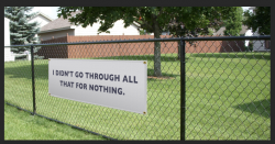
Screen Shot 2020-07-18 at 7.52.36 AM.png

I also used the warp feature to create some "sag" in the banner.
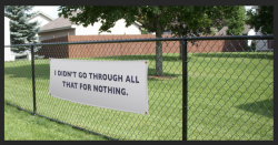
Screen Shot 2020-07-18 at 7.52.47 AM.png

I then added "wrinkles" (shading & highlights) to the banner with the Brush Tool
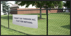
Screen Shot 2020-07-18 at 7.52.57 AM.png

I then added "tie downs" for the banner.
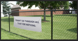
Screen Shot 2020-07-18 at 7.53.17 AM.png

And just for fun...........I added flowers to the banner but any pattern could be added.
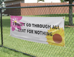
Screen Shot 2020-08-03 at 3.24.05 PM.png
 

Back
Top