What's new
Photoshop Gurus Forum

Welcome to Photoshop Gurus forum. Register a free account today to become a member! It's completely free. Once signed in, you'll enjoy an ad-free experience and be able to participate on this site by adding your own topics and posts, as well as connect with other members through your own private inbox!

Help creating depth


Rarooranya

Member
Messages
12
Likes
0
Hi everyone!

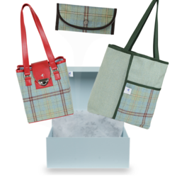
I'm working on this gift box composite where I've put a few products on different layers over a layer with the gift box on it. I'm aiming for it to look like the products are 'exploding 'out of the box but it's looking pretty 2 dimensional. Does anyone have any idea how to make the products look more like they're coming from the box rather than just pasted on top of it? Thanks in advance for any help!


BOX TEST1.jpg
 
The main thing you need is blur.
k7rqfdsi.png
Even just a tiny bit of lens blur can boost the realism significantly.
As a little experiment, I also tried adding some simple shapes at a very low opacity to convey motion, but I don't think it turned out very well. In case you do like it, I've attached it below anyway:

k7rqfdsii.png

k7rqfdsii.png
 
It's often just a matter of perspective and alignment. Your bags are too big for the box they're supposed to be coming out of. The bags outer edges are not aligned with the box.

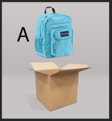
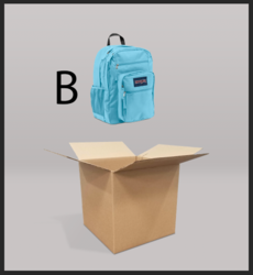
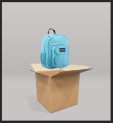
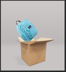
Which image looks more like the backpack would have come out of the box?

Screen Shot 2019-11-09 at 9.24.46 PM.png

Screen Shot 2019-11-09 at 9.24.30 PM.png

B looks more like it could have come out of the box. It's a bit smaller and seems like it's back farther.

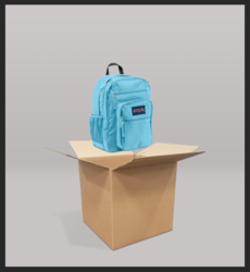
Let's lower the backpack and offer some perspective by placing it in front of the back lid.
Screen Shot 2019-11-09 at 9.28.38 PM.png

Let's adjust the lighting some......
Screen Shot 2019-11-09 at 9.30.19 PM.png

Exploding out and the Backpacks lower right edge is aligned with the right side of the box and not outside.
Screen Shot 2019-11-09 at 9.34.09 PM.png
 
Hi everyone! Sorry to have taken so long to reply - life's been a little hectic this past week or so!

Thanks so much for your suggestions, I added a little blur and played about with proportions and placements etc and I'm very happy with the final product so thanks again!
 
To add more realism, consider adding shadows depending on the source and intensity of light. Also blur the shadows.
In your case, the handbag with Red handle could cast a blurry shadow on the lid of the open box. Also the Green handle bag can cast a faint blurred shadow at the bottom on the cushion. Just an idea.
 

Back
Top