First of all, hello all! This is a great site you've got here!
Okay, I've got two questions;
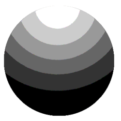
1. In Mark's "Mercator" tute, on style 2, how does he get that posterised effect on the adjustment layer to be so "even"? When I try it does this,

Which makes sense, because a radial gradient disperses from the center point... however Mark seems to have a more oval shaped raidial gradient;

What simple setting am I missing? [stuned]
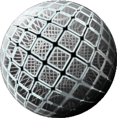
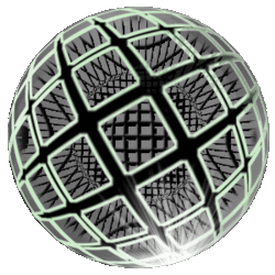
2. Why does the picture in my sig show up fine in IE, but appear to "flash" instead of turn in Netscape based browsers? What's the difference?
Please help, thanks
Okay, I've got two questions;
1. In Mark's "Mercator" tute, on style 2, how does he get that posterised effect on the adjustment layer to be so "even"? When I try it does this,

Which makes sense, because a radial gradient disperses from the center point... however Mark seems to have a more oval shaped raidial gradient;

What simple setting am I missing? [stuned]
2. Why does the picture in my sig show up fine in IE, but appear to "flash" instead of turn in Netscape based browsers? What's the difference?
Please help, thanks


