Photoshop Gurus Forum
Welcome to Photoshop Gurus forum. Register a free account today to become a member! It's completely free. Once signed in, you'll enjoy an ad-free experience and be able to participate on this site by adding your own topics and posts, as well as connect with other members through your own private inbox!
You are using an out of date browser. It may not display this or other websites correctly.
You should upgrade or use an alternative browser.
You should upgrade or use an alternative browser.
Halloween
- Thread starter hershy314
- Start date
tomross
Well-Known Member
- Messages
- 85
- Likes
- 49
Nice work Hershy. Imo the fence is obscuring the nice detail too much though.
As you're looking for suggestions, here's some ideas:
- I think the atmosphere and mood of the piece are great, but I'd be intrigued to see if you could make it even more of a nighttime scene (graveyards are creepiest at night)
- I'm not sure if you're going for a ghostly feel, but for me it looks strange lowering the opacity of some gravestones so the background is showing through. That's where my eye goes, and it feels like more of an oversight than a deliberate design decision.
- I'd like to see more variance in the main cluster of gravestones. Right now the fact it appears to be the same one duplicated many times over which makes the piece feel less natural
- I'd like to see the elements tied into the scene better. Stuff like having some flowers in front of the right gravestone would be a connecting point between the field and the gravestone, and make them feel more like part of the same scene
- As we're going Halloween theme with this, it would be awesome to see an open, dug grave, and even better a creepy zombie hand sticking out of the earth
- Is the circular gravestone (with the inner cross) part of that large rectangular gravestone? Right now it appears to be balancing strangely on it. If it's a separate gravestone hidden behind the larger, one, I'd love to see it moved out further to the left, so they're distinct from one another.
- The fog overlay is great, and definitely necessary. However, to add more depth, I would also add fog/smoke on the ground level, trailing and weaving between the various gravestones.
I hope this helps, and nice work, I'm sure people will love it as a cover photo .
.
As you're looking for suggestions, here's some ideas:
- I think the atmosphere and mood of the piece are great, but I'd be intrigued to see if you could make it even more of a nighttime scene (graveyards are creepiest at night)
- I'm not sure if you're going for a ghostly feel, but for me it looks strange lowering the opacity of some gravestones so the background is showing through. That's where my eye goes, and it feels like more of an oversight than a deliberate design decision.
- I'd like to see more variance in the main cluster of gravestones. Right now the fact it appears to be the same one duplicated many times over which makes the piece feel less natural
- I'd like to see the elements tied into the scene better. Stuff like having some flowers in front of the right gravestone would be a connecting point between the field and the gravestone, and make them feel more like part of the same scene
- As we're going Halloween theme with this, it would be awesome to see an open, dug grave, and even better a creepy zombie hand sticking out of the earth
- Is the circular gravestone (with the inner cross) part of that large rectangular gravestone? Right now it appears to be balancing strangely on it. If it's a separate gravestone hidden behind the larger, one, I'd love to see it moved out further to the left, so they're distinct from one another.
- The fog overlay is great, and definitely necessary. However, to add more depth, I would also add fog/smoke on the ground level, trailing and weaving between the various gravestones.
I hope this helps, and nice work, I'm sure people will love it as a cover photo
ibclare
Queen Bee
- Messages
- 11,033
- Likes
- 4,638
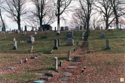
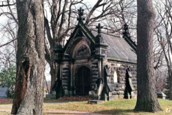
Here are a couple cemetary images just for ideas. A crypt could be cool too. Maybe a bolt of lightning? A crispy critter? Some other elements of gravesites, like those metallic markers they plant for vets and so on? I like the rain and the gate, but I agree it is overwhelming to the rest of the image at this point.
And I agree. Halloween is the top choice of holiday celebrations! The first day of the New Year for Witches and a day when Spirits Cross the Veil.


And I agree. Halloween is the top choice of holiday celebrations! The first day of the New Year for Witches and a day when Spirits Cross the Veil.


hershy314
Guru
- Messages
- 1,616
- Likes
- 769
Another version of the grave yard scene. Not complete yet. I changed just about everything, only the ground and trees in the back ground stayed the same. I added a walking path, different graves (will add more if I can find more I like), added an angel on top of one of the headstones, same headstone you can see an arm sticking out of the ground. Tried to use the open grave idea, but couldn't get it to look right. Also tried adding a ghostly figure but again just didn't work out.

accidently threw in the psd for this, so have fun.
accidently threw in the psd for this, so have fun.
Attachments
- Messages
- 23,872
- Likes
- 13,629
Paul said:Maybe lower the fence in the picture or off set it to the left or right instead of being slap bang in the middle?
.......Imo the fence is obscuring the nice detail too much though.
Sorry Paul, reading others posts and acknowledging or agreeing with them is often difficult for SPE's.
ForeverFallenAngel
Power User
- Messages
- 200
- Likes
- 118
ForeverFallenAngel
Power User
- Messages
- 200
- Likes
- 118
Those are some awesome images, specially the last one.
I looked up apocalyptic sky they have some great images for it glad you like them


