What's new
Photoshop Gurus Forum

Welcome to Photoshop Gurus forum. Register a free account today to become a member! It's completely free. Once signed in, you'll enjoy an ad-free experience and be able to participate on this site by adding your own topics and posts, as well as connect with other members through your own private inbox!

Gurus kindly walk me through in right direction please


balavalli

Well-Known Member
Messages
156
Likes
36
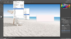
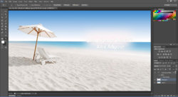
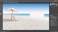
Gurus kindly walk me through in the right direction please. As am trying to add some text on the banner of a web site. As the banner is light in color i wanted to add a rectangle and use the blur effect and then want to put my text over it. I attached all the process i have done so far by screen shots. The process is
1) I added a rectangle on a given header and rasterized it.
2)Then i added Blur > Gaussian Blur effect and rasterized the layer
3)Then i added text over it with some layer styles.]

We often see this sort of effect on various web sites to place the text on the banners.Kindly walk me through if am on right track or not.If not kindly teach me further. Thanks in advance.

regards
balavalli_M
15ydz4p.jpg

11hgxf9.jpg


2ue6wix.jpg

Here's the source PSD With free wallpaper image

http://www.mediafire.com/download/tjyz4ki2hg09i63/soumya.psd
 
Last edited:
It would help enormously if you could post a couple of links to specific web pages that show the precise effect you want to achieve.

Thanks,

Tom M
 
It would help enormously if you could post a couple of links to specific web pages that show the precise effect you want to achieve.

Thanks,

Tom M

Yeah sure .Please look at this attached image please. Thank you for the prompt reply

2ywbi15.jpg
 
You are on the right track, but here's a slightly different, alternative method.

Essentially, all you are asking for is a way to make a portion of an image white with a smooth transition between the white area and the background. Then, once you have this, you can position the required text, selection boxes, etc. over this area using HTML (or equivalent) commands.

There are many ways to do this. My preference would be to simply put a solid white layer above your image, put a black layer mask on that layer (so initially, you don't see any white), and then, using either your filled rectangle method, or even just a soft, large brush, paint white on that mask wherever you want the white layer to show through. To blend a bit better with the background, decrease the opacity of the white layer from 100% down to around 60%. Stick your text on top of that (either on the image itself, or using HTML), and you are done.

Layer stack:

layer_stack-2x.jpg

The advantage of doing it the way I suggest instead of using your method is that I can easily adjust the opacity of the white layer, and by using the properties of the layer mask, particularly, the feathering slider, make the transition even softer.


HTH,

Tom M
 

Attachments

  • beach_scene-plus_text-ps01a-01_698px_wide.jpg
    beach_scene-plus_text-ps01a-01_698px_wide.jpg
    151.8 KB · Views: 21
Last edited:
Here's another to add to your PS arsenal......

Looking at your above sample with adjusted brightness and contrast to see the irregular shape clearly, I can't help be reminded of the old-school, tried and tested way to produce the effect..... use the feather settings to create a vignette....

After creating the shape, select the shape on the layer, press CTRL+Shift+I to inverse the selection, press ALT+CTRL+D to bring up and adjust the feather settings. Finally hit delete.....

In my sample below with blue as fill color, I used a large soft edged brush to paint the shape following the contours of the beach chair and umbrella. I first used a feather setting of 20 and hit the delete button a couple of times... then adjusted the feather setting to 50 and deleted a couple of times...... LOL......

oldschool.jpg

Not with the finesse and reversibility of Tom's procedure but if your design outfit's Art Director wants quick design results, this is what I used to go for......
 

Back
Top