Re: Greetings, could I have advice please (first web layout attempt, no laughing plea
There's nothing to laugh about; it's a respectable effort for a first attempt

Usability-wise, it could be improved:
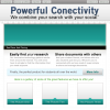
- what is the purpose of that large minty rectangle at the top? It might make more sense to put those two text sections immediately below the title, to limit the amount of eye-searching users will have to do.
- could you possibly expand the width of the page to fit more of the info onto the readily available screen, to avoid scrolling?
The header at the top could be "souped up" somehow, made more interesting, even if just a change of font. The generic sans-serif typeface isn't working for it, I don't think.
My other main pointer would be, tweak the colour-scheme. Mint-Black-Blue-White seems a bit dull to me. Perhaps use Black, Blue and White as your base colours, and try a brighter, contrasting spot colour for the stand-out elements of the page, for example orange - but that's just me.
Jan


