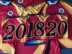
Hi. I've been sent the attached image of several kits arranged so the numbers show the dates 2018-20. I need to include it as the cover photo in the club's strategic plan document for 2018-20. As you can see, the kits are very crinkled and creased. Is there anything some talented person could do just to lessen the severity of some of these creases and shadows, and generally make the concept more visually appealing?
Also, if the small sections of blue carpet in 3 of the corners could be made green to look more like grass, that would be a great touch.
Yours hopefully.
Kim
Also, if the small sections of blue carpet in 3 of the corners could be made green to look more like grass, that would be a great touch.
Yours hopefully.
Kim