What's new
Photoshop Gurus Forum

Welcome to Photoshop Gurus forum. Register a free account today to become a member! It's completely free. Once signed in, you'll enjoy an ad-free experience and be able to participate on this site by adding your own topics and posts, as well as connect with other members through your own private inbox!

Feedback request for my "card" design


Liss1024

New Member
Messages
4
Likes
1
Hello!
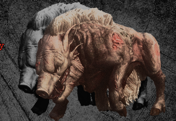
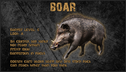
I am making "cards" for my future video, I want to showcase a monster from a game and share some facts about it. So far I've made this Gamma-mutants-boar.png
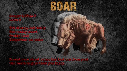
I like the look overall, but red text bothers me. I wasn't able to figure out better color for it and it is not very easy to read.
Anyway, all feedback and advices are welcome, feel free to share even negative opinions. Thank you in advance!
 
Hello and welcome to the forum.

Can you explain all of this? It's very confusing.
Screen Shot 2025-01-28 at 8.59.22 AM.png
 
Is there anyway you can just have one Boar? This image is a mess.
I believe that the boar image needs to be refined and defined so that it's understood exactly what it is.
Screen Shot 2025-01-28 at 1.05.16 PM.png

I'm really confused about this.....
Screen Shot 2025-01-28 at 1.06.50 PM.png
 
Is there anyway you can just have one Boar? This image is a mess.
I believe that the boar image needs to be refined and defined so that it's understood exactly what it is.
Got it, I'll try with just one, thanks!

I'm really confused about this.....
It's hair I guess... Idk, I didn't design the creature itself :)
 
Full confession - I am NOT a designer. I tend to be more of a mechanic and work with the tools and parts that I have.

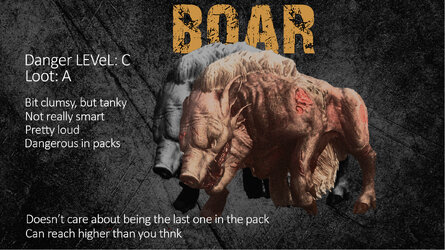
I agree that the red type is hard on the eyes - tends to "vibrate a bit, especially on these tired orbs So I went with dropout (white) type, simple sans serif face. Also enlarged the boar pair - hair and all - and also upsized the BOAR logotype, placing it behind those imposing animals. I felt both those elements should be stronger. Moved things around a bit as you can see and the old editor in me took charge and changed some of the grammar.

So just some suggestions here and certainly not a judgement of your work:

BOAR.jpg
 
Full confession - I am NOT a designer. I tend to be more of a mechanic and work with the tools and parts that I have.

I agree that the red type is hard on the eyes - tends to "vibrate a bit, especially on these tired orbs So I went with dropout (white) type, simple sans serif face. Also enlarged the boar pair - hair and all - and also upsized the BOAR logotype, placing it behind those imposing animals. I felt both those elements should be stronger. Moved things around a bit as you can see and the old editor in me took charge and changed some of the grammar.

So just some suggestions here and certainly not a judgement of your work:
I actually didn't like simple white text until you showed me how good it can be. Definitely would be using your advice, thanks a lot!
 
I think the font could be more like the "BOAR" font and the same color. (The font bleow is not my favorite, but it's what I had)
As I stated before, the main problem with your original is the image of the boar itself...........really needs to be changed.

Screen Shot 2025-01-31 at 1.17.39 PM.png
 

Back
Top